我制作了一个
有什么建议吗?我找不到方法:(
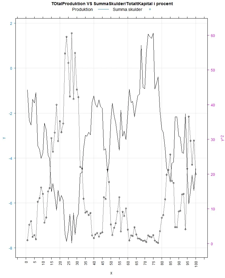
doubleYScale 折线图:library(lattice)
library(latticeExtra)
# Some data
foo <- list(x = 1:100, y = cumsum(rnorm(100)))
obj1 <- xyplot(y~ x, data=foo,xlab=list(cex=1.2),
main="TOtalProduktion VS SummaSkulder/TotaltKapital i procent",
type = c("l","g"),col="black",
lty=1,key = simpleKey(col=c('black'),
text=c("Produktion"),cex=1.2,points=FALSE, lines=TRUE),
scales=list(x=list(rot=90,tick.number=25,
cex=1,axs="r")))
obj2 <- xyplot(y^2 ~ x,data= foo ,type = "o",col="black",
lty=9,key = simpleKey(col=c('black'),
text=c("Summa.skulder"),cex=1.2,lines=FALSE,points= TRUE))
doubleYScale(obj1, obj2, add.ylab2 = TRUE)
问题在于我无法改变y轴标签(y和y^2文本)的文本大小,我想把它变大。如果我只绘制obj1或obj2,则更改它没有问题,但对于doubleYScale则不起作用...
另一方面,我可以使用以下方法更改y轴上数字的大小:
trellis.par.set(axis.text=list(cex=1))
有什么建议吗?我找不到方法:(
fontsize的大小,并根据你的需要进行指定。 - sparrow