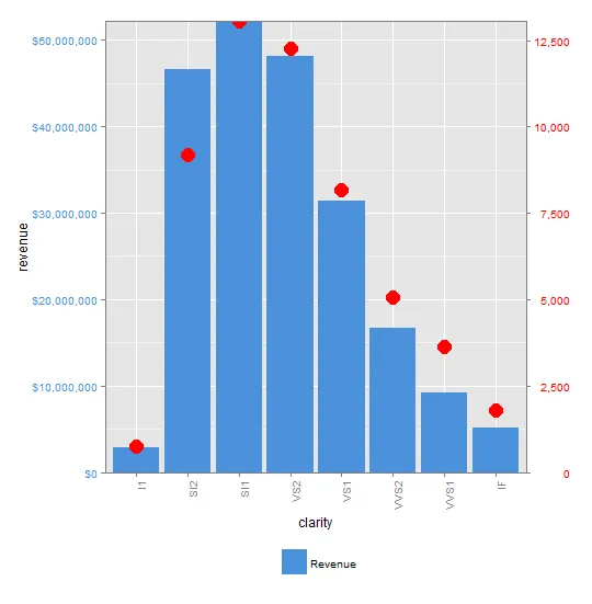
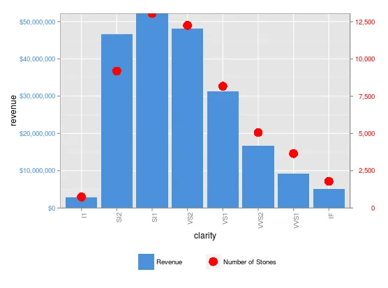
我正在尝试使用ggplot制作双y轴图表。首先,让我说一下,我并不是在讨论是否将其视为良好实践的问题。我发现当查看基于时间的数据以识别两个离散变量中的趋势时,它们特别有用。在我看来,进一步讨论应更适合于交叉验证。
Kohske提供了一个非常好的示例,我已经成功地使用了它。然而,我无法为两个y轴都包括图例。我还看到了类似的问题here和here,但没有一个似乎解决了包括图例的问题。
我使用ggplot中的钻石数据集得到了可重现的示例。 数据
我使用ggplot中的钻石数据集得到了可重现的示例。 数据
library(ggplot2)
library(gtable)
library(grid)
library(data.table)
library(scales)

grid.newpage()

dt.diamonds <- as.data.table(diamonds)

d1 <- dt.diamonds[,list(revenue = sum(price),
                        stones = length(price)),
                  by=clarity]

setkey(d1, clarity)
图表
p1 <- ggplot(d1, aes(x=clarity,y=revenue, fill="#4B92DB")) +
  geom_bar(stat="identity") +
  labs(x="clarity", y="revenue") +
  scale_fill_identity(name="", guide="legend", labels=c("Revenue")) +
  scale_y_continuous(labels=dollar, expand=c(0,0)) +
  theme(axis.text.x = element_text(angle = 90, hjust = 1),
        axis.text.y = element_text(colour="#4B92DB"),
        legend.position="bottom")

p2 <- ggplot(d1, aes(x=clarity, y=stones, colour="red")) +
  geom_point(size=6) +
  labs(x="", y="number of stones") + expand_limits(y=0) +
  scale_y_continuous(labels=comma, expand=c(0,0)) +
  scale_colour_manual(name = '',values =c("red","green"), labels = c("Number of Stones"))+
  theme(axis.text.y = element_text(colour = "red")) +
  theme(panel.background = element_rect(fill = NA),
        panel.grid.major = element_blank(),
        panel.grid.minor = element_blank(),
        panel.border = element_rect(fill=NA,colour="grey50"),
        legend.position="bottom")

# extract gtable
g1 <- ggplot_gtable(ggplot_build(p1))
g2 <- ggplot_gtable(ggplot_build(p2))


pp <- c(subset(g1$layout, name == "panel", se = t:r))
g <- gtable_add_grob(g1, g2$grobs[[which(g2$layout$name == "panel")]], pp$t,
                     pp$l, pp$b, pp$l)
# axis tweaks
ia <- which(g2$layout$name == "axis-l")
ga <- g2$grobs[[ia]]
ax <- ga$children[[2]]
ax$widths <- rev(ax$widths)
ax$grobs <- rev(ax$grobs)
ax$grobs[[1]]$x <- ax$grobs[[1]]$x - unit(1, "npc") + unit(0.15, "cm")
g <- gtable_add_cols(g, g2$widths[g2$layout[ia, ]$l], length(g$widths) - 1)
g <- gtable_add_grob(g, ax, pp$t, length(g$widths) - 1, pp$b)
# draw it
grid.draw(g)
问题:有人有关于如何显示图例第二部分的提示吗?
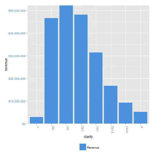
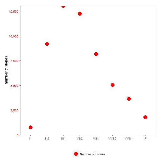
以下是按顺序生成的图表 p1、p2、组合 p1&p2,您会注意到 p2 的图例在组合图中没有显示。
p1
p2
合并p1和p2
aes中?或者可以通过aes_string传递单个颜色或data.table列来设置填充吗? - Danaes_string似乎接受字符串并将它们转换为变量名,我已经将我的red转义为"\"red\"",看起来效果很好。 - Dan