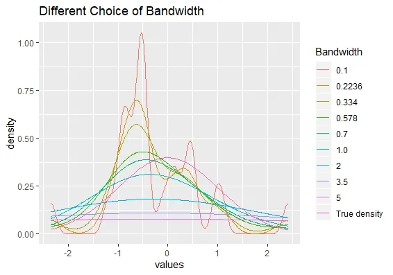
我想使用ggplot2在一个图中创建多个核密度图,每个图都有不同的颜色和图例。我是这样做的:
library(tidyverse)
set.seed(1234)
x <- rnorm(25)
x %>% tibble() %>% ggplot(aes(x = values)) +
  stat_density(aes(x, color = "0.1"), position = "identity", geom = "line",
               kernel = "gaussian", bw = 0.1) +
  stat_density(aes(x, color = "0.2236"), position = "identity", geom = "line",
               kernel = "gaussian", bw = 0.2236) +
  stat_density(aes(x, color = "0.334"), position = "identity", geom = "line",
               kernel = "gaussian", bw = 0.334) +
  stat_density(aes(x, color = "0.578"), position = "identity", geom = "line",
               kernel = "gaussian", bw = 0.578) +
  stat_density(aes(x, color = "0.7"), position = "identity", geom = "line",
               kernel = "gaussian", bw = 0.7) +
  stat_density(aes(x, color = "1.0"), position = "identity", geom = "line",
               kernel = "gaussian", bw = 1.0) +
  stat_density(aes(x, color = "2"), position = "identity", geom = "line",
               kernel = "gaussian", bw = 2) +
  stat_density(aes(x, color = "3.5"), position = "identity", geom = "line",
               kernel = "gaussian", bw = 3.5) +
  stat_density(aes(x, color = "5"), position = "identity", geom = "line",
               kernel = "gaussian", bw = 5) +
  stat_function(fun = function(y) dnorm(y), aes(x, color = "True density")) +
  labs( title = "Different Choice of Bandwidth", color = "Bandwidth")
当需要比较的带宽数量超过6个时,使用if语句会变得相当冗长。因此,我使用for循环来完成相同的操作。
bw_choice <- c(  0.1, 0.2236, 0.334, 0.578,
                    0.7, 1.0, 2, 3.5, 5)
plot <- x %>% tibble() %>% ggplot(aes(x = values))
for (i in 1:length(bw_choice)) {
  plot <-  plot + stat_density(aes(x , color = as.character(bw_choice[i])),
                                   position = "identity", geom = "line",
                                   kernel = "gaussian",
                                   bw = bw_choice[i])
}
plot <- plot + stat_function(fun = function(y) dnorm(y), aes(x, color = "True Density")) +
  labs( title = "Different Choice of Bandwidth", color = "Bandwidth")
plot
然而,在for循环中创建的绘图的颜色保持不变。
我还尝试将color放在aes之外。
color <- c( "#FFCC00", "#FF3300", "#99CC00", "#CC0033", "#666600", "#FF3399", "#3300CC",
              "#33FFCC", "#003300", "#003366")
bw_choice <- c(  0.1, 0.2236, 0.334, 0.578,
                    0.7, 1.0, 2, 3.5, 5)
plot <- x %>% tibble() %>% ggplot(aes(x = values))
for (i in 1:length(bw_choice)) {
  plot <-  plot + stat_density(aes(x), colour = color[i] ,
                                   position = "identity", geom = "line",
                                   kernel = "gaussian",
                                   bw = bw_choice[i])
}
plot <- plot + stat_function(fun = function(y) dnorm(y), aes(x), color = color[10]) +
  scale_color_manual(values = c( '#FFCC00', "#FF3300", "#99CC00", "#CC0033",
                                 "#666600", "#FF3399", "#3300CC",
                                 "#33FFCC", "#003300", "#003366"), name = "Bandwidth",
                     labels = c("0.1", "0.2236", "0.334", "0.578",
                                "0.7", "1.0", "2", "3.5", "5", "Density"))+
  labs( title = "Different Choice of Bandwidth", color = "Bandwidth")
plot
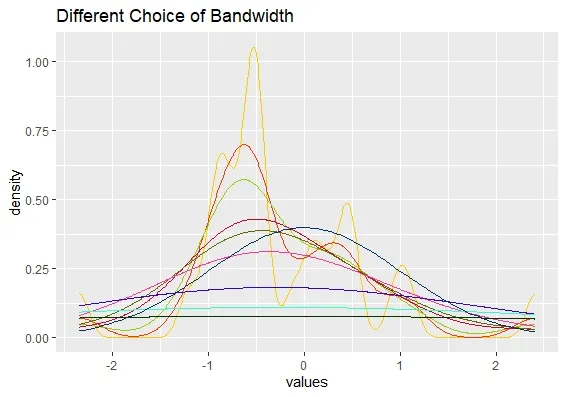
尽管输出的颜色不同,但我无法在这里创建图例。
提前致谢。

set.seed!欢迎来到本网站! - Gregor Thomas