给ggplot2线图添加图例

181

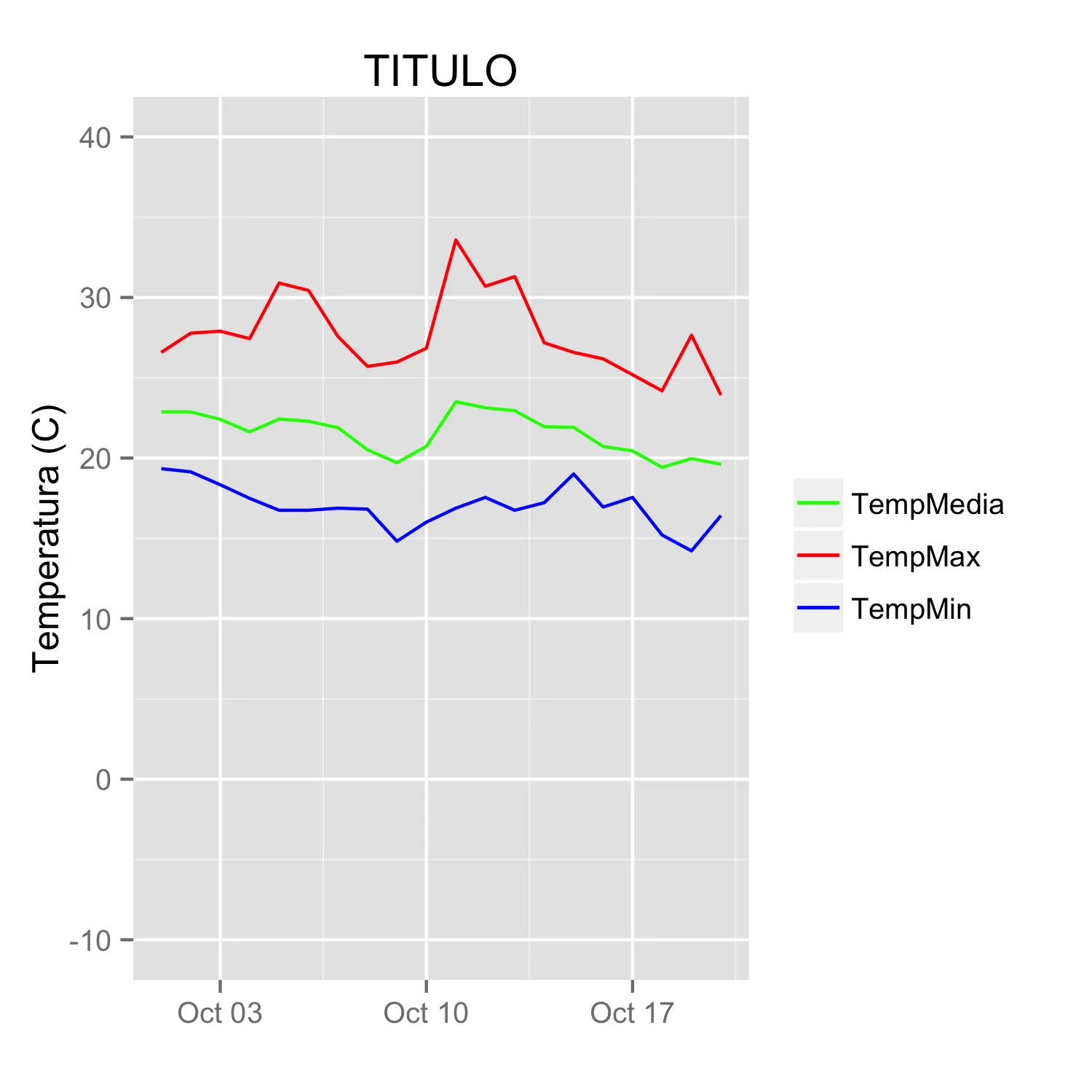
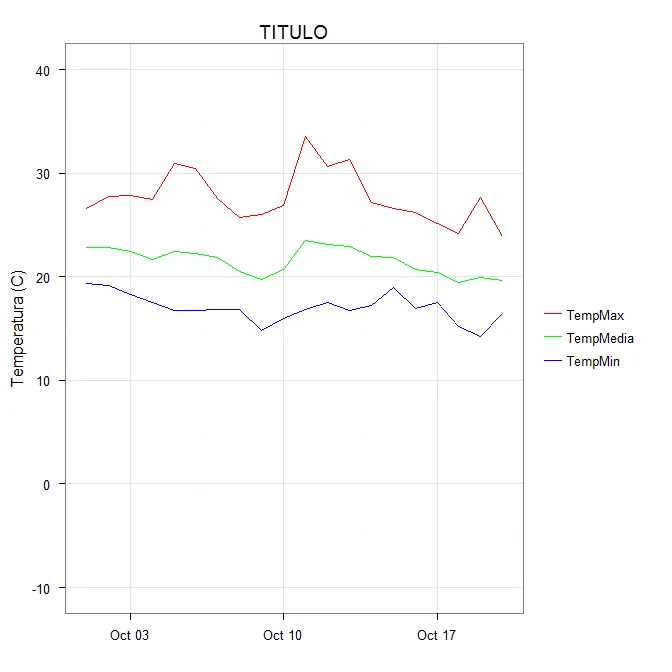
我对ggplot2中的图例有一个问题。我成功地在同一张图中绘制了三条线,并希望添加一个图例来显示使用的三种颜色。这是使用的代码:

library(ggplot2)

## edit from original post - removed lines that downloaded data from broken link. Data snippet now below.
## Here a subset as used by [Brian Diggs in their answer](https://dev59.com/p2kv5IYBdhLWcg3wxzyA#10355844)
datos <- structure(list(fecha = structure(c(1317452400, 1317538800, 1317625200, 1317711600, 1317798000, 1317884400, 1317970800, 1318057200, 1318143600, 1318230000, 1318316400, 1318402800, 1318489200, 1318575600, 1318662000, 1318748400, 1318834800, 1318921200, 1319007600, 1319094000), class = c("POSIXct", "POSIXt"), tzone = ""), TempMax = c(26.58, 27.78, 27.9, 27.44, 30.9, 30.44, 27.57, 25.71, 25.98, 26.84, 33.58, 30.7, 31.3, 27.18, 26.58, 26.18, 25.19, 24.19, 27.65, 23.92), TempMedia = c(22.88, 22.87, 22.41, 21.63, 22.43, 22.29, 21.89, 20.52, 19.71, 20.73, 23.51, 23.13, 22.95, 21.95, 21.91, 20.72, 20.45, 19.42, 19.97, 19.61), TempMin = c(
  19.34, 19.14, 18.34, 17.49, 16.75, 16.75, 16.88, 16.82, 14.82, 16.01, 16.88, 17.55, 16.75, 17.22, 19.01,
  16.95, 17.55, 15.21, 14.22, 16.42
)), .Names = c(
  "fecha", "TempMax",
  "TempMedia", "TempMin"
), row.names = c(NA, 20L), class = "data.frame")

ggplot(data = datos, aes(x = fecha, y = TempMax, colour = "1")) +
  geom_line(colour = "red") +
  geom_line(aes(x = fecha, y = TempMedia, colour = "2"), colour = "green") +
  geom_line(aes(x = fecha, y = TempMin, colour = "2"), colour = "blue") +
  scale_y_continuous(limits = c(-10, 40)) +
  scale_colour_manual(values = c("red", "green", "blue")) +
  labs(title = "TITULO", x = NULL, y = "Temperatura (C)") 

我想添加一个图例,标注三种颜色以及变量名称(TempMax、TempMedia 和 TempMin)。我尝试过使用scale_colour_manual,但未找到确切的方法。


2
我仍然很好奇传说是否可以与情节的不同元素(如不同的geom_line)联系起来。 - Etienne Low-Décarie
如果你只有三行代码,我建议看看dirrectlabels包。(链接) - Tyler Rinker
@TylerRinker 我之前用过它来做其他事情,但现在 csgillespie 的答案对我更有效。 - pacomet
@EtienneLow-Décarie,你可以这样做,但通常只有在它们使用不同的美学时才能实现。例如,将一组线映射到颜色,另一组线映射到线型。在这种情况下,通常还会向每个几何图形传递单独的数据。 - joran
相关 https://dev59.com/HG865IYBdhLWcg3whO7E - tjebo
4个回答

249

由于@Etienne询问如何在不破坏数据的情况下实现此操作(通常这是首选方法,但我认识到可能存在一些情况无法使用),因此我提供以下替代方案。

从原始数据中开始选择一个子集:

datos <-
structure(list(fecha = structure(c(1317452400, 1317538800, 1317625200, 
1317711600, 1317798000, 1317884400, 1317970800, 1318057200, 1318143600, 
1318230000, 1318316400, 1318402800, 1318489200, 1318575600, 1318662000, 
1318748400, 1318834800, 1318921200, 1319007600, 1319094000), class = c("POSIXct", 
"POSIXt"), tzone = ""), TempMax = c(26.58, 27.78, 27.9, 27.44, 
30.9, 30.44, 27.57, 25.71, 25.98, 26.84, 33.58, 30.7, 31.3, 27.18, 
26.58, 26.18, 25.19, 24.19, 27.65, 23.92), TempMedia = c(22.88, 
22.87, 22.41, 21.63, 22.43, 22.29, 21.89, 20.52, 19.71, 20.73, 
23.51, 23.13, 22.95, 21.95, 21.91, 20.72, 20.45, 19.42, 19.97, 
19.61), TempMin = c(19.34, 19.14, 18.34, 17.49, 16.75, 16.75, 
16.88, 16.82, 14.82, 16.01, 16.88, 17.55, 16.75, 17.22, 19.01, 
16.95, 17.55, 15.21, 14.22, 16.42)), .Names = c("fecha", "TempMax", 
"TempMedia", "TempMin"), row.names = c(NA, 20L), class = "data.frame")

你可以通过以下方式获得所需的效果(同时清理原始绘图代码):

ggplot(data = datos, aes(x = fecha)) +
  geom_line(aes(y = TempMax, colour = "TempMax")) +
  geom_line(aes(y = TempMedia, colour = "TempMedia")) +
  geom_line(aes(y = TempMin, colour = "TempMin")) +
  scale_colour_manual("", 
                      breaks = c("TempMax", "TempMedia", "TempMin"),
                      values = c("red", "green", "blue")) +
  xlab(" ") +
  scale_y_continuous("Temperatura (C)", limits = c(-10,40)) + 
  labs(title="TITULO")

The idea is to assign a color to each line by using the colour aesthetic and mapping it to a constant string. The easiest way to choose the string that appears in the legend is to use the same string as the name of the plotted y variable, but any set of strings can be used. It is crucial to include this inside the aes call because you are creating a mapping to this "variable". scale_colour_manual can then map these strings to the appropriate colors. The resulting image is shown below: enter image description here In some cases, it is necessary to explicitly name the values in the manual scale to establish the mapping between levels and colors (thanks to @DaveRGP for pointing this out):
ggplot(data = datos, aes(x = fecha)) +
  geom_line(aes(y = TempMax, colour = "TempMax")) +
  geom_line(aes(y = TempMedia, colour = "TempMedia")) +
  geom_line(aes(y = TempMin, colour = "TempMin")) +
  scale_colour_manual("", 
                      values = c("TempMedia"="green", "TempMax"="red", 
                                 "TempMin"="blue")) +
  xlab(" ") +
  scale_y_continuous("Temperatura (C)", limits = c(-10,40)) + 
  labs(title="TITULO")

(给出与之前相同的数字)。使用命名值,可以使用断点设置图例中的顺序,并且可以在值中使用任何顺序。

ggplot(data = datos, aes(x = fecha)) +
  geom_line(aes(y = TempMax, colour = "TempMax")) +
  geom_line(aes(y = TempMedia, colour = "TempMedia")) +
  geom_line(aes(y = TempMin, colour = "TempMin")) +
  scale_colour_manual("", 
                      breaks = c("TempMedia", "TempMax", "TempMin"),
                      values = c("TempMedia"="green", "TempMax"="red", 
                                 "TempMin"="blue")) +
  xlab(" ") +
  scale_y_continuous("Temperatura (C)", limits = c(-10,40)) + 
  labs(title="TITULO")


2
我喜欢这个解决方案,但我认为可能存在某些限制。'breaks'和'values'变量的映射是否存在字母排序问题?TempM{a]x,TempM{e}dia和TempM{i}n可以很好地排序,但当我将其适应我的变量名称时,颜色似乎按照'breaks'的字母顺序进行匹配,而不是按照输入顺序。能否澄清/优化上述内容以反映/修复此问题? - DaveRGP
4
我已经成功解决了之前提到的颜色排序问题。请使用以下表单:scale_colour_manual("", values = c("TempMax" = "red", "TempMedia" = "green", "TempMin" = "blue")),其中TempMax、TempMedia和TempMin被指定为颜色参数,就像上面的答案一样。 - DaveRGP
@DaveRGP 这是否可以被视为 ggplot 的一个 bug? - Alessandro Jacopson
1
@StellaBiderman 谢谢。很高兴知道这个答案在将近5年后仍然有用。 - Brian Diggs
1
@BrianDiggs 你知道怎么让这个显示一个点而不是一条线吗? - Stella Biderman
显示剩余4条评论

93

我发现如果在多个geom中分别指定颜色,通常意味着我的做法不正确。下面是我如何绘制您的数据:

library(ggplot2)
library(tidyr)

dd_tidyr <- pivot_longer(datos, cols = -fecha, names_to = "Temperature")

现在只需要使用一个简单的 ggplot 命令:

ggplot(dd_tidyr) +
  geom_line(aes(x = fecha, y = value, colour = Temperature)) +
  scale_colour_manual(values = c("red", "green", "blue"))

还有其他的方法可以重塑数据。一种被取代的方式是使用现在已经废弃的{reshape2}软件包。

library(reshape2)
dd = melt(datos, id=c("fecha"))

107
我仍然对如何添加与geom_line等单独元素添加相关的图例感到好奇,我认为这是该问题的最初目的。 - Etienne Low-Décarie
4
因为这个答案被引用的次数很多,而且reshape2已经被弃用,因此展示一个使用tidyr::pivot_longer()重新塑形数据的方法可能会很好。 - teunbrand
1
@teunbrand 我已经更新了。希望很多人会觉得这很有用。 - tjebo

2
我非常喜欢@Brian Diggs提出的解决方案。然而,在我的情况下,我是通过循环创建线图而不是直接给出它们,因为我事先不知道会有多少个图。当我尝试调整@Brian的代码时,我遇到了一些处理颜色的问题。结果发现我需要修改美学函数。如果有人遇到同样的问题,这里是适用于我的代码。
我使用了与@Brian相同的数据框:
data <- structure(list(month = structure(c(1317452400, 1317538800, 1317625200, 1317711600, 
                                       1317798000, 1317884400, 1317970800, 1318057200, 
                                       1318143600, 1318230000, 1318316400, 1318402800, 
                                       1318489200, 1318575600, 1318662000, 1318748400, 
                                       1318834800, 1318921200, 1319007600, 1319094000), 
                                     class = c("POSIXct", "POSIXt"), tzone = ""),
                   TempMax = c(26.58, 27.78, 27.9, 27.44, 30.9, 30.44, 27.57, 25.71, 
                               25.98, 26.84, 33.58, 30.7, 31.3, 27.18, 26.58, 26.18, 
                               25.19, 24.19, 27.65, 23.92), 
                   TempMed = c(22.88, 22.87, 22.41, 21.63, 22.43, 22.29, 21.89, 20.52,
                                 19.71, 20.73, 23.51, 23.13, 22.95, 21.95, 21.91, 20.72, 
                                 20.45, 19.42, 19.97, 19.61), 
                   TempMin = c(19.34, 19.14, 18.34, 17.49, 16.75, 16.75, 16.88, 16.82, 
                               14.82, 16.01, 16.88, 17.55, 16.75, 17.22, 19.01, 16.95, 
                               17.55, 15.21, 14.22, 16.42)), 
              .Names = c("month", "TempMax", "TempMed", "TempMin"), 
              row.names = c(NA, 20L), class = "data.frame")  

在我的情况下,我动态生成了my.colsmy.names,但我不想让事情变得过于复杂,所以在这里明确地给出它们。这三行使图例的排序和颜色分配更容易。
my.cols <- heat.colors(3, alpha=1)
my.names <- c("TempMin", "TempMed", "TempMax")
names(my.cols) <- my.names

以下是情节:

p <-  ggplot(data, aes(x = month))

for (i in 1:3){
  p <- p + geom_line(aes_(y = as.name(names(data[i+1])), colour = 
colnames(data[i+1])))#as.character(my.names[i])))
}
p + scale_colour_manual("", 
                        breaks = as.character(my.names),
                        values = my.cols)
p

enter image description here


5
在这种复杂情况下,将数据重塑为ggplot所期望的长格式确实变得更加容易。 - Axeman
4
我认为相比于@Brian发布的原始答案,它并不会增加太多复杂性。此外,有些人可能想在不重塑数据的情况下完成任务。 - Justyna
1
...而且这种方法允许通过变量使用不同的几何图形(绘图类型)。 - mac

1

使用 scale_color_identity 的另一个选项。关键是在每个 geom_line 的每个 aes 中指定颜色名称。在 scale_color_identity 中,您可以将每种颜色作为 breaks 提及,并添加所需的 labels。以下是可复制的示例:

library(ggplot2)    

temp = ggplot(data = datos, aes(x = fecha)) +
  geom_line(aes(y = TempMax, colour = "red")) +
  geom_line(aes(y = TempMedia, colour = "green")) +
  geom_line(aes(y = TempMin, colour = "blue")) +
  labs(title="TITULO") +
  ylab("Temperatura (C)") + 
  xlab(" ") + 
  scale_y_continuous(limits = c(-10,40)) + 
  scale_color_identity(name = '',
                       breaks = c('red', 'green', 'blue'),
                       labels = c("TempMax", "TempMedia", "TempMin"),
                       guide = 'legend')

temp

使用 reprex v2.0.2 工具创建于2022-11-19。


网页内容由stack overflow 提供, 点击上面的
可以查看英文原文,
原文链接