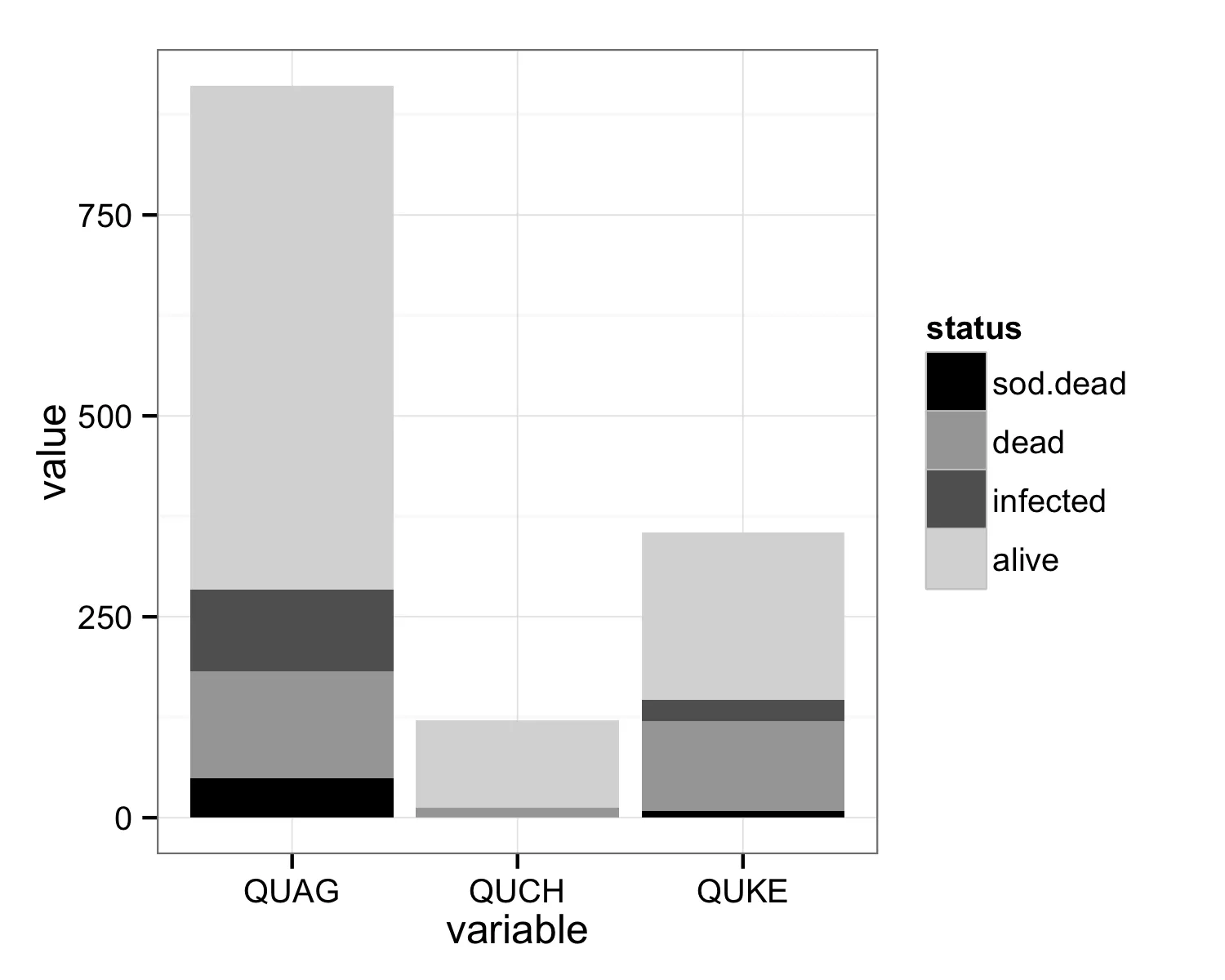
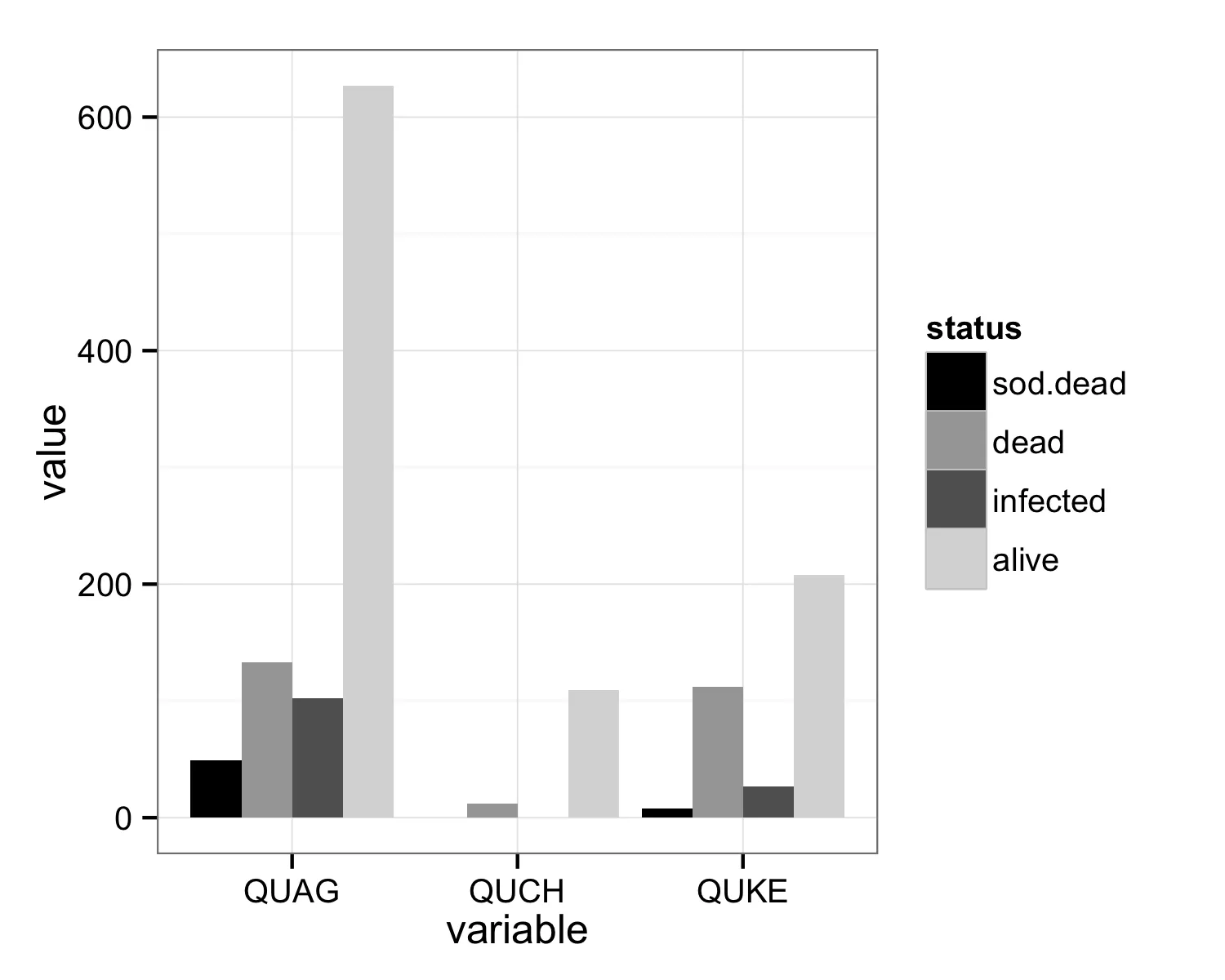
我对R是个新手,请谅解我的无知。我使用geom_bar制作了一个伪堆积条形图,在其中将4组柱状图叠在一起。有3种橡树(QUAG,QUKE,QUCH)的4种健康状态分类(活着,死了,感染了和枯萎死亡)。
我的代码如下:
x <- as.data.frame(list(variable=c("QUAG", "QUKE", "QUCH"), alive = c(627,208,109),  infected = c(102,27,0), dead = c(133,112,12), sod.dead=c(49,8,0)))

x.plot = ggplot(x, aes(variable, alive)) + geom_bar(fill="gray85") +
  geom_bar(aes(variable,dead), fill="gray65") +
  geom_bar(aes(variable, infected), fill="gray38") +
  geom_bar(aes(variable, sod.dead), fill="black")+
  opts(panel.background = theme_rect(fill='gray100'))
x.plot