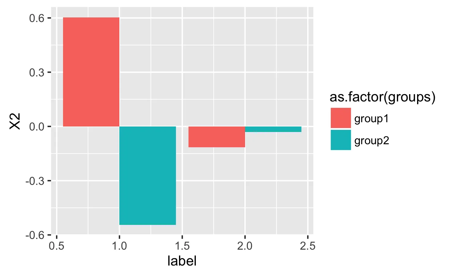
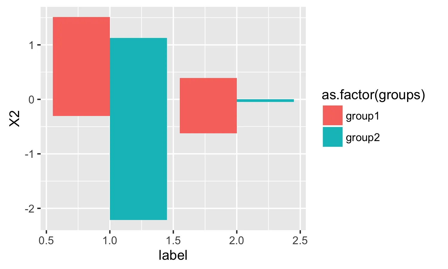
ggplot2: 使用geom_bar绘制均值

41

我有以下数据框:

test2 <- data.frame(groups = c(rep("group1",4), rep("group2",4)), 
    X2 = c(rnorm(4), rnorm(4)) , 
    label = c(rep(1,2),rep(2,2),rep(1,2),rep(2,2)))

我正在使用以下方法为每个组中的每个标签绘制条形图:

ggplot(test2, aes(label, X2, fill=as.factor(groups))) + 
    geom_bar(position="dodge", stat="identity")

在此输入图片描述

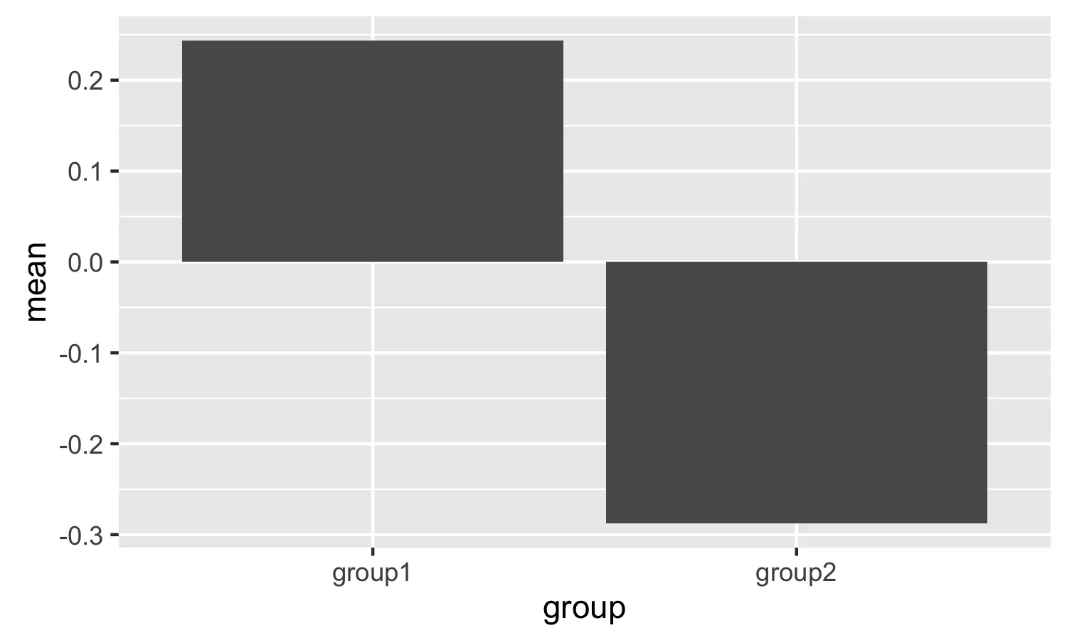
然而我似乎找不到 stat="mean",这样我就可以在每个条形图上绘制平均值而不是身份标识。

感谢任何帮助。


本教程提供了如何实现此目标的良好描述:http://www.r-bloggers.com/using-r-barplot-with-ggplot2/ - seaotternerd
2
可能是ggplot2中绘制每个级别的平均值的重复问题。 - seaotternerd
3个回答

100

只需使用stat = "summary"fun.y = "mean"

ggplot(test2) + 
  geom_bar(aes(label, X2, fill = as.factor(groups)), 
           position = "dodge", stat = "summary", fun.y = "mean")

输入图像描述


哇,这真是太棒了,非常优雅。谢谢!你知道如何以好的方式得到更深的颜色吗? - Cauchy
您该如何修改它以在条形图顶部添加标签? - Carrol
21
尝试使用ggplot 3.3.2进行此操作,似乎已经废弃了fun.y。请改用fun = "mean" - nniloc
1
这个解决方案是否也兼容geom_errorbar? - Rivered

6

ggplot2 喜欢每个绘图点对应一个数据点。创建一个包含摘要统计信息的新数据框,然后使用 stat="identity" 绘制。

require(reshape2)
plot.data <- melt(tapply(test2$X2, test2$groups,mean), varnames="group", value.name="mean")

 ggplot(plot.data, aes(x=group,y=mean)) + geom_bar(position="dodge", stat="identity")

enter image description here


1

尝试使用ggpubr。它可以创建类似于ggplot2的图表。

library(ggpubr)

ggbarplot(test2, x = "label", y = "X2",
          add = "mean", fill = "groups")

enter image description here

或者,添加一个 facet:

ggbarplot(test2, x = "label", y = "X2",
          add = "mean", fill = "groups",
          facet.by = "groups")

enter image description here


网页内容由stack overflow 提供, 点击上面的
可以查看英文原文,
原文链接