我希望能够理解为什么本应该很简单的事情实际上却并不简单。
[我从另一篇涉及此问题的帖子中借用了一部分代码,但最终得到的解决方案并不令我满意]
library(ggplot2)
library(xts)
library(dplyr)
library(scales)
csvData <- "dt,status
2015-12-03,1
2015-12-05,1
2015-12-05,0
2015-11-24,1
2015-10-17,0
2015-12-18,0
2016-06-30,0
2016-05-21,1
2016-03-31,0
2015-12-31,0"
tmp <- read.csv(textConnection(csvData))
tmp$dt <- as.Date(tmp$dt)
tmp$yearmon <- as.yearmon(tmp$dt)
tmp$status <- as.factor(tmp$status)
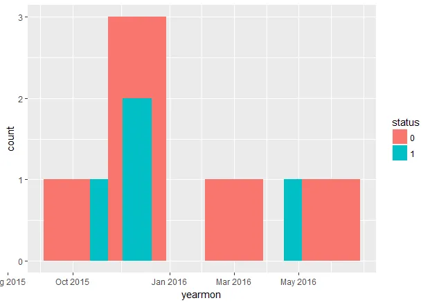
### Not good. Why?
ggplot(tmp, aes(x = yearmon, fill = status)) +
geom_bar() +
scale_x_yearmon()
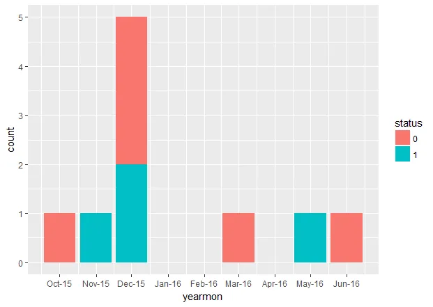
### Almost good but long-winded and ticks not great
chartData <- tmp %>%
group_by(yearmon, status) %>%
summarise(count = n()) %>%
as.data.frame()
ggplot(chartData, aes(x = yearmon, y = count, fill = status)) +
geom_col() +
scale_x_yearmon()
第一个图表完全错误;第二个几乎完美(X轴刻度不太好,但我可以接受)。难道
geom_bar()不应该执行我在第二个图表中手动执行的计数工作吗?
第一张图表
 第二张图表
第二张图表
 我的问题是:为什么第一个图表如此糟糕?有一个警告,意味着要建议一些东西(“position_stack需要非重叠的x间隔”),但我真的无法理解它。谢谢。
我的个人答案
这就是我学到的东西(非常感谢你们所有人!):
我的问题是:为什么第一个图表如此糟糕?有一个警告,意味着要建议一些东西(“position_stack需要非重叠的x间隔”),但我真的无法理解它。谢谢。
我的个人答案
这就是我学到的东西(非常感谢你们所有人!):即使有一个
scale_#_yearmon或scale_#_date,不幸的是ggplot将这些对象类型视为连续数字。这使得geom_bar无法使用。
geom_histogram可能会奏效。但你失去了对相关美学部分的控制。
底线:您需要在绘图之前进行分组/求和。
不确定(如果您计划使用ggplot2)xts或lubridate是否真正对我尝试实现的目标有用。我怀疑对于任何连续的情况 - 日期方面 - 它们将是完美的。
总之,我最终得到了这个完全满足我的要求的东西(请注意,没有必要使用xts或lubridate):library(ggplot2)
library(dplyr)
library(scales)
csvData <- "dt,status
2015-12-03,1
2015-12-05,1
2015-12-05,0
2015-11-24,1
2015-10-17,0
2015-12-18,0
2016-06-30,0
2016-05-21,1
2016-03-31,0
2015-12-31,0"
tmp <- read.csv(textConnection(csvData))
tmp$dt <- as.Date(tmp$dt)
tmp$yearmon <- as.Date(format(tmp$dt, "%Y-%m-01"))
tmp$status <- as.factor(tmp$status)
### GOOD
chartData <- tmp %>%
group_by(yearmon, status) %>%
summarise(count = n()) %>%
as.data.frame()
ggplot(chartData, aes(x = yearmon, y = count, fill = status)) +
geom_col() +
scale_x_date(labels = date_format("%h-%y"),
breaks = seq(from = min(chartData$yearmon),
to = max(chartData$yearmon), by = "month"))
最终输出
 请注意,这是HTML代码。
floor_date()是来自 lubridate 包对吧?不管怎样:我使用它可以得到和上面“FIRST CHART”一样的结果。 - Matteo Castagna