ggplot2 | geom_bar and position = "identity"

3

我是一名绝对的初学者,最近开始使用优秀的ggplot包。我有一个关于在条形图中使用position =“identity”的问题。我在互联网上搜索并找到了这个链接:http://docs.ggplot2.org/current/geom_tile.html 然而,它们与geom_bar()没有关系。
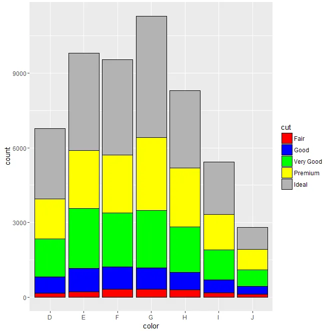
A)第一个图表:(有效果)

ggplot(diamonds, aes(color, fill = cut)) +
geom_bar()

这个图表展示了频率(纵轴)与颜色的关系,并根据 "cut" 进行填充。我对此感到满意。

B)现在,在第二张图中,我不确定正在发生什么:

ggplot(diamonds, aes(color, fill = cut)) +
geom_bar(position = "identity", alpha = 1 / 2, colour = "red")

有人能解释一下为什么第二张图稍有不同吗?(即,两张图的柱状图高度不同;颜色方案也发生了变化-我本来希望条形图是红色的,因为我明确设置了颜色=“红色”,但条形图具有渐变色彩方案,并且它们有一个“红色”边框。)
在作图时,我使用了公开可用的ggplot2库和附带它的diamond数据集包。
我是初学者,如果我的问题听起来太基础,请见谅。

2
颜色设置了条形边框的颜色,而不是填充颜色。 - Richard Telford
4
位置= 身份重叠在条形图上,而不是将它们堆叠。 - Richard Telford
1个回答

5
正如@Richard Telford所说,position="identity"将重叠在条形图上,而默认选项是position="stack",您可以通过以下方式查看:
args(geom_bar)
function (mapping = NULL, data = NULL, stat = "count", position = "stack", 
..., width = NULL, binwidth = NULL, na.rm = FALSE, show.legend = NA, 
inherit.aes = TRUE)

args 显示任何函数的参数及其默认值,如您在此处所见,position 参数的默认值为 "stack",因此在您的第一个示例中,条形图是堆叠的。如果您想要指定“填充”颜色,您需要一个特殊的额外参数:一个比例尺(如果您在 geom_bar 调用中尝试使用 fill=...,它会覆盖 ggplot 调用中的 fill=cut)。这里有个示例,显示了丑陋的颜色和黑色边框:

ggplot(diamonds, aes(color, fill = cut)) +
geom_bar(position = "stack", color="black") +
scale_fill_manual(values=c("red", "blue", "green", "yellow", "gray70"))

enter image description here


感谢Toshiro和@Richard Telford:geom_bar(color = "red")与geom_point(color = "red")有什么区别?我相信当我调用geom_point(color = "red")时,它会填充颜色。不是吗?因此,当调用geom_bar()时,我本来期望得到类似的结果。我很好奇。 - watchtower
这取决于您使用的“点”的类型:默认点形状只有一种颜色,而其他一些则具有颜色和填充选项。尝试使用 pch=21 选项运行此代码,以查看颜色和填充之间的区别。ggplot(data=data.frame(x=1:10, y=(1:10)^2), aes(x=x, y=y)) + geom_point(col="red", fill="yellow", pch=21, cex=5) - Jean-Noël
太棒了!你是怎么发现pch和cex的?我很好奇。我查看了?geom_point,但没有找到它。我还尝试了ggplot(data=data.frame(x=1:10, y=(1:10)^2), aes(x=x, y=y)) + geom_point(col="red", fill="yellow", pch=21, cex=5)ggplot(data=data.frame(x=1:10, y=(1:10)^2), aes(x=x, y=y)) + geom_point(col="red", fill="yellow"),这两个图形明显不同。 - watchtower
好吧,我太匆忙了:pch=cex=是基本的plot()选项,更准确地说,在geom_point()中,我应该写shape=21,这在ggplot语法中更方便(其中形状可以是动态参数)。您可以在此处查看详细信息(以及不同的形状):http://sape.inf.usi.ch/quick-reference/ggplot2/shape。您图表之间的差异来自默认形状(16),它只有一种颜色(和默认大小`cex`)。 - Jean-Noël
1
不错的提示:使用透明度来显示重叠的条形图,代码示例如下:geom_bar(stat = "identity", position="identity" , alpha=0.5) - fred

网页内容由stack overflow 提供, 点击上面的
可以查看英文原文,
原文链接