在ggplot2中更改geom_bar图例键的形状

6

我想要改变 geom_bar 图表中图例键的形状。我查看了多个在线答案,但发现它们在这种情况下无法工作。让我解释一下问题:

df1 = data.frame(person = c("person1", "person2", "person3"),
             variable = "variable1",
             value = c(0.5, 0.3, 0.2))

df2 = data.frame(person = c("person1", "person2", "person3"),
             variable = "variable2",
             value = c(-0.3, -0.1, -0.4))

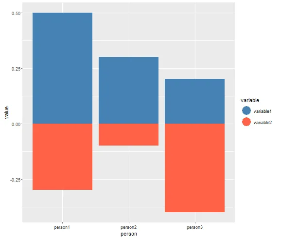
我想制作一个堆积条形图,其中一侧是负数。使用ggplot2我得到了如下图所示的结果:
library(ggplot2)
ggplot() + geom_bar(data = df1, aes(x = person, y = value, fill = variable), stat = "identity") +
  geom_bar(data = df2, aes(x = person, y = value, fill = variable), stat = "identity") +
  scale_fill_manual(values = c("steelblue", "tomato"), breaks = c("variable1","variable2"),
                labels = c("Variable 1", "Variable 2"))

然后它看起来像这样:

enter image description here

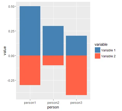
现在,默认情况下,图例显示为正方形。是否有一种方法可以将其更改为圆形等其他形状?

在线上,我发现通常使用以下方式来实现:

guides(fill = guide_legend(override.aes = list(shape = 1)))

或类似的变体。然而,这似乎不起作用。如果有人能帮忙,那就太好了,我已经卡了很长时间了。


3
没有绕过方法?这让我感到惊讶。 - Pierre L
1个回答

8

您可以添加一个没有数据的geom_point层(仅用于创建图例),并使用show.legend = FALSE隐藏不需要的矩形图例:

df3 = data.frame(person = as.numeric(c(NA, NA)),
                 variable = c("variable1", "variable2"),
                 value = as.numeric(c(NA, NA)))

ggplot() + 
  geom_bar(data = df1, aes(x = person, y = value, fill = variable), stat = "identity", show.legend = FALSE) +
  geom_bar(data = df2, aes(x = person, y = value, fill = variable), stat = "identity", show.legend = FALSE) +
  geom_point(data = df3, aes(x = person, y = value, color = variable), size=8) +
  scale_fill_manual(values = c("steelblue", "tomato"), breaks = c("variable1","variable2")) +
  scale_color_manual(values = c("steelblue", "tomato")) +
  theme(legend.key = element_blank())

enter image description here


1
谢谢!它确实起到了作用,尽管这似乎是唯一的方法,正如Pierre所指出的那样。 - Nils Mackay

网页内容由stack overflow 提供, 点击上面的
可以查看英文原文,
原文链接