我的数据集如下
dput(data2)
structure(list(School = structure(c(1L, 1L, 1L, 2L, 2L, 2L, 3L,
3L, 3L), .Label = c("School1", "School2", "School3"), class = "factor"),
    Year = c(2015L, 2014L, 2013L, 2015L, 2014L, 2013L, 2015L,
    2014L, 2013L), Rate = c(70L, 50L, 30L, 80L, 90L, 11L, 60L,
    50L, 40L)), .Names = c("School", "Year", "Rate"), class = "data.frame", row.names = c(NA,
-9L))


   School Year Rate
1 School1 2015   70
2 School1 2014   50
3 School1 2013   30
4 School2 2015   80
5 School2 2014   90
6 School2 2013   11
7 School3 2015   60
8 School3 2014   50
9 School3 2013   40
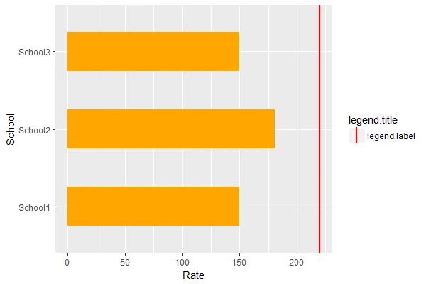
我使用ggplot2绘制这些数据,如下所示
library(ggplot2)
ggplot(data=data2,aes(x=School,y=Rate)) +
  geom_bar(stat = "identity", fill="orange",width = 0.5) +
  geom_hline(aes(yintercept = 220,color="red"), size = 1) +
  coord_flip()
我得到了以下图表,现在想要将图例中的线条旋转,如下所示: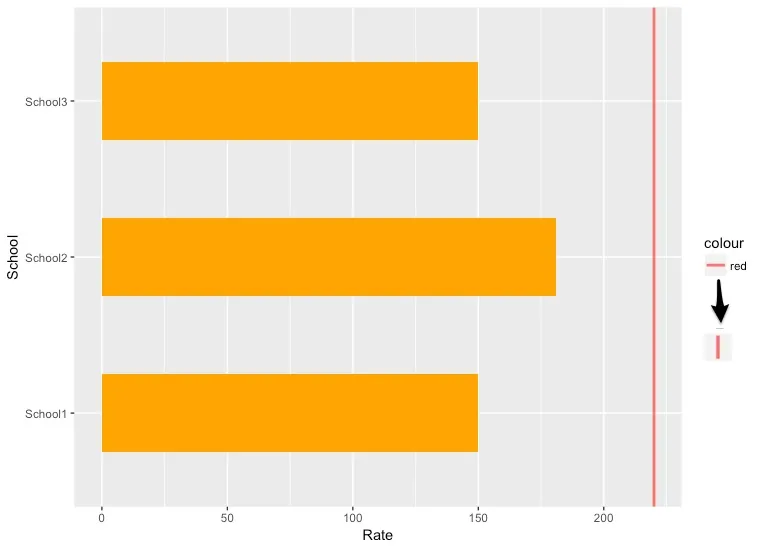
我在Stack Overflow上看到一些帖子提到图例中的线条为垂直显示,但只有当使用geom_linerange时才会出现这种情况,而我不能在我的示例中使用它。
请问有人可以帮助我理解如何在图例中旋转线条吗?
一个替代方案是使用grid包中的视口来导航视图,然后查看是否能够旋转图例键使用的视口。