我试图使ggplot的图例填充透明。我遵循了Hadley的ggplot2指南之一中更改图例键填充的说明,但是出现了问题,当我将填充设置为透明时,它会填充为灰色。即使我将图例填充设置为白色,最终的绘图中仍然显示为灰色。
以下是一个例子:
library(ggplot2)
data1 = c(0,10, 11, 23, 33, 40, 41, 50, 59, 68, 76, 88, 90, 99)
data2 = c(2, 8, 10, 22, 39, 47, 49, 55, 62, 70, 76, 86, 88, 95)
df = data.frame(data1, data2)
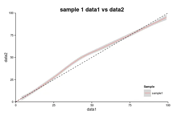
(plot = ggplot() +
geom_smooth(data=df, aes(data1, data2,colour="sample1"))+
geom_abline(intercept=0, slope=1,linetype="dashed", color = "black")+
scale_x_continuous(expand=c(0,0), limits=c(0,100)) +
scale_y_continuous(expand=c(0,0), limits=c(0,100))+
theme_classic()+
labs(y="data2", x="data1",
title="sample 1 data1 vs data2") +
theme(plot.title = element_text(size=18, face="bold"),
legend.key = element_rect(colour = "transparent", fill = "white"),
legend.justification = c(1,0), legend.position = c(1,0))+
scale_color_discrete(name="Sample") )
theme(legend.key = element_rect(colour = "transparent", fill = "red")),就会得到以下绘图:
 所以看起来我可以改变图例键填充颜色,但不能设置为白色或透明。
有人知道我做错了什么吗?还是说没有办法让图例键填充透明/白色? 编辑:设置
theme(legend.key = element_rect(fill = alpha("white", 0.0)))无法解决问题。
请参见此处:
library(ggplot2)
library(scales)

data1 = c(0,10, 11, 23, 33, 40, 41, 50, 59, 68, 76, 88, 90, 99)
data2 = c(2, 8, 10, 22, 39, 47, 49, 55, 62, 70, 76, 86, 88, 95)

df = data.frame(data1, data2)

(plot = ggplot() +
  geom_smooth(data=df, aes(data1, data2,colour="sample1"))+
  theme_classic()+
  labs(y="data2", x="data1",
       title="sample 1 data1 vs data2") +
  theme(plot.title = element_text(size=18, face="bold"),
        legend.key = element_rect(colour = "transparent", fill = alpha("red", 0)),
        legend.justification = c(1,0), legend.position = c(1,0))+
  scale_color_discrete(name="Sample") )
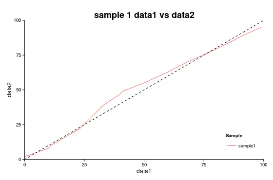
编辑2:如果我使用geom_line()而不是geom_smooth,我可以将图例键填充设置为NA,因此这必须是因为geom_smooth中的线具有置信区间的灰色区域,因此图例键反映了那种外观。
(plot = ggplot() +
  geom_smooth(data=df, aes(data1, data2,colour="sample1"))+
  geom_abline(intercept=0, slope=1,linetype="dashed", color = "black")+
  scale_x_continuous(expand=c(0,0), limits=c(0,100)) +
  scale_y_continuous(expand=c(0,0), limits=c(0,100))+
  theme_classic()+
  labs(y="data2", x="data1",
       title="sample 1 data1 vs data2") +
  theme(plot.title = element_text(size=18, face="bold"),
        legend.key = element_rect(colour = NA, fill = NA),
        legend.justification = c(1,0), legend.position = c(1,0))+
  scale_color_discrete(name="Sample") )
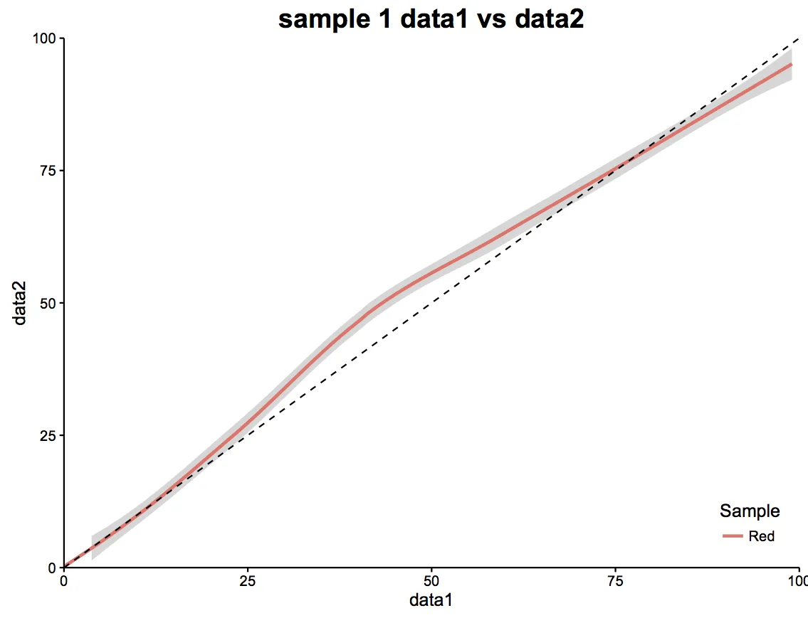
legend.key = element_rect(fill = NA)设置后,效果与之前一样。键填充仍然是灰色的。 - Reilstein