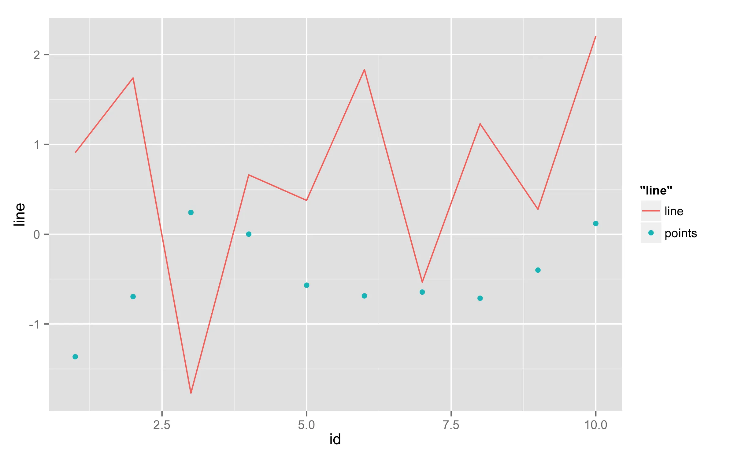
假设我不需要一个“正确”的变量映射,但仍然希望有图例来帮助理解图表。我的实际数据类似于以下df:
df <- data.frame(id = 1:10, line = rnorm(10), points = rnorm(10))

library(ggplot2)

ggplot(df) +
  geom_line(aes(id, line, colour = "line")) +
  geom_point(aes(id, points, colour = "points"))
基本上,我希望与points相关的图例键仅为一个点,没有中间的线。我通过以下代码实现了接近该效果:
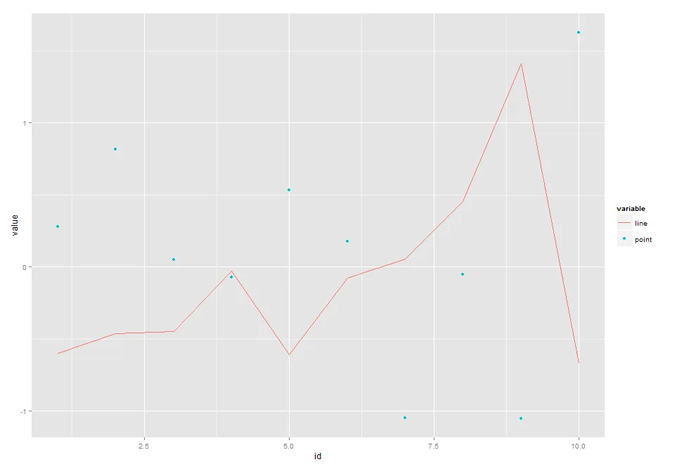
library(reshape2)

df <- melt(df, id.vars="id")

ggplot() +
  geom_point(aes(id, value, shape = variable), df[df$variable=="points",]) +
  geom_line(aes(id, value, colour = variable), df[df$variable=="line",])
但它定义了两个不同的图例。修复第二段代码(并需要重新整理我的数据)也可以,但我更喜欢一种方式(如果有的话)手动更改任何图例键(并继续使用第一种方法)。谢谢!
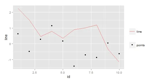
编辑:
感谢@alexwhan您提醒我关于变量映射的内容。但是,到目前为止,我找到的最简单的方法仍然是以下内容(非常糟糕的hack!):
df <- data.frame(id = 1:10, line = rnorm(10), points = rnorm(10))

ggplot(df) +
  geom_line(aes(id, line, colour = "line")) +
  geom_point(aes(id, points, shape = "points")) +
  theme(legend.title=element_blank())
这只是隐藏了两个不同图例的标题。
欢迎提出其他想法!