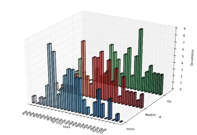
我有一个数据框,其中行代表一天中的小时数,列代表时间频率。目标是创建一个三维条形图,每个列代表不同的颜色。我的数据框如下:
frec=pd.read_csv('tiempo.csv', parse_dates='Horas',index_col='Horas')
frec.index=[date.strftime('%H:%M') for date in frec.index]

frec
         Inicio  MaxExt  Fin
18:00       1       1    1
19:00       0       0    3
20:00       1       1    1
21:00       1       1    0
22:00       3       1    0
23:00       9       1    0
00:00       8       3    2
01:00       2       0    1
02:00       3       8    1
03:00       5       3    2
04:00       6       2    6
05:00       6       6    5
06:00       5       6    4
07:00       5       7    2
08:00       2       4    5
09:00       1       6    6
10:00       0       3    2
11:00       2       5    5
12:00       4       1    9
13:00       2       4    2
15:00       0       2    3
14:00       3       2    4
15:00       0       2    3
16:00       1       1    3
17:00       0       2    3
以下代码尝试创建绘图:
xpos=np.arange(frec.shape[0])
ypos=np.arange(frec.shape[1])
yposM, xposM = np.meshgrid(ypos+0.5, xpos+0.5)
zpos=np.zeros(frec.shape).flatten()

dx = 0.5 * np.ones_like(zpos)
dy= 0.1 * np.ones_like(zpos)
dz=frec.values.ravel()

fig = plt.figure(figsize=(12,9))
ax = fig.add_subplot(111, projection='3d')

values = np.linspace(0.2, 1., xposM.ravel().shape[0])
colors = cm.rainbow(values)

ax.bar3d(xposM.ravel(),yposM.ravel(),zpos,dx,dy,dz,color=colors, alpha=0.5)


ticks_x = np.arange(0.5, 24, 1)
ax.set_xticks(ticks_x)
ticks_y=np.arange(0.6,3,1)
ax.set_yticks(ticks_y)

ax.w_xaxis.set_ticklabels(frec.index)
ax.w_yaxis.set_ticklabels(frec.columns)

ax.set_xlabel('Hora')
ax.set_ylabel('B')
ax.set_zlabel('Occurrence')
plt.xticks(ticks_x ['1PM','2PM','3PM','4PM','5PM','6PM','7PM','8PM','9PM','1OPM','11PM','12AM','1AM','2AM','3AM','4AM','5AM','6AM','7AM','9AM','10AM','11AM','12PM'])
fig.autofmt_xdate()
plt.show()
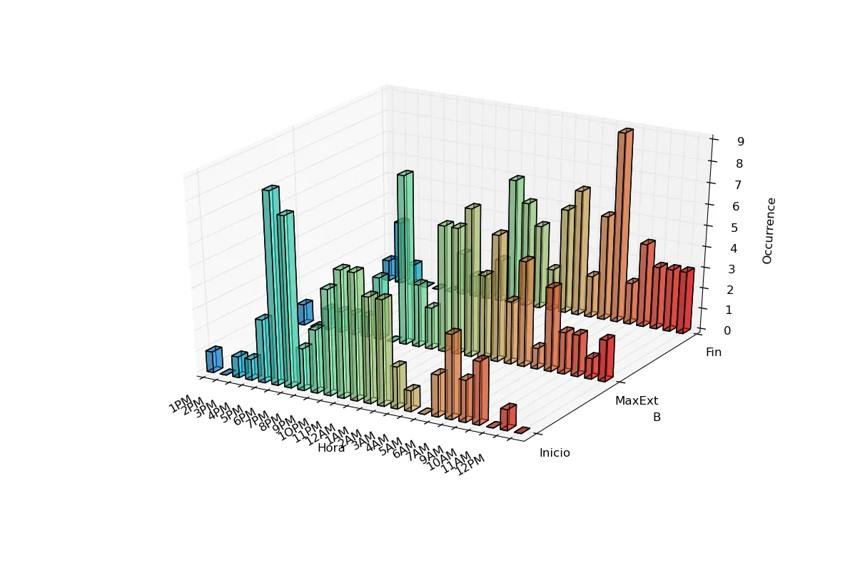
我如何绘制每列以不同颜色绘制的图表?也就是说,Inicio列的条形图为蓝色,MaxExt列的条形图为红色,Fin列的条形图为黄色。