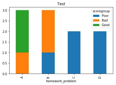
我正在尝试使用pandas/matplotlib制作学生作业问题的条形图。我可以轻松制作条形图,但我想根据学生的分数选择颜色。例如,我希望可以将得分<=50的设置为红色,将得分>50且<=75的设置为黄色等等。
以下是我目前的代码:
以下是我目前的代码:
import pandas as pd
import matplotlib.pyplot as plt
# make some arrays
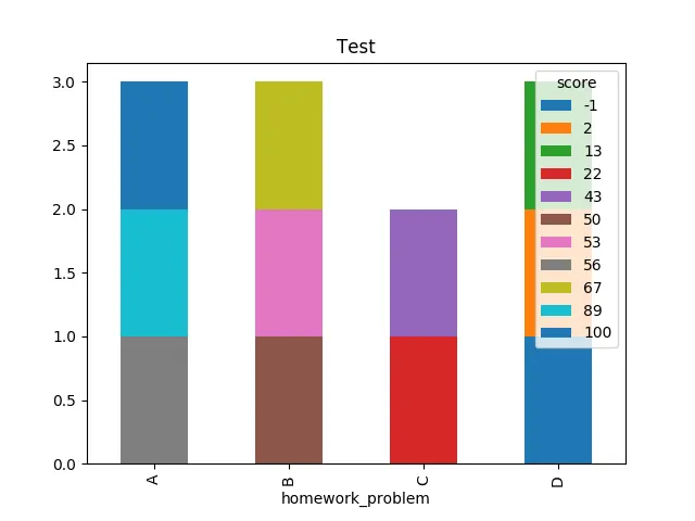
score = [100, 50, 43, 67, 89, 2, 13, 56, 22, -1, 53]
homework_problem = ['A', 'B', 'C', 'B', 'A', 'D', 'D', 'A', 'C', 'D', 'B']
topic = ['F', 'G', 'H', 'G', 'H', 'F', 'H', 'G', 'G', 'F', 'H']
# put the arrays into a pandas df
df = pd.DataFrame()
df['score'] = score
df['homework_problem'] = homework_problem
df['topic'] = topic
#make sure it looks okay
print(df)
# let's groupby and plot
df.groupby(['homework_problem','score'])['topic'].size().unstack().plot(kind='bar',stacked=True, title = "Test")
plt.show()
以下是输出下面的图表的代码: