有人知道如何在matplotlib中轻松实现3D条形图的颜色映射吗?
考虑this的例子,我该如何根据颜色映射更改每个条形的颜色?例如,短条应主要为蓝色,而较高的条形应从蓝色逐渐过渡到红色...
有人知道如何在matplotlib中轻松实现3D条形图的颜色映射吗?
考虑this的例子,我该如何根据颜色映射更改每个条形的颜色?例如,短条应主要为蓝色,而较高的条形应从蓝色逐渐过渡到红色...
xAmplitudes = np.random.exponential(10,10000) #your data here
yAmplitudes = np.random.normal(50,10,10000) #your other data here - must be same array length

x = np.array(xAmplitudes)   #turn x,y data into numpy arrays
y = np.array(yAmplitudes)   #useful for regular matplotlib arrays

fig = plt.figure()          #create a canvas, tell matplotlib it's 3d
ax = fig.add_subplot(111, projection='3d')

#make histogram stuff - set bins - I choose 20x20 because I have a lot of data
hist, xedges, yedges = np.histogram2d(x, y, bins=(20,20))
xpos, ypos = np.meshgrid(xedges[:-1]+xedges[1:], yedges[:-1]+yedges[1:])

xpos = xpos.flatten()/2.
ypos = ypos.flatten()/2.
zpos = np.zeros_like (xpos)

dx = xedges [1] - xedges [0]
dy = yedges [1] - yedges [0]
dz = hist.flatten()

cmap = cm.get_cmap('jet') # Get desired colormap - you can change this!
max_height = np.max(dz)   # get range of colorbars so we can normalize
min_height = np.min(dz)
# scale each z to [0,1], and get their rgb values
rgba = [cmap((k-min_height)/max_height) for k in dz]

ax.bar3d(xpos, ypos, zpos, dx, dy, dz, color=rgba, zsort='average')
plt.title("X vs. Y Amplitudes for ____ Data")
plt.xlabel("My X data source")
plt.ylabel("My Y data source")
plt.savefig("Your_title_goes_here")
plt.show()
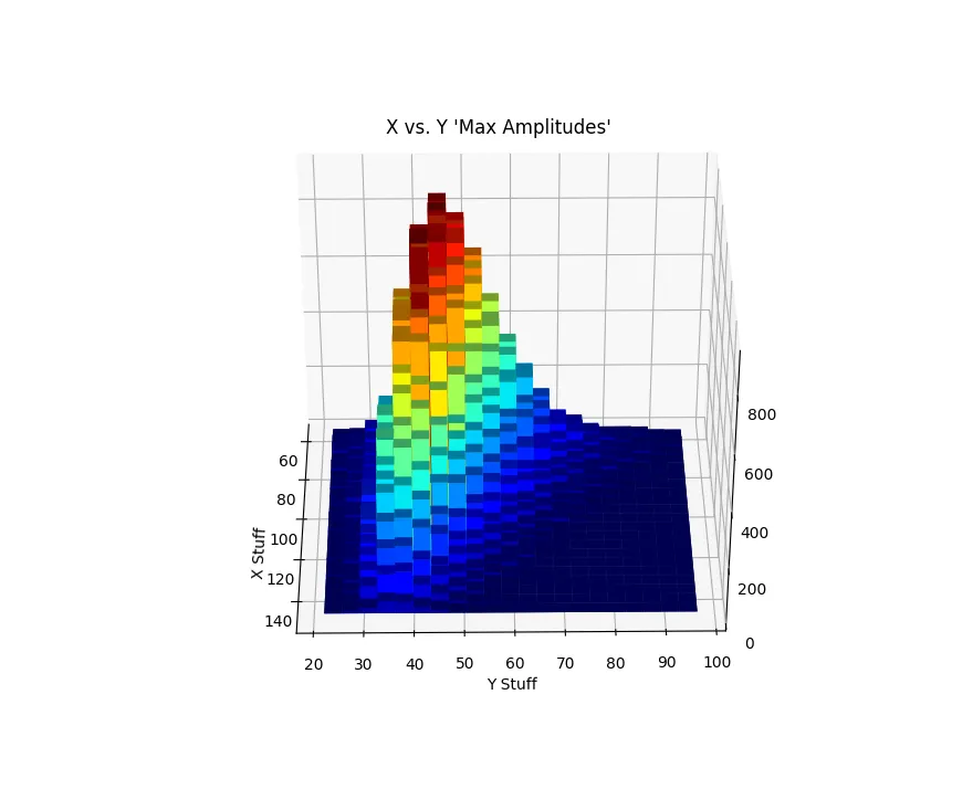
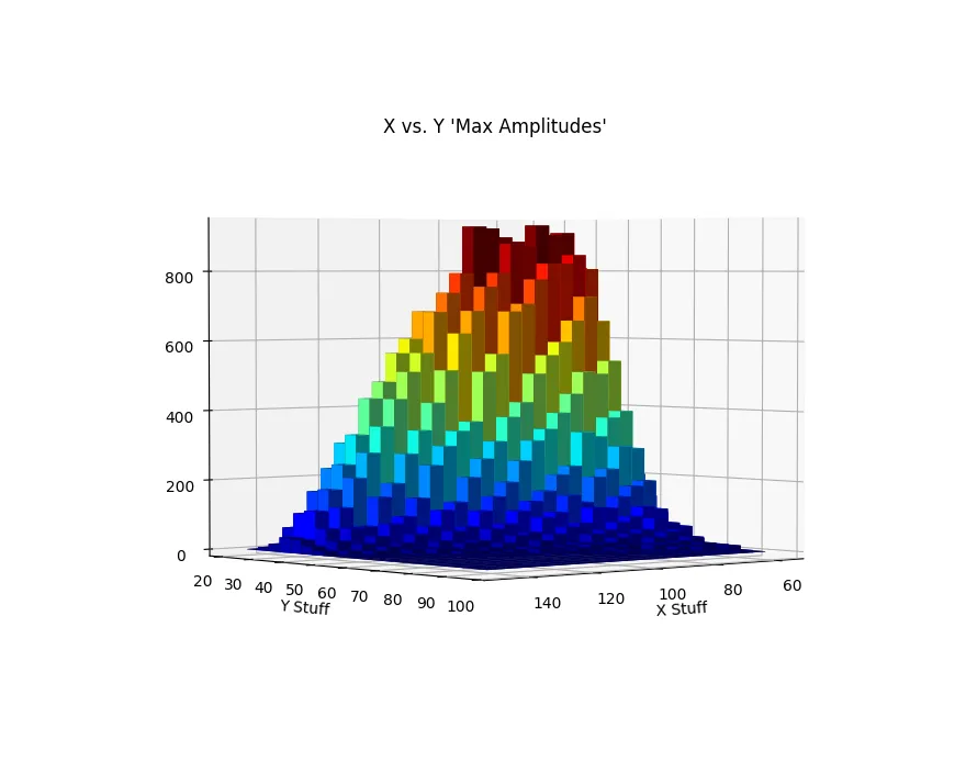
注意:结果将根据您选择的箱数和使用的数据量而异。此代码需要您插入一些数据或生成一个随机线性数组。下面是生成的图表,展示了两个不同的视角:
from mpl_toolkits.mplot3d import Axes3D
import matplotlib.pyplot as plt
import matplotlib.cm as cm           # import colormap stuff!
import numpy as np

fig = plt.figure()
ax = fig.add_subplot(111, projection='3d')
x, y = np.random.rand(2, 100) * 4
hist, xedges, yedges = np.histogram2d(x, y, bins=4, range=[[0, 4], [0, 4]])

# Construct arrays for the anchor positions of the 16 bars.
# Note: np.meshgrid gives arrays in (ny, nx) so we use 'F' to flatten xpos,
# ypos in column-major order. For numpy >= 1.7, we could instead call meshgrid
# with indexing='ij'.
xpos, ypos = np.meshgrid(xedges[:-1] + 0.25, yedges[:-1] + 0.25)
xpos = xpos.flatten('F')
ypos = ypos.flatten('F')
zpos = np.zeros_like(xpos)

# Construct arrays with the dimensions for the 16 bars.
dx = 0.5 * np.ones_like(zpos)
dy = dx.copy()
dz = hist.flatten()

cmap = cm.get_cmap('jet') # Get desired colormap
max_height = np.max(dz)   # get range of colorbars
min_height = np.min(dz)

# scale each z to [0,1], and get their rgb values
rgba = [cmap((k-min_height)/max_height) for k in dz]

ax.bar3d(xpos, ypos, zpos, dx, dy, dz, color=rgba, zsort='average')

plt.show()
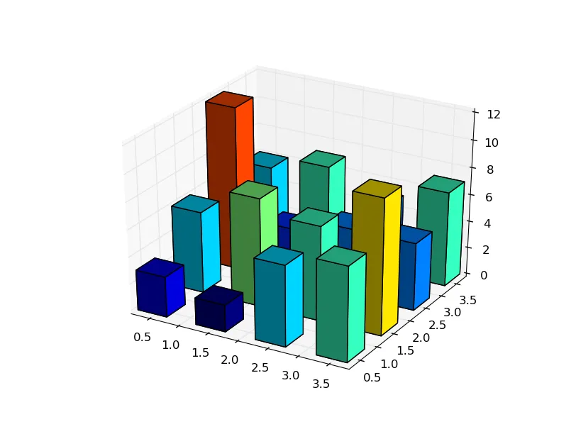
个人认为这看起来很丑!但是用一个连续的颜色映射可能不会太糟糕 - https://matplotlib.org/examples/color/colormaps_reference.html
import matplotlib.cm as cm。 - Yigit Alparslan