我正在使用Chart.js版本2.7.1,并在温度数据到达时动态更新我的折线图。问题是,每次我更新时,图表都会自动调整X轴右侧(最大时间)的比例尺,使我的数据永远不会接近图表的右侧。我希望线条能够接近右侧,并且每次更新时只扩展一个小的时间间隔到未来的X轴。我该如何实现这一点?下面是我的图表配置:
这里是图表: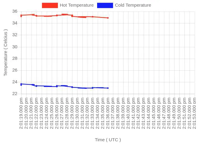
var ctx = document.getElementById('tempChart').getContext('2d');
ctx.canvas.width = 320;
ctx.canvas.height = 240;

var chart = new Chart(ctx, {
  type: 'line',
  data: {
      labels: [],
      legend: {
         display: true
      },
      datasets: [{
          fill: false,
          data: [],
          label: 'Hot Temperature',
          backgroundColor: "#FF2D00",
          borderColor: "#FF2D00",
          type: 'line',
          pointRadius: 1,
          lineTension: 2,
          borderWidth: 2
      },
      {
          fill: false,
          data: [],
          label: 'Cold Temperature',
          backgroundColor: "#0027FF",
          borderColor: "#0027FF",
          type: 'line',
          pointRadius: 1,
          lineTension: 2,
          borderWidth: 2
      }]
  },
  options: {
    animation: false,
    responsive: true,
    scales: {
      xAxes: [{
          scaleLabel: {
            display: true,
            labelString: 'Time ( UTC )'
          },
          type: 'time',
          time: {
            tooltipFormat: "hh:mm:ss",
            displayFormats: {
              hour: 'MMM D, hh:mm:ss'
            }
          },
          ticks: {
                    maxRotation: 90,
                    minRotation: 90
          }
      }],
      yAxes: [{
        scaleLabel: {
          display: true,
          labelString: 'Temperature ( Celcius )'
        },
      }]
    }
  }
});
这里是图表: