Chart.js v3.x时间序列X轴

6

我已经纠结了好几个小时,但是仍无法解决这个问题。

我试图创建一个(我以为简单的)线性图,x轴表示小时制时间,y轴表示浏览量。我尝试将x轴范围设置为从过去24小时到现在。

以下是我的代码。我错在哪里了?

<script src="https://cdnjs.cloudflare.com/ajax/libs/jquery/3.3.1/jquery.min.js"></script>
<script src="https://cdnjs.cloudflare.com/ajax/libs/Chart.js/2.7.3/Chart.bundle.min.js"></script>
<div style="width: 500px; height: 500px;"><canvas id="myChart" width="400" height="400"></canvas></div>
    
<script>
    var ctx = document.getElementById('myChart');
    var myChart = new Chart(ctx, {
        type: 'line',
        data: {
            labels: [],
            datasets: [{
                label: '# of Votes',
                data: [{x:'1619701200',y:41},{x:'1619704800',y:9},{x:'1619708400',y:21}]
            }]
        },
        options: {
        scales: {
            x: {
                type: 'time',
                min: Date.now() - (24 * 60 * 60 * 1000),
                max: Date.now()
            }
        }
    }
    });

    </script>

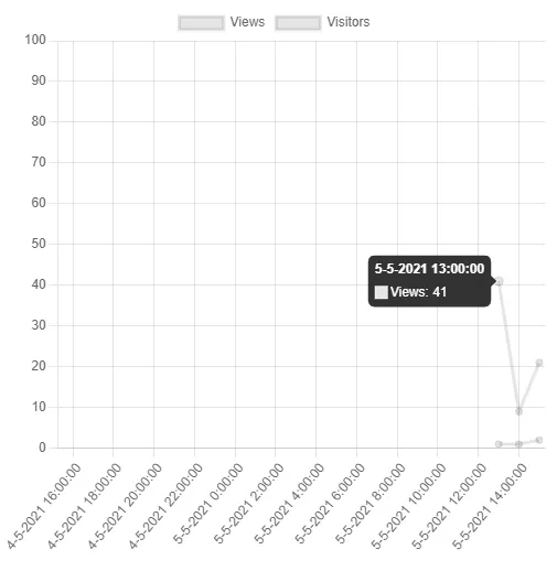
编辑:问题在于x轴不延伸到24小时之前的now()。此外,数据集中有3个值,但只显示了两个。您甚至可以将x值编辑为任何您想要的值,整个图形仍然保持不变。

编辑2:

能帮我把这个搞对吗?我已经粘贴了我的数据如下: 我想要实现的目标:

  1. X轴从现在开始到24小时前,间隔为1小时,以“d-m-Y H:00:00”的格式进行格式化。如果需要更改数据现在是自纪元以来的秒数,请告诉我!
  2. Y轴从0到数据集中的最大值
  3. 我需要包含哪些CDN?我发现chart.js、moments、adapters等文档非常不清楚,我在互联网上找到的一切都是针对之前的版本。

谢谢!!

<div style="width: 500px; height: 500px;"><canvas id="myChart" width="400" height="400"></canvas></div>
    <script>
        new Chart(document.getElementById("myChart"), {
        type: 'line',
        data: {
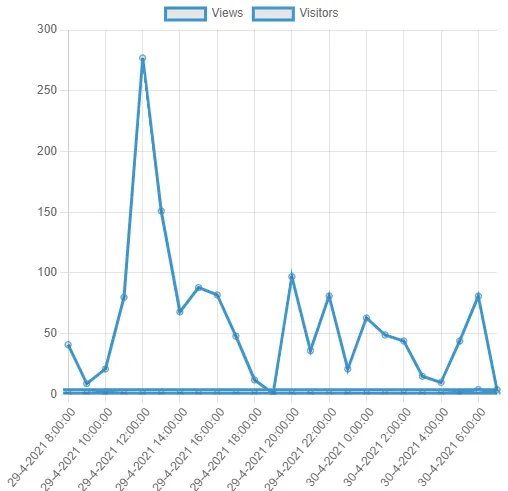
            labels: ['1619701200','1619704800','1619708400','1619715600','1619719200','1619722800','1619726400','1619730000','1619733600','1619737200','1619744400','1619773200','1619780400','1619784000','1619787600','1619791200','1619794800','1619798400','1619802000','1619809200','1619812800','1619816400','1619820000','1619823600','1619856000'],
            datasets: [{ 
                data: [41,9,21,80,277,151,68,88,82,48,12,1,97,36,81,21,63,49,44,15,10,44,81,4,9],
                label: "Views",
                borderColor: "#3e95cd",
                fill: false
            },
            { 
                data: [1,1,2,1,1,1,1,1,1,1,1,1,1,1,1,1,1,1,1,1,1,2,4,1,1],
                label: "Visitors",
                borderColor: "#3e95cd",
                fill: false
            }
            ]
        }
  </script>

我将你的代码复制/粘贴到https://jsfiddle.net中以创建一个[mcve],并且没有看到任何错误 - 请参见,你能否[编辑]你的问题并解释你面临的问题和期望的结果? - Marco Aurelio Fernandez Reyes
2个回答

6
我们希望你保持头发 :-)
尝试以下 2 个选项 来获取最新版本的 Chart.js Chart.js v3.2.1(与 v2.xx 不兼容)

选项1:

<script src="https://cdn.jsdelivr.net/npm/chart.js"></script>
   // gets you the latest version of Chart.js, now at v3.2.1

<script src="https://cdnjs.cloudflare.com/ajax/libs/moment.js/2.29.1/moment.min.js"></script>
<script src="https://cdn.jsdelivr.net/npm/chartjs-adapter-moment"></script>
   // You need moment.js and adapter for time or timeseries to work at x-Axis


<div style="width: 500px; height: 500px">
  <canvas id="myChart" width="400" height="400"></canvas>
</div>


<script>
const startDate = new Date(1619701200*1000);
    // first label from your data, times 1000 to get milliseconds,
    // for last 24 hours from now, see further down below

const myLabels = [];
let nextHour = startDate;

let i = 0; // tip: declare i outside for-loop for better performance

for (i; i < 24; i++) {
  nextHour = new Date((1619701200 + (i*3600)) *1000);
  myLabels.push(nextHour);
};

const ctx = document.querySelector('canvas').getContext('2d');

const myChart3x = new Chart(ctx, {
    type: 'line',
    data: {
        labels: myLabels,
        datasets: [{
          data: [41,9,21,80,277,151,68,88,82,48,12,1,97,36,81,21,63,49,44,15,10,44,81,4,9],
          label: "Views",
          borderColor: "#3e95cd",
          fill: false
        },
        {
          data: [1,1,2,1,1,1,1,1,1,1,1,1,1,1,1,1,1,1,1,1,1,2,4,1,1],
          label: "Visitors",
          borderColor: "#3e95cd",
          fill: false
        }
        ]
    },
    options: {
      scales: {
        x: {
          type: 'timeseries',
          time: {
            unit: 'hour',  // <-- that does the trick here
            displayFormats: {
              hour: 'D-M-Y H:00:00'
            },
            tooltipFormat: 'D-M-Y H:00:00'  // <-- same format for tooltip
          }
        },
        y: {
          min: 0
        }
      }
    }
  });

</script>


这是您的图表预览: enter image description here 如果您想要动态计算从现在开始的最近24小时,我建议使用moment.js代替:
<script>
   // ...

const startDate = moment().subtract(1, 'd');

const myLabels = [];
let nextHour = startDate;
let i = 0;

for (i; i < 24; i++) {
  nextHour = moment().add(i, 'h');
  myLabels.push(nextHour);
}; 

   // ....
</script>

另外,请注意,moment.js 使用略有不同的格式字符串:

'D-M-Y H:00:00' 而非 'd-m-Y H:00:00'

选项 2:

如果您的数据以JSON 格式存在

data: [{x:1620237600000,y:41},{x:1620241200000,y:9},{x:1620244800000,y:21}]

就像顶部的第一个代码片段一样,在 x 轴上使用 minmax:(优点:您无需为 x 轴定义标签数组)

<script>

const ctx = document.querySelector("canvas").getContext("2d");

var myChart = new Chart(ctx, {
  type: "line",
  data: {
    datasets: [{
      label: "Views",
      data: [{x:1620237600000,y:41},{x:1620241200000,y:9},{x:1620244800000,y:21}]
      // x-value without quotes (has to be a number) 
      // and multiply by 1000 to get milliseconds
    },
    {
      label: "Visitors",
      data: [{x:1620237600000,y:1},{x:1620241200000,y:1},{x:1620244800000,y:2}]
    }]
  },
  options: {
    scales: {
      x: {
        type: "time",  // <-- "time" instead of "timeseries"
        min: Date.now() - (24 * 60 * 60 * 1000),
        max: Date.now(),
        time: {
          unit: "hour",  // <-- that does the trick here
          displayFormats: {
            hour: "D-M-Y H:00:00"
          },
          tooltipFormat: "D-M-Y H:00:00"// <-- same format for tooltip
        }
      },
      y: {
        min: 0,
        max: 100
      }
    }
  }
});
</script>

您应该获得以下内容:

输入图像描述

希望我正确理解了您的需求,希望这能帮到您。

1
你真是太棒了!!非常感谢你。 - B. Smit
1
@B.Smit 谢谢您的好评 - 我很高兴它解决了您的问题。您在解释问题、添加编辑等方面付出了很大的努力,因此您应该得到同样的回答努力。 - Jürgen Fink

1

它需要更多的设置,我已经搜索并尝试了一些方法- 感谢这个jsfiddle - ,这是结果。

查看 更新的可用 jsfiddle:

/*
        Source: https://jsfiddle.net/microMerlin/3wfoL7jc/
*/

var ctx = document.getElementById('myChart');
var myChart = new Chart(ctx, {
  type: 'line',
  data: {
    datasets: [{
      label: '# of Votes',
      data: [{
        x: '1619701200',
        y: 41
      }, {
        x: '1619704800',
        y: 9
      }, {
        x: '1619708400',
        y: 21
      }]
    }]
  },
  options: {
    responsive: true,
    scales: {
      xAxes: [{
        min: Date.now() - (24 * 60 * 60 * 1000),
        max: Date.now(),
        type: "linear",
        position: "bottom",
        //stacked: true,
        ticks: {
          //beginAtZero: true,
          userCallback: function(t, i) {
            /*console.log("t: " + t.toString());
            console.log("i: " + i.toString());*/
            return i;
          }
        }
      }]
    }
  }
});
<script src="https://cdnjs.cloudflare.com/ajax/libs/Chart.js/2.7.3/Chart.bundle.min.js"></script>
<script src="https://cdnjs.cloudflare.com/ajax/libs/jquery/3.3.1/jquery.min.js"></script>
<div style="width: 500px; height: 500px;"><canvas id="myChart" width="400" height="400"></canvas></div>


网页内容由stack overflow 提供, 点击上面的
可以查看英文原文,
原文链接