如何在不同类型的子图之间同步颜色

12

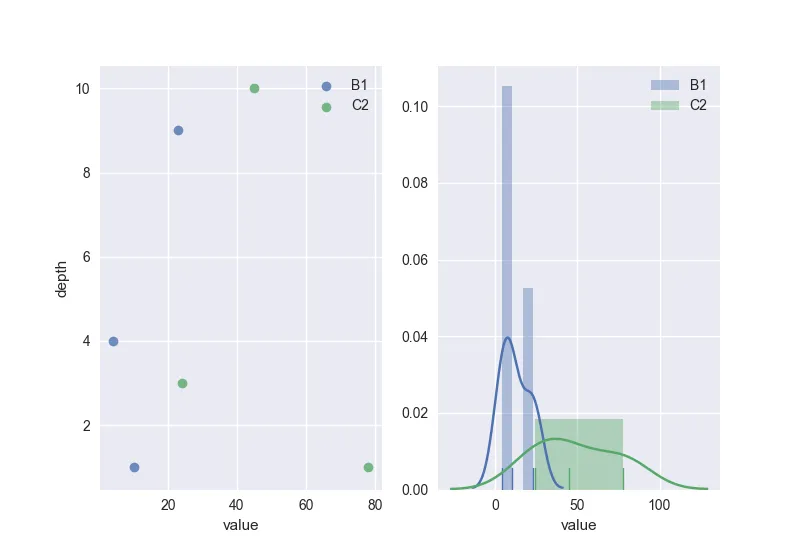
我正在尝试创建一个包含两个图表的子图。第一个图表基本上是一个散点图(我正在使用regplot),而第二个图表是一个直方图。

我的代码如下:

import pandas as pd
import matplotlib.pyplot as plt
import seaborn as sns

data = {'source':['B1','B1','B1','C2','C2','C2'],
        'depth':[1,4,9,1,3,10],
        'value':[10,4,23,78,24,45]}

df = pd.DataFrame(data)

f, (ax1, ax2) = plt.subplots(1,2)

for source in df['source'].unique():
    
    x = df.loc[df['source'] == source, 'value']
    y = df.loc[df['source'] == source, 'depth']
    
    sns.regplot(x,
                y,
                scatter = True,
                fit_reg = False,
                label = source,
                ax = ax1)
    ax1.legend()
    
    sns.distplot(x,
                 bins = 'auto',
                 norm_hist =True,
                 kde = True,
                 rug = True,
                 ax = ax2,
                 label = source)
    ax2.legend()
    ax2.relim()
    ax2.autoscale_view()
plt.show()

结果如下所示。

enter image description here

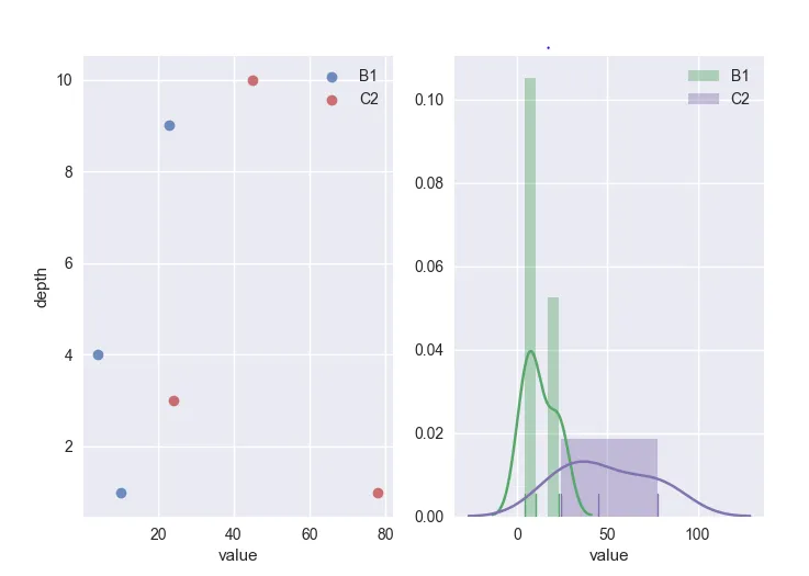
正如您所看到的,散点图和直方图之间的颜色是不同的。我已经尝试了调整颜色板等方法,但都没有成功。有谁能够提供一些帮助,告诉我如何同步这些颜色呢?

3个回答

7

使用绘图函数的color参数。在此示例中,使用当前seaborn颜色调色板中的颜色,在您的for循环中使用itertools.cycle选择一个一个地进行绘制:

import pandas as pd 
import matplotlib.pyplot as plt 
import seaborn as sns 
import itertools
    
data = {'source':['B1','B1','B1','C2','C2','C2'],
        'depth':[1,4,9,1,3,10],
        'value':[10,4,23,78,24,45]}

df = pd.DataFrame(data)

f, (ax1, ax2) = plt.subplots(1,2)

# set palette 
palette = itertools.cycle(sns.color_palette())

# plotting 
for source in df['source'].unique():

    x = df.loc[df['source'] == source, 'value']
    y = df.loc[df['source'] == source, 'depth']

    # color
    c = next(palette)
    sns.regplot(x,
                y,
                scatter = True,
                fit_reg = False,
                label = source,
                ax = ax1,
                color=c)
    ax1.legend()

    sns.distplot(x,
                 bins = 'auto',
                 norm_hist =True,
                 kde = True,
                 rug = True,
                 ax = ax2,
                 label = source,
                 color=c)
    ax2.legend()
    ax2.relim()
    ax2.autoscale_view()

plt.show()

enter image description here

你可以像这个回答中一样设置自己的颜色板,保留HTML标记。

太好了。非常感谢你的回答。 - BillyJo_rambler

2
利用 hue_order 参数。
从 seaborn 文档中可知: seaborn.countplot(*, x=None, y=None, hue=None, data=None, **order=None, hue_order=None,** orient=None, color=None, palette=None, saturation=0.75, dodge=True, ax=None, **kwargs) orderhue_order:字符串列表,可选项 按顺序绘制分类级别,否则级别将从数据对象中推断出来。
hue_order = target_0['CODE_GENDER'].unique()

plt.subplot(2,2,1)
sns.countplot(x='INCOME_BRACKET', hue='GENDER',data = df_0,hue_order=hue_order,palette = 'mako')
plt.title("Non-defaulters : Income bracket b/w Gender - Target 0");

plt.subplot(2,2,2)
sns.countplot(x='INCOME_BRACKET', hue='GENDER',data = df_1,hue_order=hue_order,palette = 'mako')
plt.title("Defaulters : >Income bracket b/w Gender - Target 1");

如下所示的输出:

同步颜色的两个子图

我知道这是一个老问题。然而,这很简单(不确定以前是否有此选项),我在其他答案中找不到这个选项,而且这些答案由于某种原因也无法工作。因此,这个答案是为了帮助仍在苦苦挣扎的其他人。


1
我遇到了非常相似的问题。
以下是对Serenity答案的替代方案(与原始代码相关的新部分已突出显示):
import pandas as pd
import matplotlib.pyplot as plt
import seaborn as sns

data = {'source':['B1','B1','B1','C2','C2','C2'],
        'depth':[1,4,9,1,3,10],
        'value':[10,4,23,78,24,45]}

df = pd.DataFrame(data)

f, (ax1, ax2) = plt.subplots(1,2)
palette = sns.color_palette()
for color,source in zip(palette,df['source'].unique()):
      x = df.loc[df['source'] == source, 'value']
      y = df.loc[df['source'] == source, 'depth']

      sns.regplot(x,
                  y,
                  scatter = True,
                  fit_reg = False,
                  label = source,
                  ax = ax1,
                color=color)
      ax1.legend()

      sns.distplot(x,
                   bins = 'auto',
                   norm_hist =True,
                   kde = True,
                   rug = True,
                   ax = ax2,
                   label = source,
                 color=color)
      ax2.legend()
      ax2.relim()
      ax2.autoscale_view()
plt.show()

基本上,使用 sns.color_palette() 获取 matplotlib 正在使用的颜色列表。
循环遍历 zip() 后的一对 (color, source) 列表,其中 color 在由 sns.color_palette() 返回的列表中,并将 color 作为参数指定在调用 sns.xxxplot() 中。

网页内容由stack overflow 提供, 点击上面的
可以查看英文原文,
原文链接