子图之间的箭头

3

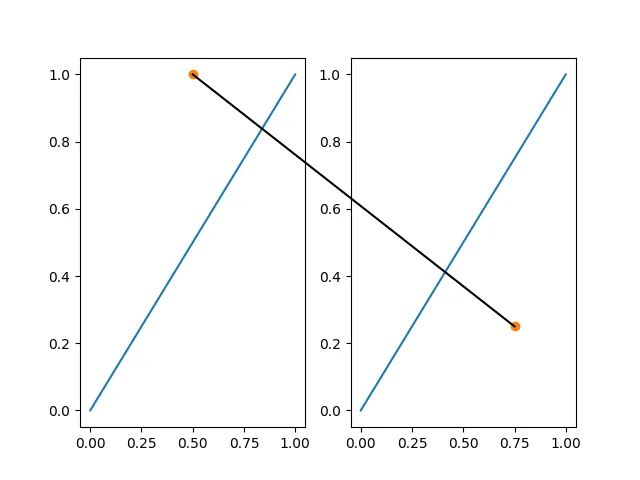
我决定玩一下this的示例代码。我成功地找到了如何在两个子图之间绘制一条直线,即使该线超出了其中一个子图的边界。

import matplotlib.pyplot as plt
import matplotlib as mpl
import numpy as np

fig = plt.figure(figsize=(10, 5))
ax1 = fig.add_subplot(121)
ax2 = fig.add_subplot(122)
axs = [ax1, ax2]

# Fixing random state for reproducibility
np.random.seed(19680801)

# generate some random test data
all_data = [np.random.normal(0, std, 100) for std in range(6, 10)]

# plot violin plot
axs[0].violinplot(all_data,
                  showmeans=False,
                  showmedians=True)
axs[0].set_title('Violin plot')

# plot box plot
axs[1].boxplot(all_data)
axs[1].set_title('Box plot')

# adding horizontal grid lines
for ax in axs:
    ax.yaxis.grid(True)
    ax.set_xticks([y + 1 for y in range(len(all_data))])
    ax.set_xlabel('Four separate samples')
    ax.set_ylabel('Observed values')

for tick in ax.xaxis.get_major_ticks():
    tick.label.set_fontsize(20)
plt.setp(axs[0], xticklabels=['x1', 'x2', 'x3', 'x4'])

transFigure = fig.transFigure.inverted()
coord1 = transFigure.transform(ax1.transData.transform([5,10]))
coord2 = transFigure.transform(ax2.transData.transform([2,-10]))
line = mpl.lines.Line2D((coord1[0],coord2[0]),(coord1[1],coord2[1]),
                        c='k', lw=5, transform=fig.transFigure)
fig.lines.append(line)

是的,那条添加的线很丑,但我只想让它起到功能。

不过,我真正想做的是在子图之间制作一个箭头,但我无法弄清楚如何做到这一点,而不需要自己弄出箭头。有没有一种方法可以使用matplotlib.pyplot.arrow类来实现这一点呢?
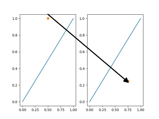
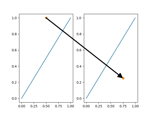
1个回答

6

我也想在两个子图之间画一个箭头,但我甚至不知道从哪里开始!然而,在原问题中的子图之间线条示例为我提供了足够的线索来开始...

首先,我将原问题中的代码缩减到最小工作示例:

from matplotlib import lines, pyplot as plt

fig = plt.figure()

# First subplot
ax1 = fig.add_subplot(121)
plt.plot([0, 1], [0, 1])

# Second subplot
ax2 = fig.add_subplot(122)
plt.plot([0, 1], [0, 1])

# Add line from one subplot to the other
xyA = [0.5, 1.0]
ax1.plot(*xyA, "o")
xyB = [0.75, 0.25]
ax2.plot(*xyB, "o")
transFigure = fig.transFigure.inverted()
coord1 = transFigure.transform(ax1.transData.transform(xyA))
coord2 = transFigure.transform(ax2.transData.transform(xyB))
line = lines.Line2D(
    (coord1[0], coord2[0]),  # xdata
    (coord1[1], coord2[1]),  # ydata
    transform=fig.transFigure,
    color="black",
)
fig.lines.append(line)

# Show figure
plt.show()

这将产生以下输出:

Line between subplots

然后,使用这篇博客文章,我认为答案是创建一个matplotlib.patches.FancyArrowPatch并将其附加到fig.patches(而不是创建一个matplotlib.lines.Line2D并将其附加到fig.lines)。在查阅了matplotlib.patches.FancyArrowPatch文档,以及一些试错之后,我得出了一个在matplotlib 3.1.2中有效的解决方案:

from matplotlib import patches, pyplot as plt

fig = plt.figure()

# First subplot
ax1 = fig.add_subplot(121)
plt.plot([0, 1], [0, 1])

# Second subplot
ax2 = fig.add_subplot(122)
plt.plot([0, 1], [0, 1])

# Add line from one subplot to the other
xyA = [0.5, 1.0]
ax1.plot(*xyA, "o")
xyB = [0.75, 0.25]
ax2.plot(*xyB, "o")
transFigure = fig.transFigure.inverted()
coord1 = transFigure.transform(ax1.transData.transform(xyA))
coord2 = transFigure.transform(ax2.transData.transform(xyB))
arrow = patches.FancyArrowPatch(
    coord1,  # posA
    coord2,  # posB
    shrinkA=0,  # so tail is exactly on posA (default shrink is 2)
    shrinkB=0,  # so head is exactly on posB (default shrink is 2)
    transform=fig.transFigure,
    color="black",
    arrowstyle="-|>",  # "normal" arrow
    mutation_scale=30,  # controls arrow head size
    linewidth=3,
)
fig.patches.append(arrow)

# Show figure
plt.show()

然而,根据下面的评论,在matplotlib 3.4.2中这种方法不起作用,你会得到以下结果:

Arrow between subplots - incorrect

请注意,箭头的端点没有与目标点(橙色圆圈)对齐,它们应该对齐。
此版本更改也导致原始线条示例以相同方式失败。
然而,有一个更好的修补程序!使用ConnectionPatch(docs),它是FancyArrowPatch的子类,而不是直接使用FancyArrowPatch作为ConnectionPatch是专门为此用例设计的,并且更正确地处理变换,如在此matplotlib documentation example中所示。
fig = plt.figure()

# First subplot
ax1 = fig.add_subplot(121)
plt.plot([0, 1], [0, 1]) 

# Second subplot
ax2 = fig.add_subplot(122)
plt.plot([0, 1], [0, 1]) 

# Add line from one subplot to the other
xyA = [0.5, 1.0]
ax1.plot(*xyA, "o")
xyB = [0.75, 0.25]
ax2.plot(*xyB, "o")
# ConnectionPatch handles the transform internally so no need to get fig.transFigure
arrow = patches.ConnectionPatch(
    xyA,
    xyB,
    coordsA=ax1.transData,
    coordsB=ax2.transData,
    # Default shrink parameter is 0 so can be omitted
    color="black",
    arrowstyle="-|>",  # "normal" arrow
    mutation_scale=30,  # controls arrow head size
    linewidth=3,
)
fig.patches.append(arrow)

# Show figure
plt.show()

这将在matplotlib 3.1.2matplotlib 3.4.2中产生正确的输出,如下所示:

enter image description here

要在matplotlib 3.4.2中绘制正确位置的跨越两个子图的连接线,请使用一个ConnectionPatch,但是使用arrowstyle="-"(即没有箭头,只有一条线)。
注意:您不能使用:
  • plt.arrow,因为它会自动添加到当前轴中,所以只会出现在一个子图中。

  • matplotlib.patches.Arrow,因为轴-图形转换会使箭头变形。

  • matplotlib.patches.FancyArrow,因为这也会导致箭头变形。


它很接近了,但是对于我来说,箭头的头和尾比我用 coord1coord2 设置的位置要高一点。有没有办法让这些 y 坐标精确呢? - Forklift17
是的。使用matplotlib.patches.FancyArrowPatch参数shrinkA=0(尾部)和shrinkB=0(头部)。默认值出于某种原因为2。回答已相应编辑。 - Biggsy
“shrink”参数对我似乎没有任何作用。我想知道这是否与我的图形后端Gt5有关。我尝试将其更改为自动,但没有效果。明确一点,箭头的只有y1(在尾部),而不是x1、x2或y2太高。 - Forklift17
这是你自己的小提琴图示例还是我发布的最小工作示例?你能标记预期点以查看它有多远(例如,start = [0.5, 1.0]; ax1.plot(*start, marker="x"); end = [0.75, 0.25]; ax2.plot(*end, marker="x"); coord1 = transFigure.transform(ax1.transData.transform(start)); coord2 = transFigure.transform(ax2.transData.transform(end))),并上传输出图像吗? - Biggsy
我刚刚运行了它。不确定如何在评论中上传图片,但是“x”标记正好位于它们应该在的位置(0.5,1)和(0.75,0.25)。我尝试使用Spyder中的每个可用后端,在更改后端后每次重新启动控制台。箭头仍然没有显示在正确的坐标上。 - Forklift17
1
啊,我现在明白了!Matplotlib存在一些问题。在Python 3.8.5和Matplotlib 3.1.2下,图像是正确的,就像上面那样。但是,在Matplotlib 3.4.2下,箭头位置是错误的。然而,还有一个更好的解决方法!使用ConnectionPatch(文档:https://v.ht/A2V3),它是FancyArrowPatch的子类,而不是直接使用FancyArrowPatch,因为ConnectionPatch专门为这种情况设计,并更正确地处理变换(例如:https://v.ht/ZMTh)。在发布此评论后,我将相应地更新答案。 - Biggsy

网页内容由stack overflow 提供, 点击上面的
可以查看英文原文,
原文链接