我是新手,想要通过ggplot来为我的数据集制作可视化图表。以下是我的目前代码:
#create plot
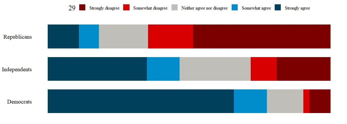
plot <- ggplot(newDoto, aes(y = pid3lean, weight = weight, fill = factor(Q29_1String, levels = c("Strongly disagree","Somewhat disagree", "Neither agree nor disagree", "Somewhat agree", "Strongly agree")))) + geom_bar(position = "fill", width = .732)
#fix colors
plot <- plot + scale_fill_manual(values = c("Strongly disagree" = "#7D0000", "Somewhat disagree" = "#D70000","Neither agree nor disagree" = "#C0BEB8", "Somewhat agree" = "#008DCA", "Strongly agree" = "#00405B"))
#fix grid
plot <- plot + guides(fill=guide_legend(title="29")) + theme_bw() + theme(panel.grid.major = element_blank(), panel.grid.minor = element_blank()) + theme(panel.border = element_blank()) + theme(axis.ticks = element_blank()) + theme(axis.title.y=element_blank()) + theme(axis.title.x=element_blank()) + theme(axis.text.x=element_blank()) + theme(text=element_text(size=19, family="serif")) + theme(axis.text.y = element_text(color="black")) + theme(legend.position = "top") + theme(legend.text=element_text(size=12))
#plot graph
plot
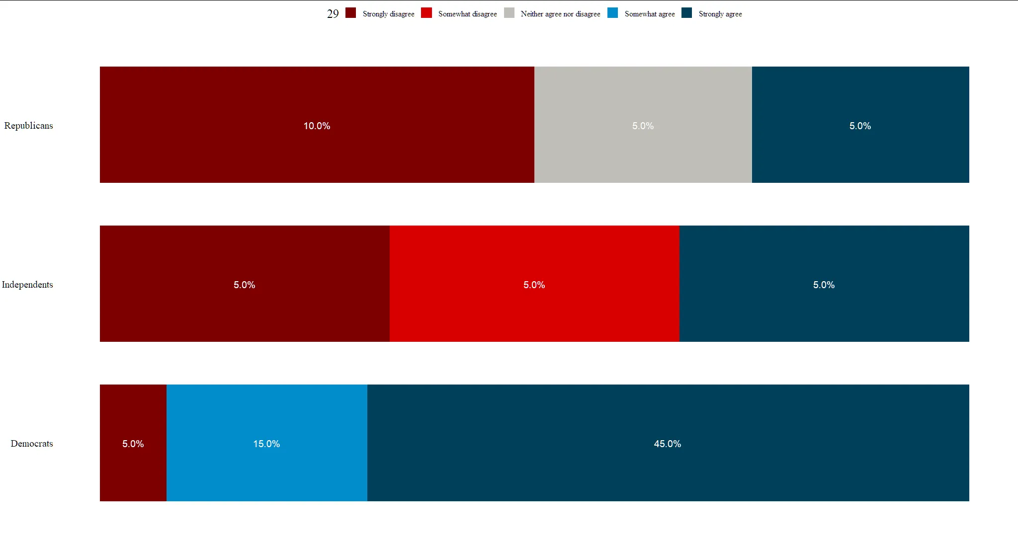
这将创建此条形图:
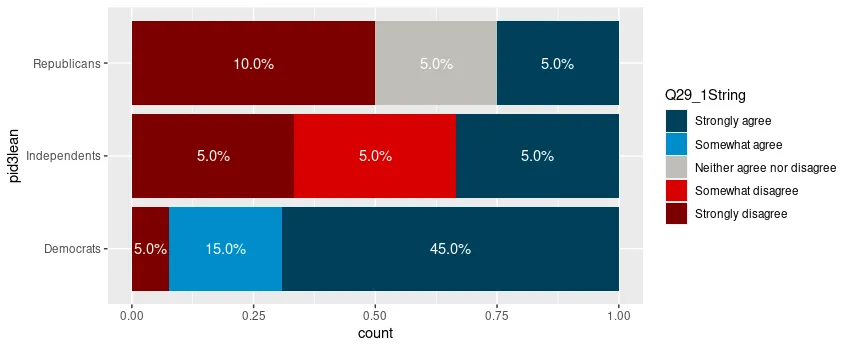
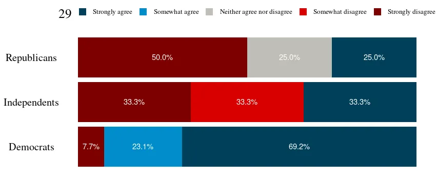
 目前,我遇到的问题是尝试在这些条形上添加百分比标签。我想添加显示每个部分百分比的文本,居中且为白色字体。
不幸的是,我一直在尝试添加geom_text,但它经常因为我没有x变量而导致错误,我不知道如何修复它,因为我使用fill的方式有点奇怪,与其他使用x和y变量的方式相比。考虑到填充是每种响应类型的百分比(不同的响应类型在级别中显示),我甚至不知道要添加什么x变量。
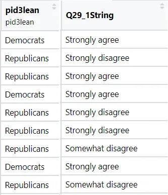
如果数据集很重要,我很乐意回答任何关于数据集的问题。以下是两个相关列的示例,看起来像什么(没有使用head,因为数据集中有很多变量)。基本上,它们显示了受访者属于哪个政党以及他们是否强烈同意、有点同意等。
 以下是两个变量的dput输出的结果:
structure(list(pid3lean = structure(c("Democrats", "Democrats",
"Democrats", "Democrats", "Independents", "Democrats", "Republicans",
"Independents", "Republicans", "Democrats", "Democrats", "Independents",
"Democrats", "Republicans", "Democrats", "Democrats", "Democrats",
"Democrats", "Democrats", "Republicans"), label = "pid3lean", format.spss = "A13", display_width = 15L),
    Q29_1String = structure(c(1L, 1L, 2L, 2L, 1L, 1L, 5L, 4L,
    1L, 1L, 2L, 5L, 1L, 5L, 1L, 1L, 1L, 5L, 1L, 3L), .Label = c("Strongly agree",
    "Somewhat agree", "Neither agree nor disagree", "Somewhat disagree",
    "Strongly disagree"), class = "factor")), row.names = c(NA,
-20L), class = c("tbl_df", "tbl", "data.frame"))

dput(newDoto)的输出结果。如果太大,请使用dput(head(newDoto, 20))的输出结果。 - Rui Barradasdput添加数据以重新创建问题。 - Vishal A.dput(newDoto[1:20, c("pid3lean", "Q29_1String")]。 - Rui Barradas