我对R还很陌生,所以请原谅。我正在尝试使用ggplot2制作甜甜圈图。 我修改了ggplot Donut chart的代码,但现在我无法在图表上添加百分比。 这是我的尝试:
library(ggplot2)
blank_theme <- theme_minimal()+
theme(
axis.title.x = element_blank(),
axis.title.y = element_blank(),
panel.border = element_blank(),
panel.grid=element_blank(),
axis.ticks = element_blank(),
plot.title=element_text(size=14, face="bold")
)
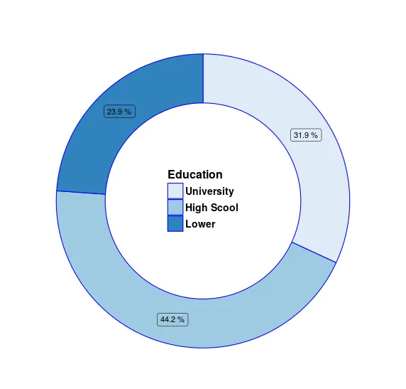
dat = data.frame(count=c(319, 442, 239), category=c("University", "High Scool", "Lower"))
dat$fraction = dat$count / sum(dat$count)
dat$ymax = cumsum(dat$fraction)
dat$ymin = c(0, head(dat$ymax, n=-1))
dat$category <- factor(dat$category, levels = c("University", "High Scool", "Lower"))
p1 = ggplot(dat, aes(fill=category, ymax=ymax, ymin=ymin, xmax=4, xmin=3)) +
geom_rect(color='blue') +
coord_polar(theta="y") +
xlim(c(1, 4))
edu<-p1 + scale_fill_brewer("Education") + blank_theme +
theme(axis.text.x=element_blank()) + theme(legend.position=c(.5, .5)) + ggtitle("") +
theme(panel.grid=element_blank()) +
theme(axis.text=element_blank()) +
theme(axis.ticks=element_blank()) +
theme(legend.title = element_text(size=16, face="bold")) +
theme(legend.text = element_text(size = 14, face = "bold"))
edu
我尝试了很多geom_text和scale_y_continuous的代码,但是......什么都没发生。 有人可以帮帮我吗? 谢谢
geom_label中添加size=8或更大的字体大小(但不要放在aes内部)。 - scoa+ scale_fill_discrete()并查看其帮助以选择颜色。 - scoa