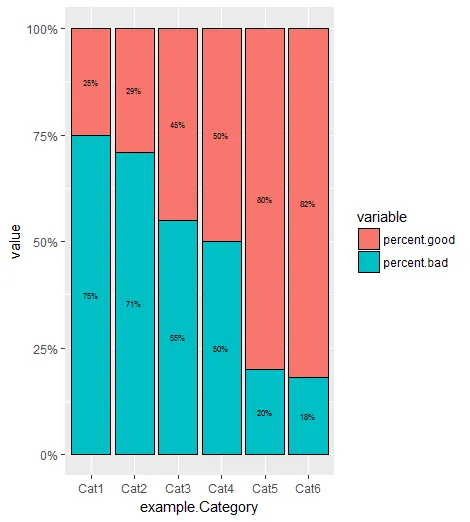
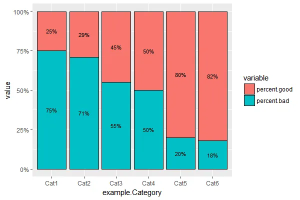
我在R中成功制作了一个堆积条形图,其中百分比加起来为100%,针对多个不同的类别。我在此处制作了一个示例数据框。
example.Category<- c("Cat1","Cat2","Cat3","Cat4","Cat5","Cat6")
percent.good <- c(.25,.29,.45,.5,.8,.82)
example.data <- data.frame(example.Category,percent.good)
example.data$percent.bad <- (1-example.data$percent.good)
数据框的形式如下。
     example.Category percent.good percent.bad
1             Cat1         0.25        0.75
2             Cat2         0.29        0.71
3             Cat3         0.45        0.55
4             Cat4         0.50        0.50
5             Cat5         0.80        0.20
6             Cat6         0.82        0.18
接下来,我使用了reshape包中的melt函数以获取如下结果...
example.melt <- melt(example.data, id.vars="example.Category")

   example.Category     variable value
1              Cat1 percent.good  0.25
2              Cat2 percent.good  0.29
3              Cat3 percent.good  0.45
4              Cat4 percent.good  0.50
5              Cat5 percent.good  0.80
6              Cat6 percent.good  0.82
7              Cat1  percent.bad  0.75
8              Cat2  percent.bad  0.71
9              Cat3  percent.bad  0.55
10             Cat4  percent.bad  0.50
11             Cat5  percent.bad  0.20
12             Cat6  percent.bad  0.18
然后我使用ggplot制作了一个堆叠条形图,显示这些百分比。
ggplot(example.melt, aes(x=example.Category, y=value, fill = variable)) +
  geom_bar(position = "fill", stat = "identity",color='black',width=0.9) +
  scale_y_continuous(labels = scales::percent) +
  geom_text(aes(label = paste0((example.data$percent.good && example.data$percent.bad)*100), '%'),position = position_dodge(width = .9),size = 3)
这产生了这张图表,这正是我想要的,除了标签的方式。
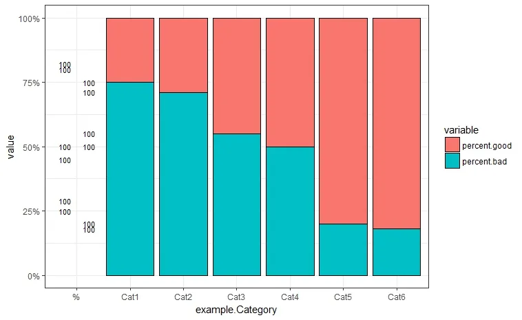 我想做的是为每个堆叠条上的每种颜色都有百分比标签,但我不知道该如何做,也确定自己没有做对。我唯一做到的就是一些 “100” 的东西。如何在这个图表上让每个部分的百分比标签出现呢?
希望这不是多余的或以前问过的问题。谢谢。
annotate()方法,但我不确定那是否符合你的需求,而且它有点棘手... - RobertMyles