我卡在了使用ggplot2创建图表上。我正在尝试创建一个带有百分比的堆积条形图,类似于这个页面上的图表,但我无法在条形中添加百分比标签:How to draw stacked bars in ggplot2 that show percentages based on group?
我找到的所有答案都尝试添加百分比标签,类似于以下代码:
geom_text(aes(label = label), position = position_stack(vjust = 0.5), size = 2)
但是对我来说不起作用。
我的数据如下:
我的图表没有显示百分比,长这样: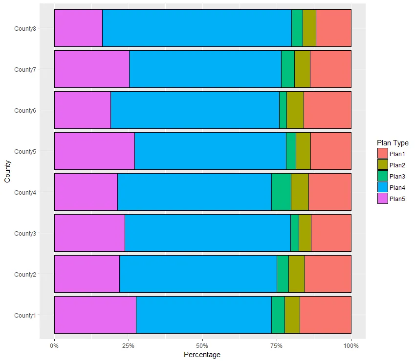 代码:
代码:
在使用上述的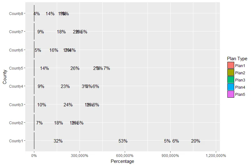 。
。
代码:
任何建议?任何意见/指导都将不胜感激!谢谢!
geom_text(aes(label = label), position = position_stack(vjust = 0.5), size = 2)
但是对我来说不起作用。
我的数据如下:
County  Group   Plan1   Plan2   Plan3   Plan4   Plan5   Total
County1 Group1  2019    597 513 5342    3220    11691
County2 Group1  521 182 130 1771    731 3335
County3 Group1  592 180 126 2448    1044    4390
County4 Group1  630 266 284 2298    937 4415
County5 Group1  708 258 171 2640    1404    5181
County6 Group1  443 159 71  1580    528 2781
County7 Group1  492 187 157 1823    900 3559
County8 Group1  261 101 84  1418    357 2221
我的图表没有显示百分比,长这样:
代码:melt(df[df$Group=="Group1",],measure.vars = c("Plan1","Plan2","Plan3","Plan4", "Plan5"),variable.name = "Counties",value.name = "value") %>%
ggplot(aes(x=County,y=value,fill=Counties))+
geom_bar(stat = "identity",position="fill", color="black", width=0.9) +
labs(y="Percent", fill="Plan Type") + ylab("Percentage") + coord_flip() + scale_y_continuous(labels=scales::percent)
在使用上述的
geom_text()代码后,它变成了这样一团乱麻:。代码:
melt(df[df$Group=="Group1",],measure.vars = c("Plan1","Plan2","Plan3","Plan4", "Plan5"),variable.name = "Counties",value.name = "value") %>%
ggplot(aes(x=County,y=value,fill=Counties))+
  geom_bar(stat = "identity",position="fill", color="black", width=0.9) +
labs(y="Percent", fill="Plan Type") + ylab("Percentage") + coord_flip() + scale_y_continuous(labels=scales::percent)+
geom_text(aes(label=paste0(round(value/100),"%")), position=position_stack(vjust=0.5))
任何建议?任何意见/指导都将不胜感激!谢谢!
df[, 3:7] <- df[, 3:7] / rowSums(df[, 3:7])。我猜您可能有更多的组,所以您需要按“组”进行操作。 - rawr