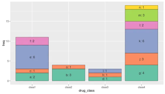
我有一个堆叠条形图,看起来像这样:
虽然颜色看起来很好,但是使用许多相似的颜色表示不同的药物会令人困惑。我希望在图表中为每个条形图使用单独的调色板,例如,class1可以使用“Blues”调色板,而class2可以使用“BuGn”调色板(调色板名称在此处找到)。
我发现一些人手动编码每个条形图的颜色(例如此处),但我不确定我所要求的是否可能 - 这些条形图需要基于调色板,因为每个药物类别中有太多药物。
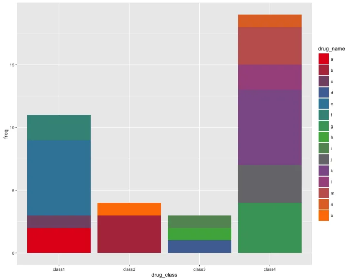
创建上述图表的代码:
library(ggplot2)
library(plyr)
library(RColorBrewer)

drug_name <- c("a", "a", "b", "b", "b", "c", "d", "e", "e", "e", "e", "e", "e",
           "f", "f", "g", "g", "g", "g", "h", "i", "j", "j", "j", "k", "k",
           "k", "k", "k", "k", "l", "l", "m", "m", "m", "n", "o")
df <- data.frame(drug_name)

#get the frequency of each drug name
df_count <- count(df, 'drug_name')

#add a column that specifies the drug class
df_count$drug_class <- vector(mode='character', length=nrow(df_count))

df_count$drug_class[df_count$drug_name %in% c("a", "c", "e", "f")] <- 'class1'

df_count$drug_class[df_count$drug_name %in% c("b", "o")] <- 'class2'

df_count$drug_class[df_count$drug_name %in% c("d", "h", "i")] <- 'class3'

df_count$drug_class[df_count$drug_name %in% c("g", "j", "k", "l", "m", "n")] <- 'class4'

#expand color palette (from http://novyden.blogspot.com/2013/09/how-to-expand-color-palette-with-ggplot.html)

colorCount = length(unique(df_count$drug_name))
getPalette = colorRampPalette(brewer.pal(9, "Set1"))

test_plot <- ggplot(data = df_count, aes(x=drug_class, y=freq, fill=drug_name) ) + geom_bar(stat="identity") + scale_fill_manual(values=getPalette(colorCount))

test_plot