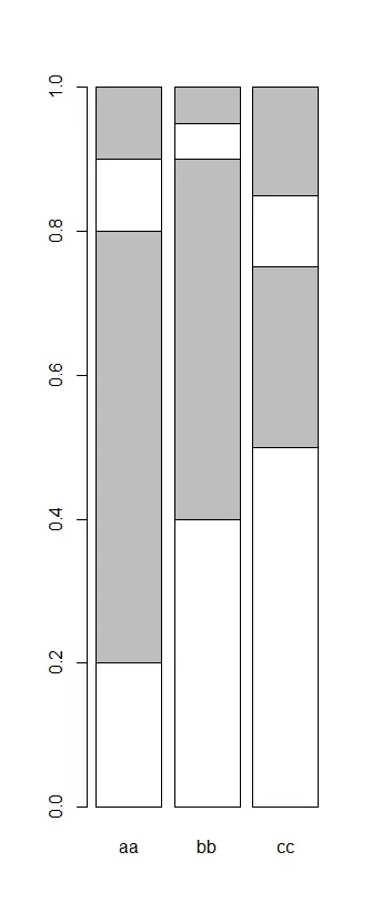
我想绘制一个类似于附件的堆叠条形图,但我希望颜色在类别aa、bb和cc之间变化。具体来说,我希望bb中的灰色块为红色,cc中的灰色块为绿色。以下代码提供了一个简单的示例,并说明了我已经尝试过的内容:
aa=c(0.2,0.6,0.1,0.1)
bb=c(0.4,0.5,0.05,0.05)
cc=c(0.5,0.25,0.1,0.15)
x=cbind(aa,bb,cc)
x #the data
aa   bb   cc

[1,] 0.2 0.40 0.50
[2,] 0.6 0.50 0.25
[3,] 0.1 0.05 0.10
[4,] 0.1 0.05 0.15
默认行为是,每个类别中的所有块都具有相同的颜色。
col=rep(c("white","grey"),2)
col
# [1] "white" "grey"  "white" "grey"

barplot(x,col=col)
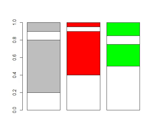
但我希望在bb中的灰色块变为红色,在cc中的灰色块变为绿色。
col=cbind(rep(c("white","grey"),2),rep(c("white","red"),2),rep(c("white","green"),2))
col
[,1] [,2] [,3]
[1,] "white" "white" "white"
[2,] "grey" "red" "green"
[3,] "white" "white" "white"
[4,] "grey" "red" "green"
barplot(x,col=col) #not working
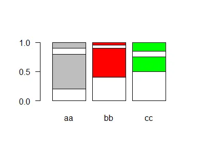
col=c(rep(c("white","grey"),2),rep(c("white","red"),2),rep(c("white","green"),2))
col
[1] "white" "grey" "white" "grey" "white" "red" "white" "red" "white" "green" "white" "green"
barplot(x,col=col) #not working either
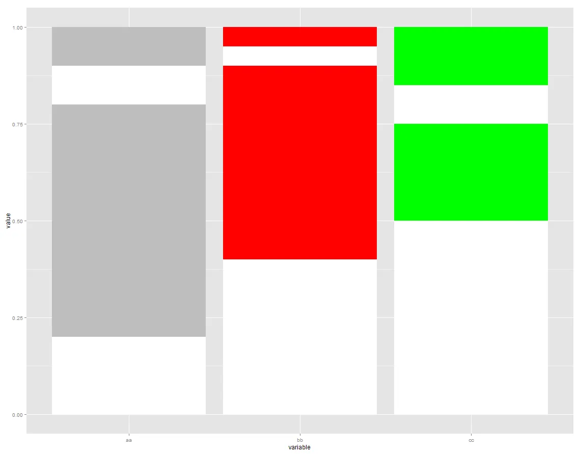
plotrix包中的barp()函数允许将矩阵传递给col- 但它只能绘制 分组 条形图,而不是 堆叠 的。你可能需要自己编写函数(可能需要大量调用rect()函数)。如果你这样做了,请在这里发布,我会很高兴为你点赞。 - Stephan Kolassa