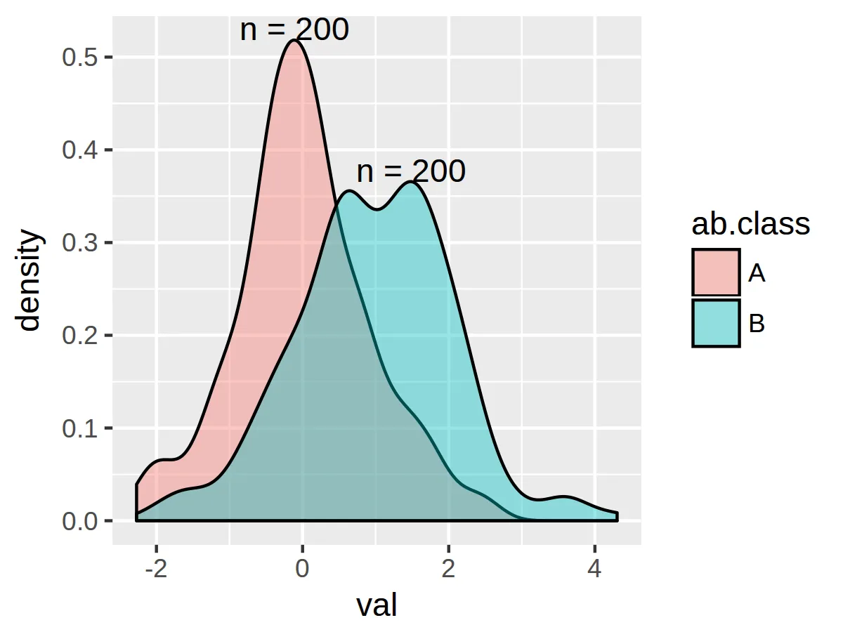
我试图生成一个带有样本量标签的(分组)密度图。
示例数据:
set.seed(100)
df <- data.frame(ab.class = c(rep("A", 200), rep("B", 200)),
                 val = c(rnorm(200, 0, 1), rnorm(200, 1, 1)))
未标记的密度图已生成,如下所示:
ggplot(df, aes(x = val, group = ab.class)) +
  geom_density(aes(fill = ab.class), alpha = 0.4)
我的目标是在每个密度的峰值附近添加文字标签,显示每个组中的样本数量。然而,我无法找到正确的选项组合以此方式总结数据。
我尝试修改在箱线图上提出类似问题的答案中建议的代码:https://dev59.com/0WUo5IYBdhLWcg3w2CaJ#15720769
n_fun <- function(x){
  return(data.frame(y = max(x), label = paste0("n = ",length(x))))
}

ggplot(df, aes(x = val, group = ab.class)) +
  geom_density(aes(fill = ab.class), alpha = 0.4) +
  stat_summary(geom = "text", fun.data = n_fun)
但是,此时会出现错误:Error: stat_summary requires the following missing aesthetics: y。
我还尝试在每个geom_density()和stat_summary()图层中的aes()中添加y = ..density..,以及在ggplot()对象本身中添加,但都没有解决问题。
我知道可以通过为每个组手动添加标签来实现,但我希望有一种通用的解决方案,例如允许使用aes()设置标签颜色以匹配密度。
我错在哪里了?