在ggplot2密度图中,图例未显示线型。

5

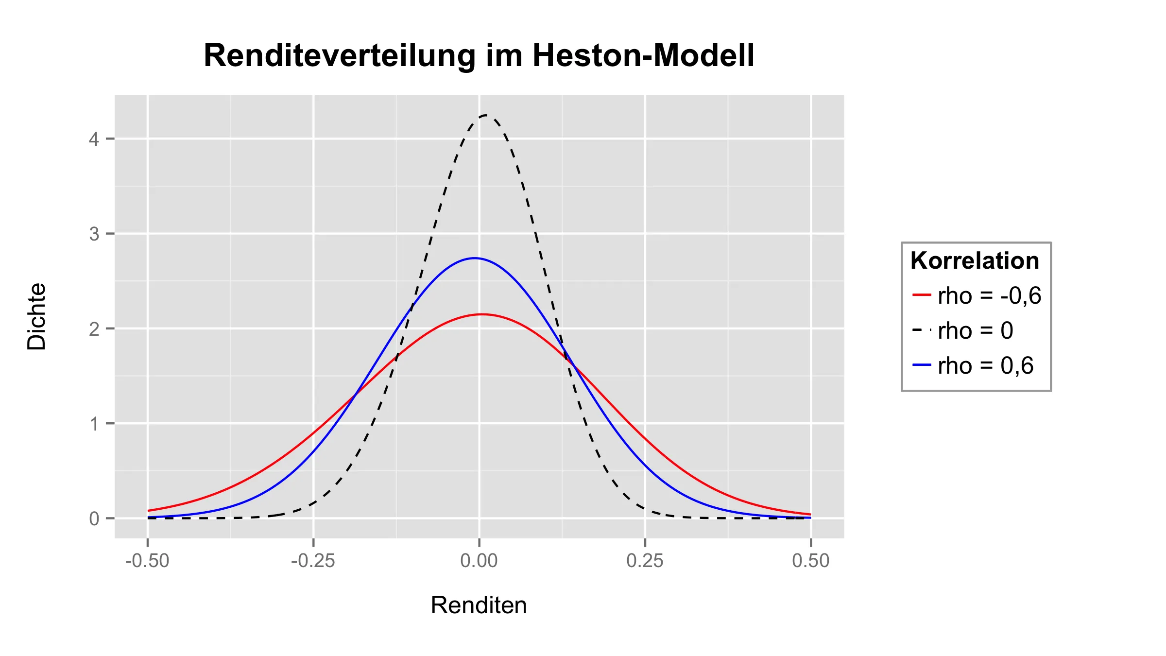
我用ggplot从一个包含3个变量的数据框创建了一张密度图。其中一条密度线是虚线,但是图例显示这条线是实线。

数据长这样:

> head(df)
            R1          R2           R3
1  0.085383867  0.04366546  0.055320885
2  0.059148932  0.03477045  0.040804048
3 -0.181279986 -0.10189900 -0.097218145
4  0.002307494 -0.01137235 -0.003585813
5 -0.047816198 -0.04932982 -0.009389939
6  0.030535090  0.02544292  0.017650949

绘图的代码如下:
ggplot(data=df)+
  stat_density(aes(x=R1, colour="rho = -0,6"), adjust=4, lwd=0.5, geom="line", position="identity")+
  stat_density(aes(x=R2, colour="rho = 0,6"), adjust=4, lwd=0.5, geom="line", position="identity")+
  stat_density(aes(x=R3, colour="rho = 0"), linetype=2, adjust=4, lwd=0.5, geom="line", position="identity")+
  xlim(-0.5, 0.5)+
  xlab("Renditen")+
  ylab("Dichte")+
  ggtitle("Renditeverteilung im Heston-Modell")+
  theme(plot.title=element_text(face="bold", size=16, vjust=2), axis.title.x=element_text(vjust=-1, size=12), 
          axis.title.y=element_text(vjust=-0.25, size=12), legend.text=element_text(size=12), legend.title=element_text(size=12), legend.margin=unit(1.5, "cm"),
          legend.key.height=unit(1.2, "line"), legend.key.size=unit(0.4, "cm"), legend.key=element_rect(fill=NA), legend.background=element_rect(colour="darkgrey"),
          plot.margin=unit(c(1,1,1,1), "cm"))+
  scale_colour_manual(values=c("rho = -0,6"="red", "rho = 0,6"="blue", "rho = 0"="black"), name="Korrelation")

最后是情节:

enter image description here

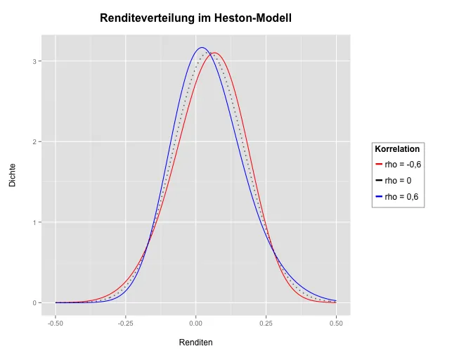
我如何使图例显示第三个密度线(变量R3)的虚线?

提前感谢您!


1
下面的答案很好,但是顺便提一句,你也可以考虑使用melt函数来避免多个stat_density层:https://dev59.com/HG865IYBdhLWcg3whO7E#3777592 - Peyton
2个回答

7

在每个与colors=相同的stat_density()中,在aes()内放置linetype=,然后使用scale_linetype_manual()按需设置类型。如果您为线型和颜色使用相同的图例名称,则两个图例将合并。

ggplot(data=df)+
  stat_density(aes(x=R1, colour="rho = -0,6",linetype="rho = -0,6"), 
                     adjust=4, lwd=0.5, geom="line", position="identity")+
  stat_density(aes(x=R2, colour="rho = 0,6",linetype="rho = 0,6"), 
                     adjust=4, lwd=0.5, geom="line", position="identity")+
  stat_density(aes(x=R3, colour="rho = 0", linetype="rho = 0"), 
                     adjust=4, lwd=0.5, geom="line", position="identity")+
  xlim(-0.5, 0.5)+
  xlab("Renditen")+
  ylab("Dichte")+
  ggtitle("Renditeverteilung im Heston-Modell")+
  theme(plot.title=element_text(face="bold", size=16, vjust=2),  
        axis.title.x=element_text(vjust=-1, size=12), 
        axis.title.y=element_text(vjust=-0.25, size=12), 
        legend.text=element_text(size=12), legend.title=element_text(size=12),
        legend.margin=unit(1.5, "cm"),
        legend.key.height=unit(1.2, "line"), 
        legend.key.size=unit(0.4, "cm"), 
        legend.key=element_rect(fill=NA), 
        legend.background=element_rect(colour="darkgrey"),
        plot.margin=unit(c(1,1,1,1), "cm"))+
  scale_colour_manual(values=c("rho = -0,6"="red", "rho = 0,6"="blue", 
                                "rho = 0"="black"), name="Korrelation")+
  scale_linetype_manual(values=c("rho = -0,6"=1, "rho = 0,6"=1, 
                                "rho = 0"=2), name="Korrelation")

enter image description here


完美的答案,正是我所需要的!谢谢! - FreshF
除了使用相同的名称来表示颜色和线型之外,还应添加参数:name="Korrelation"。 - Abhishek

2
规则很简单:
 each aes is key in the legend.

由于您的线型不在 aes 中,因此它们不会显示在图例中。

这里有一个示例:

library(ggplot2)

ggplot(mtcars) +
  geom_line(aes(x=mpg,y=cyl,linetype='2')) +
  geom_line(aes(x=mpg,y=disp,linetype='3')) + 
  scale_linetype_discrete(name = "Lines Types  aes")

enter image description here


网页内容由stack overflow 提供, 点击上面的
可以查看英文原文,
原文链接