在2D图中绘制一维密度的ggplot2

3

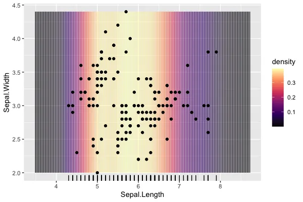
我想绘制一个能够在散点图中捕捉一维点密度的背景。这与边缘密度图或毛毯图具有类似的作用。我有一种不太优雅的方法来做到这一点,我想知道是否有内置功能可以用来产生这种类型的图。

主要存在几个问题:

  • 边界处Alpha重叠导致低分辨率时出现带状。 - 主要目标,寻找一个可以绘制填充特定颜色的漂亮连续带的几何或其他解决方案。类似于geom_density_2d(),但统计数据仅从X轴绘制。
  • "背景"未覆盖扩展区域,可以使用coord_cartesian(expand = FALSE),但希望覆盖常规边距。 - 不是很重要,这是一个美好的愿望,但不是必需的。
  • 设置scale_fill"消耗"了绘图的选项,不允许单独为点自身设置。 - 这可能不容易实现,对于层的独立调色板似乎是ggplot2的基本问题。
data(iris)

dns <- density(iris$Sepal.Length)
dns_df <- tibble(
        x = dns$x,
        density = dns$y
    )%>%
        mutate(
            start = x - mean(diff(x))/2,
            end = x + mean(diff(x))/2
        )

ggplot() +
    geom_rect(
        data = dns_df, 
        aes(xmin = start, xmax = end, fill = density),
        ymin = min(iris$Sepal.Width),
        ymax = max(iris$Sepal.Width),
        alpha = 0.5) +
    scale_fill_viridis_c(option = "A") +
    geom_point(data = iris, aes(x = Sepal.Length, y = Sepal.Width)) +
    geom_rug(data = iris, aes(x = Sepal.Length))

ggplot 1d density example

2个回答

4
这是一种有些hacky的解决方案,因为它(滥用)利用了对象内部参数化的知识来获得您想要的内容,这将产生一些警告,但可以帮助您实现所需内容。
首先,我们将使用 geom_raster()+stat_density() 加上一些经过选择的after_stat()/stage() 延迟评估进行修饰。通常情况下,这会导致高度=1的条带,但通过将内部参数ymin/ymax设置为无限大,我们将使条带延伸到整个图的高度。使用geom_raster()解决了您遇到的alpha问题。
library(ggplot2)

p <- ggplot(iris) +
  geom_raster(
    aes(Sepal.Length,
        y = mean(Sepal.Width),
        fill = after_stat(density),
        ymin = stage(NULL, after_scale = -Inf),
        ymax = stage(NULL, after_scale = Inf)),
    stat = "density", alpha = 0.5
  )
#> Warning: Ignoring unknown aesthetics: ymin, ymax
p
#> Warning: Duplicated aesthetics after name standardisation: NA

接下来,我们添加一个填充比例尺,并立即跟随 ggnewscale::new_scale_fill()。这样可以让另一层使用第二个填充比例尺,就像 fill = Species 的示例一样。
p <- p +
  scale_fill_viridis_c(option = "A") +
  ggnewscale::new_scale_fill() +
  geom_point(aes(Sepal.Length, Sepal.Width, fill = Species),
             shape = 21) +
  geom_rug(aes(Sepal.Length))
p
#> Warning: Duplicated aesthetics after name standardisation: NA

最后,为了消除x轴的填充,我们可以手动扩展限制,然后收缩扩展。它允许在更大的范围内估算密度,使栅格填满整个区域。ggplot2和scales::expand_range()之间参数化存在一些不匹配,所以确切的值需要一些试错。
p +
  scale_x_continuous(
    limits = ~ scales::expand_range(.x, mul = 0.05),
    expand = c(0, -0.2)
  )
#> Warning: Duplicated aesthetics after name standardisation: NA

此内容由reprex package (v2.0.1)于2022-07-04创建。


1

这并不能解决你的问题(我不确定是否完全理解了所有问题),但或许可以帮到你:

  • 背景不覆盖扩展区域,可以使用 coord_cartesian(expand = FALSE) 但想要覆盖常规边距。

如果你扩大“背景”并使用 coord_cartesian(),你可以获得相同的“填充到边缘”的效果;这对你的用例有用吗?

  • 边界处的透明度重叠会导致低分辨率下出现条纹,如此所见。

我无法完全解决条纹问题,但我的方法似乎可以减少它。

  • 设置 scale_fill 将消耗绘图选项,使其不能独立地为点本身设置。

如果你使用 geom_segment(),你可以将密度映射到颜色上,留下填充可供例如点之类的元素使用。同样,不确定这是否是一个可用的解决方案,只是可能有所帮助的一个想法。

library(tidyverse)

data(iris)

dns <- density(iris$Sepal.Length)
dns_df <- tibble(
  x = dns$x,
  density = dns$y
) %>%
  mutate(
    start = x - mean(diff(x))/2,
    end = x + mean(diff(x))/2
  )

ggplot() +
  geom_segment(
    data = dns_df, 
    aes(x = start, xend = end,
        y = min(iris$Sepal.Width) * 0.9, 
        yend = max(iris$Sepal.Width) * 1.1,
        color = density), alpha = 0.5) +
  coord_cartesian(ylim = c(min(iris$Sepal.Width),
                           max(iris$Sepal.Width)),
                  xlim = c(min(iris$Sepal.Length),
                           max(iris$Sepal.Length))) +
  scale_color_viridis_c(option = "A", alpha = 0.5) +
  scale_fill_viridis_d() +
  geom_point(data = iris, aes(x = Sepal.Length, 
                              y = Sepal.Width,
                              fill = Species),
             shape = 21) +
  geom_rug(data = iris, aes(x = Sepal.Length))

这是由 reprex软件包 (v2.0.1) 于2022年7月4日创建的。


注:本文中的HTML标签已保留。

谢谢,这很有帮助,我会尽力澄清我的问题。我希望有一些聪明的方法来使用geom_density_2d(),这是我没有想到的。 - shians
啊,是的 - 那很有道理 - 抱歉我的回答没有什么帮助。@teunbrand的回答更好 :) - jared_mamrot

网页内容由stack overflow 提供, 点击上面的
可以查看英文原文,
原文链接