我使用以下代码生成一个条形图:
它生成以下条形图:
Temp_Counts = Counter(weatherDFConcat['TEMPBIN_CON'])
df = pd.DataFrame.from_dict(Temp_Counts, orient = 'index')
df.plot(kind = 'bar')
它生成以下条形图:
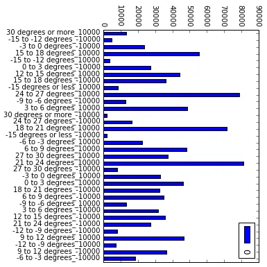
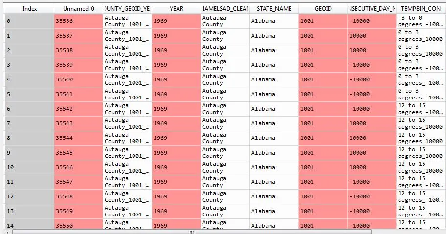
我正在创建一个条形图,显示图片中数据框的最后一列。如果有任何指导或其他方法可以创建一个允许我更改轴顺序的条形图,将不胜感激。目前的图表很难解释。