这是我的数据结构:
data = {'2013': {1:25,2:81,3:15}, '2014': {1:28, 2:65, 3:75}, '2015': {1:78,2:91,3:86 }}
我的 x 轴是数字 [1,2,3]
我的 y 轴是每个数字的数量。例如:在 2013 年,1 是 x 轴,其数量为 25。
为每一年打印单独的图表。
我想要绘制一个使用 matplotlib 的柱状图,并带有图例。
这是我的数据结构:
data = {'2013': {1:25,2:81,3:15}, '2014': {1:28, 2:65, 3:75}, '2015': {1:78,2:91,3:86 }}
我的 x 轴是数字 [1,2,3]
我的 y 轴是每个数字的数量。例如:在 2013 年,1 是 x 轴,其数量为 25。
为每一年打印单独的图表。
我想要绘制一个使用 matplotlib 的柱状图,并带有图例。
import matplotlib.pyplot as plt
import pandas as pd

data = {'2013': {1:25,2:81,3:15}, '2014': {1:28, 2:65, 3:75}, '2015': {1:78,2:91,3:86 }}

df = pd.DataFrame(data)

df.plot(kind='bar')

plt.show()

你可以通过 dict.keys() 访问字典的键,通过 dict.values() 访问值。
如果你想绘制2013年的数据,可以这样做:
import matplotlib.pyplot as pl
x_13 = data['2013'].keys()
y_13 = data['2013'].values()
pl.bar(x_13, y_13, label = '2013')
pl.legend()
那应该就可以了。更优雅地说,你可以这样做:
year = '2013'
pl.bar(data[year].keys(), data[year].values(), label=year)
这将允许您循环它:
for year in ['2013','2014','2015']:
    pl.bar(data[year].keys(), data[year].values(), label=year)
你可以用几种方法来实现这个。
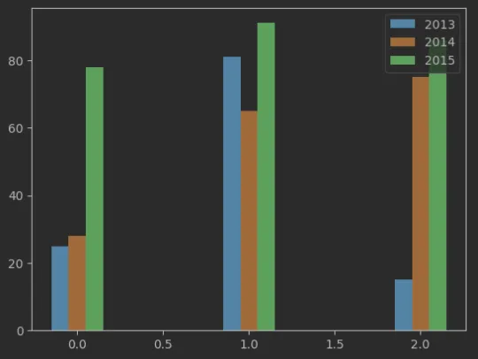
data = {'2013': {1: 25, 2: 81, 3: 15}, '2014': {1: 28, 2: 65, 3: 75}, '2015': {1: 78, 2: 91, 3: 86}}

df = pd.DataFrame(data)

X_axis = np.arange(len(df))

plt.bar(X_axis - 0.1,height=df["2013"], label='2013',width=.1)
plt.bar(X_axis, height=df["2014"], label='2014',width=.1)
plt.bar(X_axis + 0.1, height=df["2015"], label='2015',width=.1)
plt.legend()
plt.show()
更多信息在这里
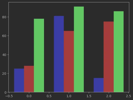
data = {'2013': {1: 25, 2: 81, 3: 15}, '2014': {1: 28, 2: 65, 3: 75}, '2015': {1: 78, 2: 91, 3: 86}}

df = pd.DataFrame(data)

fig= plt.figure()

axes = fig.add_axes([.1,.1,.8,.8])

X_axis = np.arange(len(df))
axes.bar(X_axis -.25,df["2013"], color ='b', width=.25)
axes.bar(X_axis,df["2014"], color ='r', width=.25)
axes.bar(X_axis +.25,df["2015"], color ='g', width=.25)