使用matplotlib绘制条形图 - 类型错误

6
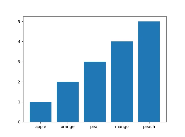
我想绘制一个频率分布图(单词出现次数和频率),以下是我的代码:
import matplotlib.pyplot as plt

y = [1,2,3,4,5]
x = ['apple', 'orange', 'pear', 'mango', 'peach']

plt.bar(x,y)
plt.show

然而,我遇到了这个错误:

TypeError: cannot concatenate 'str' and 'float' objects
2个回答

6
import matplotlib.pyplot as plt
import numpy as np
y = [1,2,3,4,5]
x = np.arange(0,len(y)) + 0.75
xl = ['', 'apple', 'orange', 'pear', 'mango', 'peach']

fig = plt.figure()
ax = fig.add_subplot(111)
ax.bar(x,y,0.5)
ax.set_xticklabels(xl)
ax.set_xlim(0,5.5)

如果有更好的方法将标签设置在条形图的中间,那将会很有趣。

根据这篇SO帖子,有一个更好的解决方案:

import matplotlib.pyplot as plt
import numpy as np
y = [1,2,3,4,5]
# adding 0.75 did the trick but only if I add a blank position to `xl`
x = np.arange(len(y))
xl = ['apple', 'orange', 'pear', 'mango', 'peach']

fig = plt.figure()
ax = fig.add_subplot(111)
ax.bar(x,y,0.5, align='center')
ax.set_xticks(x)
ax.set_xticklabels(xl)

得到这个错误:在<module>中 ax.bar(x,y) TypeError:不支持的操作数类型加法:'int'和'str'。 - jxn
代码在我的电脑上可以运行。我已经编辑过了,请再试一次。 - Moritz
是的,它可以工作。我忘记了我的y列表也是字符串格式的。必须将其转换为整数。谢谢 :) - jxn
@Moritz,你不应该在回答中添加问题。如果你有问题,就要添加一个问题 ;) - hitzg
是的,你说得对。我应该删除这个问题吗? - Moritz
不是,但你可以在你的问题中添加一个参考。这对任何遇到这个问题的人都会有帮助。 - hitzg

2

只需要添加两行代码:

import matplotlib.pyplot as plt
y = [1, 2, 3, 4, 5]
x_name = ['apple', 'orange', 'pear', 'mango', 'peach']
x = np.arange(len(x_name))  # <--
plt.bar(x, y)
plt.xticks(x, x_name)  # <--
plt.show()

enter image description here

直接使用v2.1版本,可以支持使用plt.bar(x_name, y)命令进行绘图,详见https://github.com/matplotlib/matplotlib/issues/8959


网页内容由stack overflow 提供, 点击上面的
可以查看英文原文,
原文链接