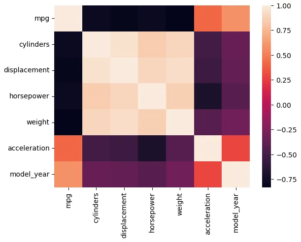
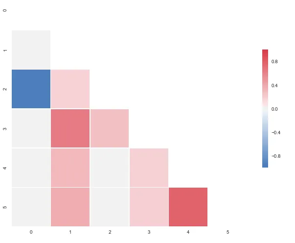
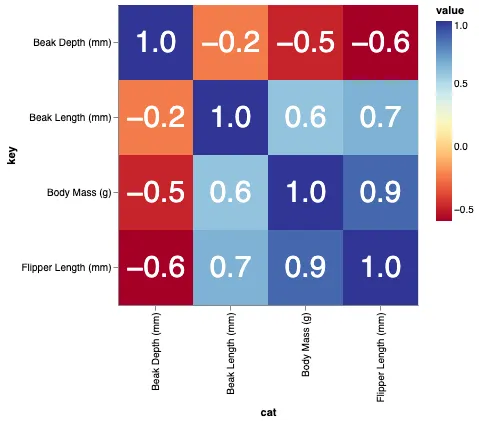
我想用热力图来表示相关矩阵。在R中有一个叫做correlogram的东西,但我不认为Python中有这样的功能。
我该如何做到这一点?值的范围从-1到1,例如:
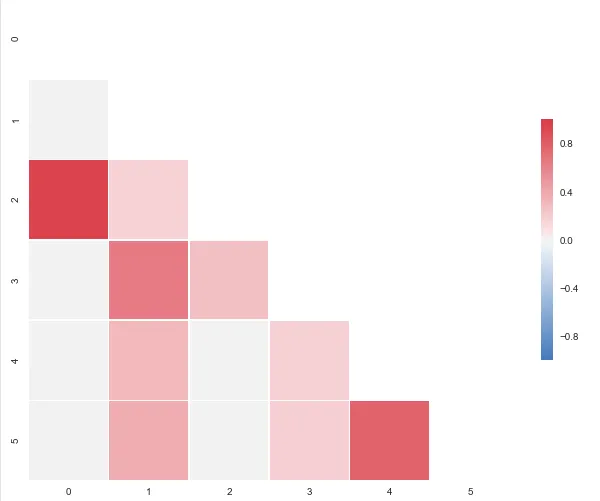
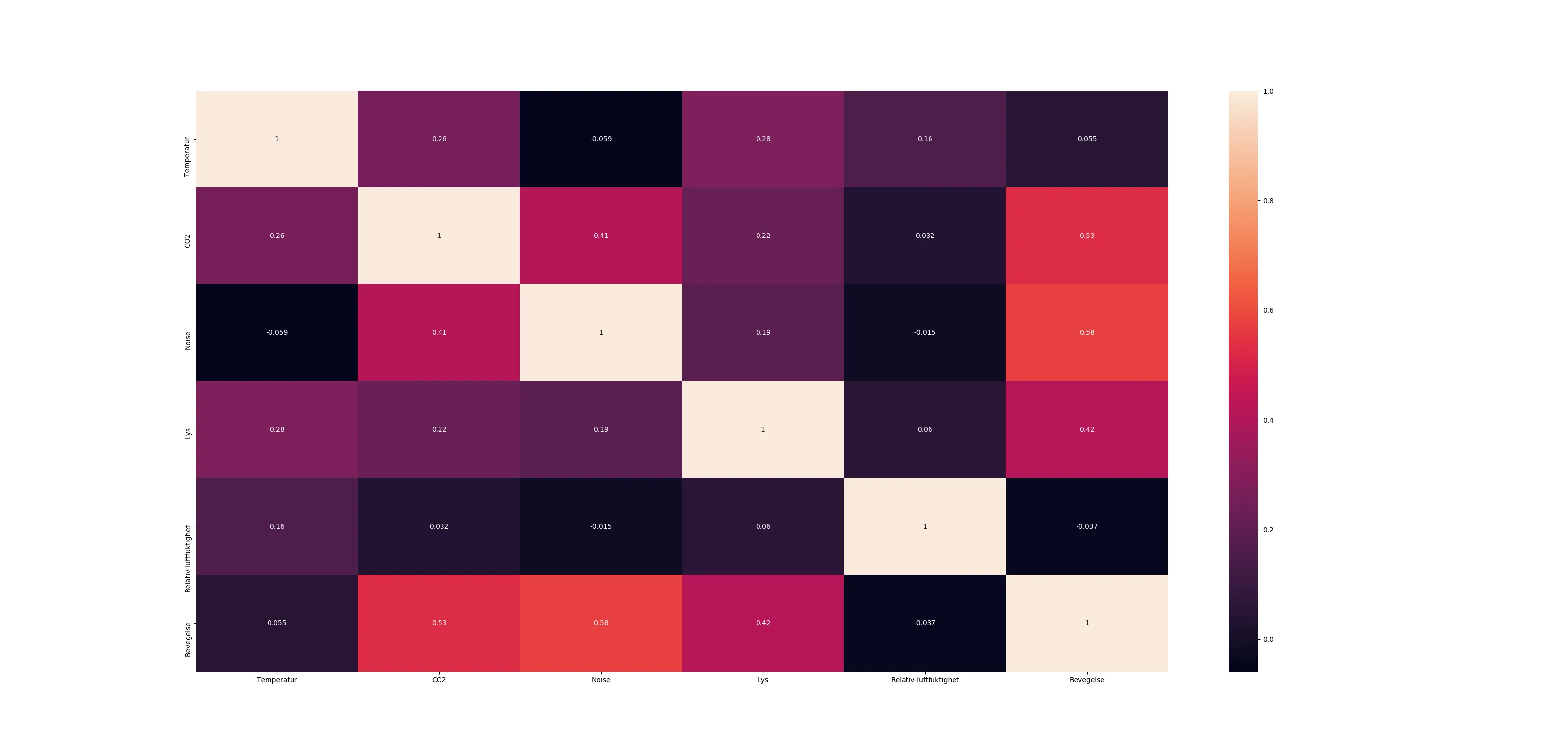
我能根据另一个问题生成以下热力图,但问题是我的值在0处被“截断”,所以我希望有一张从蓝色(-1)到红色(1)的地图,或者类似的东西,但这里的负值没有以适当的方式呈现。
我该如何做到这一点?值的范围从-1到1,例如:
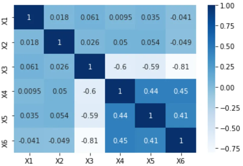
[[ 1.          0.00279981  0.95173379  0.02486161 -0.00324926 -0.00432099]
 [ 0.00279981  1.          0.17728303  0.64425774  0.30735071  0.37379443]
 [ 0.95173379  0.17728303  1.          0.27072266  0.02549031  0.03324756]
 [ 0.02486161  0.64425774  0.27072266  1.          0.18336236  0.18913512]
 [-0.00324926  0.30735071  0.02549031  0.18336236  1.          0.77678274]
 [-0.00432099  0.37379443  0.03324756  0.18913512  0.77678274  1.        ]]
我能根据另一个问题生成以下热力图,但问题是我的值在0处被“截断”,所以我希望有一张从蓝色(-1)到红色(1)的地图,或者类似的东西,但这里的负值没有以适当的方式呈现。
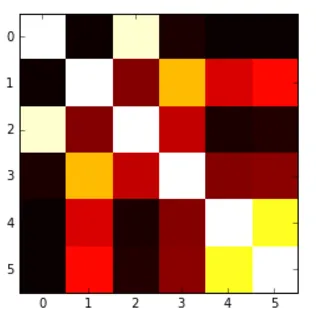
plt.imshow(correlation_matrix,cmap='hot',interpolation='nearest')