如何在使用Pyspark和Databricks时绘制相关性热力图

9

我是在Databricks中学习Pyspark。我想生成一个相关性热图。假设这是我的数据:

myGraph=spark.createDataFrame([(1.3,2.1,3.0),
                               (2.5,4.6,3.1),
                               (6.5,7.2,10.0)],
                              ['col1','col2','col3'])

以下是我的代码:

import pyspark
from pyspark.sql import SparkSession
import matplotlib.pyplot as plt
import pandas as pd
import numpy as np
from ggplot import *
from pyspark.ml.feature import VectorAssembler
from pyspark.ml.stat import Correlation
from pyspark.mllib.stat import Statistics

myGraph=spark.createDataFrame([(1.3,2.1,3.0),
                               (2.5,4.6,3.1),
                               (6.5,7.2,10.0)],
                              ['col1','col2','col3'])
vector_col = "corr_features"
assembler = VectorAssembler(inputCols=['col1','col2','col3'], 
                            outputCol=vector_col)
myGraph_vector = assembler.transform(myGraph).select(vector_col)
matrix = Correlation.corr(myGraph_vector, vector_col)
matrix.collect()[0]["pearson({})".format(vector_col)].values

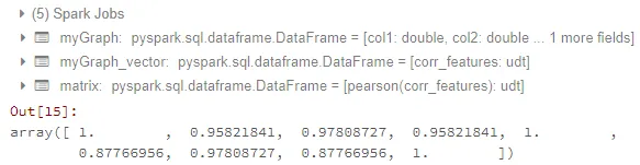
目前为止,我可以得到相关矩阵。结果看起来像这样:

enter image description here

现在我的问题是:

  1. 如何将矩阵转换为数据框?我尝试了How to convert DenseMatrix to spark DataFrame in pyspark?How to get correlation matrix values pyspark的方法,但对我没用。
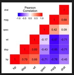
  2. 如何生成类似于以下图片的相关热力图:

enter image description here

因为我刚学习pyspark和databricks。对于我的问题,ggplot或matplotlib都可以。

1个回答

18

我认为你感到困惑的点是:

matrix.collect()[0]["pearson({})".format(vector_col)].values

调用 densematrix 的 .values 方法可以得到所有值的列表,但是你实际上需要的是一个代表相关矩阵的列表。

import matplotlib.pyplot as plt
from pyspark.ml.feature import VectorAssembler
from pyspark.ml.stat import Correlation

columns = ['col1','col2','col3']

myGraph=spark.createDataFrame([(1.3,2.1,3.0),
                               (2.5,4.6,3.1),
                               (6.5,7.2,10.0)],
                              columns)
vector_col = "corr_features"
assembler = VectorAssembler(inputCols=['col1','col2','col3'], 
                            outputCol=vector_col)
myGraph_vector = assembler.transform(myGraph).select(vector_col)
matrix = Correlation.corr(myGraph_vector, vector_col)

到目前为止,基本上都是你的代码。不要使用 .values,而应该使用 .toArray().tolist() 来获取表示相关矩阵的列表列表:

matrix = Correlation.corr(myGraph_vector, vector_col).collect()[0][0]
corrmatrix = matrix.toArray().tolist()
print(corrmatrix)

输出:

[[1.0, 0.9582184104641529, 0.9780872729407004], [0.9582184104641529, 1.0, 0.8776695567739841], [0.9780872729407004, 0.8776695567739841, 1.0]]

这种方法的优点是您可以轻松地将列表的列表转换为数据框:

df = spark.createDataFrame(corrmatrix,columns)
df.show()

输出:

+------------------+------------------+------------------+ 
|              col1|              col2|              col3| 
+------------------+------------------+------------------+ 
|               1.0|0.9582184104641529|0.9780872729407004|
|0.9582184104641529|               1.0|0.8776695567739841| 
|0.9780872729407004|0.8776695567739841|               1.0|  
+------------------+------------------+------------------+

回答你的第二个问题,有许多方法可以绘制热力图(例如这个或者这个,甚至更好地使用seaborn)。

def plot_corr_matrix(correlations,attr,fig_no):
    fig=plt.figure(fig_no)
    ax=fig.add_subplot(111)
    ax.set_title("Correlation Matrix for Specified Attributes")
    ax.set_xticklabels(['']+attr)
    ax.set_yticklabels(['']+attr)
    cax=ax.matshow(correlations,vmax=1,vmin=-1)
    fig.colorbar(cax)
    plt.show()

plot_corr_matrix(corrmatrix, columns, 234)

Cronoik - 这些值必须是INT格式吗?我正在尝试在FLOAT值之间进行相关性计算,但结果矩阵中出现了NaN。 - mwhee
不,那不是必要的。我在上面的例子中也使用了浮点格式。你能否开一个新问题并展示你的代码?我会看一下它。 - cronoik

网页内容由stack overflow 提供, 点击上面的
可以查看英文原文,
原文链接