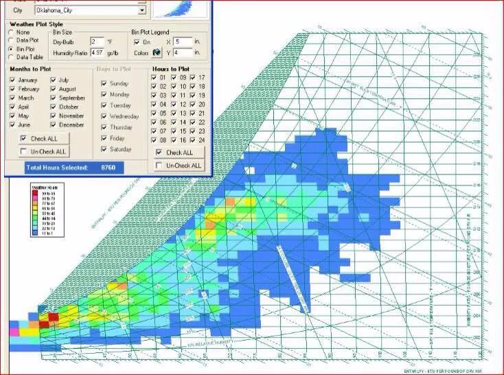
我有一个图表,想要绘制一个热力图;我唯一拥有的数据是湿度和温度,它们代表图表上的一个点。
在C#中,如何在图表上获得矩形类型的热力图?
我想要的类似于下面的图片:
您有至少三种选择来创建由彩色矩形组成的热力图。
这里是一个示例,它使用/滥用了DataGridView。虽然我不建议这样做,但该帖子包含一个有用的函数,可以创建漂亮的颜色列表以在您的任务中使用。
然后有一种选择是使用GDI+方法绘制图表,即Graphics.FillRectangle。这并不难,但是一旦您想要获得图表控件提供的诸如缩放、轴、工具提示等良好的额外功能时,工作量就会增加。请看下面!
那么让我们看看第三个选项:使用DataVisualization命名空间中的Chart控件。
首先假设您已经创建了一个颜色列表:
List<Color> colorList = new List<Color>();
假设您已成功将数据投影到一个二维int索引数组中,该数组指向颜色列表:
int[,] coloredData = null;
接下来,您需要为序列 S1选择一个ChartType。我只能想到一种类型会有所帮助:
S1.ChartType = SeriesChartType.Point;
标记由 Markers 显示。我们不想将 DataPoints 显示为标准的一个MarkerTypes。
Square 是可以的,如果我们想显示正方形; 但对于矩形,它将无法正常工作: 即使让它们重叠,仍然会存在边界上有不同大小的点,因为它们没有完全重叠..
因此,我们使用一个 自定义的 标记,通过将每个点的 MarkerImage 设置为合适大小和颜色的 位图来实现。
这里是一个循环,将 DataPoints 添加到我们的 Series 中,并将每个点设置为具有 MarkerImage:
for (int x = 1; x < coloredData.GetLength(0); x++)
    for (int y = 1; y < coloredData.GetLength(1); y++)
    {
        int pt = S1.Points.AddXY(x, y);
        S1.Points[pt].MarkerImage = "NI" +  coloredData[x,y];

    }
这需要一些解释:要设置一个不在磁盘路径上的MarkerImage,它必须驻留在图表的Images集合中。这意味着它必须是NamedImage类型。任何图像都可以,但必须添加一个唯一的名称字符串来标识它在NamedImagesCollection中。我选择的名称为'NI1'、'NI2'等等。
显然,我们需要创建所有这些图像;下面是一个函数来完成这个任务:
void createMarkers(Chart chart, int count)
{
    // rough calculation:
    int sw = chart.ClientSize.Width / coloredData.GetLength(0);
    int sh = chart.ClientSize.Height / coloredData.GetLength(1);

    // clean up previous images:
    foreach(NamedImage ni in chart1.Images) ni.Dispose();
    chart.Images.Clear();

    // now create count images:
    for (int i = 0; i < count; i++)
    {
        Bitmap bmp = new Bitmap(sw, sh);
        using (Graphics G = Graphics.FromImage(bmp))
            G.Clear(colorList[i]);
        chart.Images.Add(new NamedImage("NI" + i, bmp));
    }
}
我们希望所有标记的大小至少大致正确;因此,每当该大小发生变化时,我们会重新设置它:
void setMarkerSize(Chart chart)
{
    int sx = chart1.ClientSize.Width / coloredData.GetLength(0);
    int sy = chart1.ClientSize.Height / coloredData.GetLength(1);
    chart1.Series["S1"].MarkerSize = (int)Math.Max(sx, sy);
}
这并不太关心像InnerPlotPosition之类的细节,即要绘制的实际区域; 因此在这里有一些改进的空间..!
我们在设置图表时调用它,但也会在调整大小时调用:
private void chart1_Resize(object sender, EventArgs e)
{
    setMarkerSize(chart1);
    createMarkers(chart1, 100);
}
让我们看一下使用一些廉价测试数据的结果:
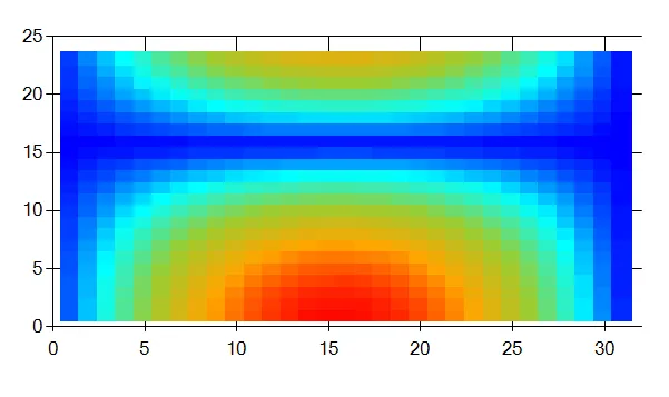
如您所见,缩放效果良好...
这里是我设置示例的完整代码:
private void button6_Click(object sender, EventArgs e)
{
    List<Color> stopColors = new List<Color>()
    { Color.Blue, Color.Cyan, Color.YellowGreen, Color.Orange, Color.Red };
    colorList = interpolateColors(stopColors, 100);

    coloredData = getCData(32, 24);
    // basic setup..
    chart1.ChartAreas.Clear();
    ChartArea CA = chart1.ChartAreas.Add("CA");
    chart1.Series.Clear();
    Series S1 = chart1.Series.Add("S1");
    chart1.Legends.Clear();
    // we choose a charttype that lets us add points freely:
    S1.ChartType = SeriesChartType.Point;

    Size sz = chart1.ClientSize;

    // we need to make the markers large enough to fill the area completely:
    setMarkerSize(chart1);
    createMarkers(chart1, 100);

    // now we fill in the datapoints
    for (int x = 1; x < coloredData.GetLength(0); x++)
        for (int y = 1; y < coloredData.GetLength(1); y++)
        {
            int pt = S1.Points.AddXY(x, y);
            //  S1.Points[pt].Color = coloredData[x, y];

            S1.Points[pt].MarkerImage = "NI" +  coloredData[x,y];
        }
}
关于限制的一些注意事项:
数据点将始终位于任何网格线的顶部。如果您确实需要这些网格线,则必须在其中一个 Paint 事件中将它们绘制在顶部。
如所示,标签是指数据数组的整数索引。如果要显示原始数据,一种方法是向轴添加 CustomLabels。请参见此处的示例!
这应该让您了解使用 Chart 控件可以做什么;为了使您更加混乱,这里是如何使用相同的颜色和数据在 GDI+ 中绘制那些矩形:
Bitmap getChartImg(float[,] data, Size sz, Padding pad)
{
    Bitmap bmp = new Bitmap(sz.Width , sz.Height);
    using (Graphics G = Graphics.FromImage(bmp))
    {
        float w = 1f * (sz.Width - pad.Left - pad.Right) / coloredData.GetLength(0);
        float h = 1f * (sz.Height - pad.Top - pad.Bottom) / coloredData.GetLength(1);
        for (int x = 0; x < coloredData.GetLength(0); x++)
            for (int y = 0; y < coloredData.GetLength(1); y++)
            {
                using (SolidBrush brush = new SolidBrush(colorList[coloredData[x,y]]))
                    G.FillRectangle(brush, pad.Left + x * w, y * h - pad.Bottom, w, h);
            }

    }
    return bmp;
}
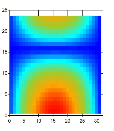
生成的位图看起来很熟悉:
这很简单,但是要将所有额外内容添加到留白区域中并不容易。
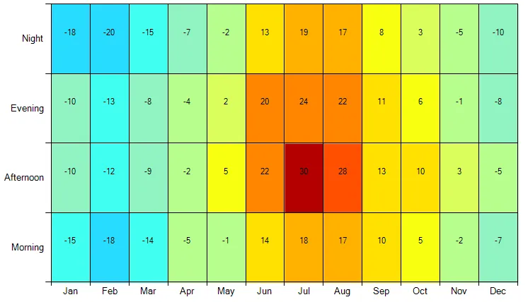
或者,您可以手动将此热力图绘制到 Chart 控件的背景中。
这是一个示例:
首先,处理 PrePaint 事件。
chart.PrePaint += ChartPrePaint;
private void ChartPrePaint(object sender, ChartPaintEventArgs e)
{
    var area = e.ChartElement as ChartArea;
    if (area == null)
    {
        return;
    }
}
private void ChartPrePaint(object sender, ChartPaintEventArgs e)
{
    var chart = sender as Chart;
    if (chart == null)
    {
        return;
    }

    var width = chart.Width;
    var height = chart.Height;

    var area = e.ChartElement as ChartArea;
    if (area == null)
    {
        return;
    }

    /*
     * In this example we plot the average temperature of each period of a day (Y-axis) for each month (X-axis).
     */
    foreach (var month in Observations)
    {
        for (var period = 0; period < month.Value.Length; period++)
        {
            /*
             * Firstly, find where each segment begins and ends.
             * In this example we split the X-axis proportionally to the number of months and find the edges of each month.
             */
            var x1 = e.ChartGraphics.GetPositionFromAxis(area.Name, area.AxisX.AxisName, month.Key);
            var x2 = e.ChartGraphics.GetPositionFromAxis(area.Name, area.AxisX.AxisName, month.Key + 1);

            /*
             * Similarly, split the Y-axis into 4 segments for each period of a day.
             */
            var y1 = e.ChartGraphics.GetPositionFromAxis(area.Name, area.AxisY.AxisName, period);
            var y2 = e.ChartGraphics.GetPositionFromAxis(area.Name, area.AxisY.AxisName, period + 1);

            /*
             * Convert the relative coordinates to absolute ones.
             */
            var x1abs = (float)(x1 / 100 * width);
            var x2abs = (float)((x2 - x1) / 100 * width);

            var y1abs = (float)(y2 / 100 * height);
            var y2abs = (float)((y1 - y2) / 100 * height);

            /*
             * Finally, pick the color of the segment.
             */
            var temperature = month.Value[period];
            var color = GetColor(temperature);

            using (var brush = new SolidBrush(color))
            {
                /*
                 * Fill the segment with its color.
                 */
                e.ChartGraphics.Graphics.FillRectangle(brush, x1abs, y1abs, x2abs, y2abs);
            }
        }
    }
}
using System.Collections.Generic;
using System.Drawing;
using System.Globalization;
using System.Windows.Forms;
using System.Windows.Forms.DataVisualization.Charting;

namespace WindowsFormsAppHeatMap
{
    public partial class Form1 : Form
    {
        public Form1()
        {
            InitializeComponent();

            var chart = new Chart { Dock = DockStyle.Fill };
            chart.PrePaint += ChartPrePaint;
            Controls.Add(chart);

            var area = new ChartArea();
            chart.ChartAreas.Add(area);

            /* Add data to the chart. */
            var series = new Series() { ChartType = SeriesChartType.Point };
            series.MarkerSize = 0;
            foreach (var month in Observations)
            {
                for (var i = 0; i < month.Value.Length; i++)
                {
                    var index = series.Points.AddXY(month.Key + 0.5, i + 0.5);
                    series.Points[index].Label = month.Value[i].ToString();
                }
            }
            chart.Series.Add(series);

            /* Custom labels for the X-axis. */
            area.AxisX.Minimum = 0;
            area.AxisX.Maximum = 12;
            area.AxisX.Interval = 1;
            var ci = CultureInfo.InvariantCulture;
            for (var i = 0; i < 12; i++)
            {
                var month = ci.DateTimeFormat.GetMonthName(i + 1).Substring(0, 3);
                area.AxisX.CustomLabels.Add(i, i + 1, month);
            }

            /* Custom labels for the Y-axis. */
            area.AxisY.Minimum = 0;
            area.AxisY.Maximum = 4;
            area.AxisY.Interval = 1;
            area.AxisY.CustomLabels.Add(0, 1, "Morning");
            area.AxisY.CustomLabels.Add(1, 2, "Afternoon");
            area.AxisY.CustomLabels.Add(2, 3, "Evening");
            area.AxisY.CustomLabels.Add(3, 4, "Night");
        }

        /// <summary>
        /// Input data for each month and each period of a day (Morning, Afternoon, Evening, Night).
        /// </summary>
        private readonly Dictionary<int, int[]> Observations = new Dictionary<int, int[]>
        {
            {  0, new [] { -15, -10, -10, -18 } },
            {  1, new [] { -18, -12, -13, -20 } },
            {  2, new [] { -14,  -9,  -8, -15 } },
            {  3, new [] {  -5,  -2,  -4,  -7 } },
            {  4, new [] {  -1,   5,   2,  -2 } },
            {  5, new [] {  14,  22,  20,  13 } },
            {  6, new [] {  18,  30,  24,  19 } },
            {  7, new [] {  17,  28,  22,  17 } },
            {  8 ,new [] {  10,  13,  11,   8 } },
            {  9, new [] {   5,  10,   6,   3 } },
            { 10, new [] {  -2,   3,  -1,  -5 } },
            { 11, new [] {  -7,  -5,  -8, -10 } }
        };

        /// <summary>
        /// Colors map that states the color for each temperature range.
        /// </summary>
        private readonly Dictionary<int, Color> Colors = new Dictionary<int, Color>
        {
            { -35, Color.FromArgb( 0,   0, 255) },
            { -30, Color.FromArgb(40,  67, 255) },
            { -25, Color.FromArgb(53, 115, 255) },
            { -20, Color.FromArgb(53, 168, 255) },
            { -15, Color.FromArgb(40, 220, 254) },
            { -10, Color.FromArgb(64, 255, 240) },
            { -5, Color.FromArgb(144, 244, 194) },
            {  0, Color.FromArgb(183, 254, 140) },
            {  5, Color.FromArgb(219, 254,  92) },
            { 10, Color.FromArgb(249, 255,  16) },
            { 15, Color.FromArgb(255, 225,   0) },
            { 20, Color.FromArgb(255, 178,   0) },
            { 25, Color.FromArgb(255, 133,   0) },
            { 30, Color.FromArgb(255,  80,   0) },
            { 99, Color.FromArgb(179,   0,   0) }
        };

        /// <summary>
        /// Returns the color for the specified temperature.
        /// </summary>
        /// <param name="temperature">A temperature.</param>
        /// <returns>A color.</returns>
        private Color GetColor(int temperature)
        {
            foreach (var color in Colors)
            {
                if (temperature < color.Key)
                {
                    return color.Value;
                }
            }

            return Color.Transparent;
        }

        /// <summary>
        /// Draws the colorful segments in the chart area.
        /// </summary>
        private void ChartPrePaint(object sender, ChartPaintEventArgs e)
        {
            var chart = sender as Chart;
            if (chart == null)
            {
                return;
            }

            var width = chart.Width;
            var height = chart.Height;

            var area = e.ChartElement as ChartArea;
            if (area == null)
            {
                return;
            }

            /*
             * In this example we plot the average temperature of each period of a day (Y-axis) for each month (X-axis).
             */
            foreach (var month in Observations)
            {
                for (var period = 0; period < month.Value.Length; period++)
                {
                    /*
                     * Firstly, find where each segment begins and ends.
                     * In this example we split the X-axis proportionally to the number of months and find the edges of each month.
                     */
                    var x1 = e.ChartGraphics.GetPositionFromAxis(area.Name, area.AxisX.AxisName, month.Key);
                    var x2 = e.ChartGraphics.GetPositionFromAxis(area.Name, area.AxisX.AxisName, month.Key + 1);

                    /*
                     * Similarly, split the Y-axis into 4 segments for each period of a day.
                     */
                    var y1 = e.ChartGraphics.GetPositionFromAxis(area.Name, area.AxisY.AxisName, period);
                    var y2 = e.ChartGraphics.GetPositionFromAxis(area.Name, area.AxisY.AxisName, period + 1);

                    /*
                     * Convert the relative coordinates to absolute ones.
                     */
                    var x1abs = (float)(x1 / 100 * width);
                    var x2abs = (float)((x2 - x1) / 100 * width);

                    var y1abs = (float)(y2 / 100 * height);
                    var y2abs = (float)((y1 - y2) / 100 * height);

                    /*
                     * Finally, pick the color of the segment.
                     */
                    var temperature = month.Value[period];
                    var color = GetColor(temperature);

                    using (var brush = new SolidBrush(color))
                    {
                        /*
                         * Fill the segment with its color.
                         */
                        e.ChartGraphics.Graphics.FillRectangle(brush, x1abs, y1abs, x2abs, y2abs);
                    }
                }
            }
        }
    }
}