我希望将theta和phi的720 x 180个值绘制成图表,其中:
- theta范围为(-180到180,步长为0.5)
- phi范围为(0到-90,步长为0.5)
这是我拥有的数据集示例:
Theta Phi Values
-180   0    0.2
-180   0.5  0.5
...    ...  ...
-180   -90  1.1
-179.5  0   0.92
...    ...  ...
 0     -90   0.6
...    ...  ...
180   -89.5 0.17
180   -90   0.12
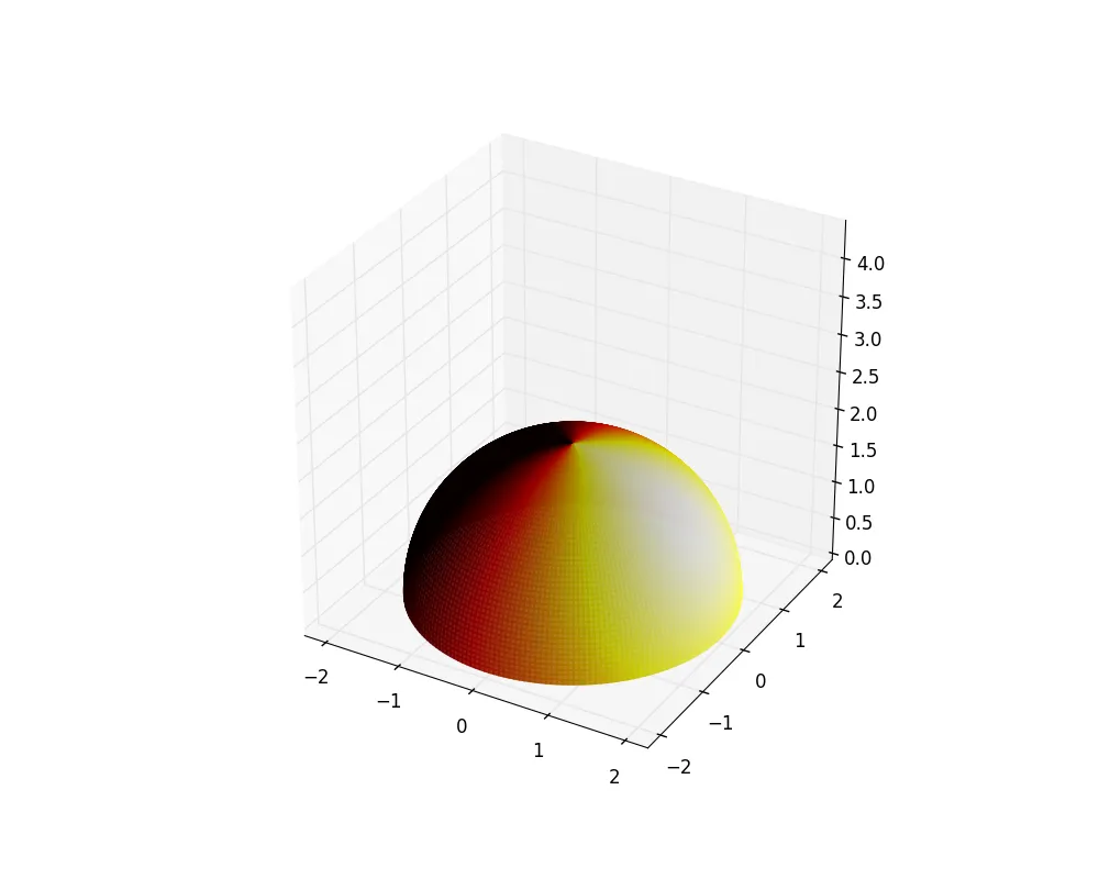
最终,我希望得到一个类似于这样的图:
![热力图[1]](https://istack.dev59.com/ckbWN.webp) 我知道如何使用以下代码创建半球形,但是如何将来自我的数据框中的值分配给它呢?
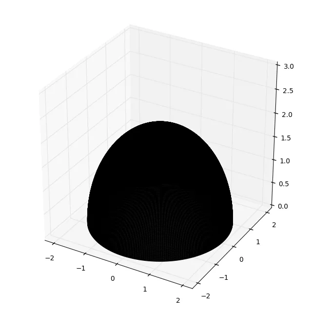
我知道如何使用以下代码创建半球形,但是如何将来自我的数据框中的值分配给它呢?
import matplotlib.pyplot as plt
from matplotlib import cm, colors
from mpl_toolkits.mplot3d import Axes3D
import numpy as np

# Create a sphere
r = 2
pi = np.pi
cos = np.cos
sin = np.sin
altitude
phi, theta = np.mgrid[0.0:0.5*pi:180j, 0.0:2.0*pi:720j] # phi = alti, theta = azi
x = r*sin(phi)*cos(theta)
y = r*sin(phi)*sin(theta)
z = r*cos(phi)
#Set colours and render
fig = plt.figure(figsize=(10, 8))
ax = fig.add_subplot(111, projection='3d')
ax.plot_surface(
    x, y, z,  rstride=4, cstride=4, color='w', alpha=0.1, linewidth=0)
ax.set_xlim([-2.2,2.2])
ax.set_ylim([-2.2,2.2])
ax.set_zlim([0,3])
ax.set_aspect("equal")
ax.plot_wireframe(x, y, z, color="k")
这段代码生成了下面这个图像:
c必须是与x、y、z相同形状的数组。因此,位于z[yi,xi]的点的颜色需要是c[yi,xi]。如何获取这取决于您拥有的数据,这里重新整形是一个简单的选项。 - ImportanceOfBeingErnest