在JFreeChart中创建热力图有点棘手,因为目前(截至版本1.0.19/1.5.0),没有相应的图表类型或绘图用于此用例。(可用的
HeatMapDataset是为与
HeatMapUtilities一起使用而编写的,正如
David Gilbert在论坛中所述。)
创建热图的最佳方式是使用
XYPlot与
XYBlockRenderer和
XYZDataset,就像
trashgod已经写过的那样。
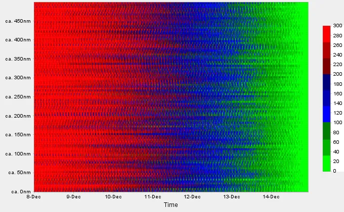
下面是一个完整的、简洁的示例,您可以运行它以获得下面所示的图表:
import org.jfree.chart.ChartPanel;
import org.jfree.chart.JFreeChart;
import org.jfree.chart.axis.*;
import org.jfree.chart.plot.XYPlot;
import org.jfree.chart.renderer.LookupPaintScale;
import org.jfree.chart.renderer.xy.XYBlockRenderer;
import org.jfree.chart.title.PaintScaleLegend;
import org.jfree.data.xy.DefaultXYZDataset;
import org.jfree.data.xy.XYZDataset;
import org.jfree.ui.ApplicationFrame;
import org.jfree.ui.RectangleEdge;
import java.awt.*;
import java.util.Random;
public class HeatMapDemo extends ApplicationFrame
{
public HeatMapDemo()
{
super("JFreeChart Heatmap Demo");
final JFreeChart chart = createChart(createDataset());
setContentPane(new ChartPanel(chart));
}
private static JFreeChart createChart(XYZDataset dataset)
{
DateAxis xAxis = new DateAxis("Time");
xAxis.setStandardTickUnits(DateAxis.createStandardDateTickUnits());
xAxis.setLowerMargin(0);
xAxis.setUpperMargin(0);
String labels[] = new String[500];
for (int i = 0; i < 500; i++)
labels[i] = "ca. " + i + "nm";
SymbolAxis yAxis = new SymbolAxis(null, labels);
yAxis.setTickUnit(new NumberTickUnit(50));
NumberAxis valueAxis1 = new NumberAxis("Marker");
valueAxis1.setLowerMargin(0);
valueAxis1.setUpperMargin(0);
valueAxis1.setVisible(false);
LookupPaintScale paintScale = new LookupPaintScale(0, 300, Color.black);
Color c = Color.green;
paintScale.add(0.0, c);
paintScale.add(33.0, c = c.darker());
paintScale.add(66.0, c.darker());
paintScale.add(100.0, c = Color.blue);
paintScale.add(133.0, c = c.darker());
paintScale.add(166.0, c.darker());
paintScale.add(200.0, c = Color.red.darker().darker());
paintScale.add(233.0, c = c.brighter());
paintScale.add(266.0, c.brighter());
PaintScaleLegend psl = new PaintScaleLegend(paintScale, new NumberAxis());
psl.setPosition(RectangleEdge.RIGHT);
psl.setAxisLocation(AxisLocation.TOP_OR_RIGHT);
psl.setMargin(50.0, 20.0, 80.0, 0.0);
XYPlot plot = new XYPlot(dataset, xAxis, yAxis, new XYBlockRenderer());
((XYBlockRenderer)plot.getRenderer()).setPaintScale(paintScale);
plot.setRangeAxis(1, valueAxis1);
plot.mapDatasetToRangeAxis(0, 1);
JFreeChart chart = new JFreeChart(null, null, plot, false);
chart.addSubtitle(psl);
return chart;
}
public XYZDataset createDataset()
{
double[] xvalues = new double[1000*100];
double[] yvalues = new double[1000*100];
double[] zvalues = new double[1000*100];
final Random rand = new Random();
long l = System.currentTimeMillis();
for (int i = 0; i < 1000; i++) {
l -= 600000;
for (int j = 0; j < 100; j++) {
final int idx = i * 100 + j;
xvalues[idx] = l;
yvalues[idx] = j;
double delta = rand.nextInt(15) * (rand.nextInt(4) == 0 ? -1 : 1);
zvalues[idx] = Math.max(0, Math.min(300,
(idx < 1000 ? 0 : zvalues[idx - 1000]) + delta));
}
}
DefaultXYZDataset dataset = new DefaultXYZDataset();
dataset.addSeries("Just one Series", new double[][] { xvalues, yvalues, zvalues });
return dataset;
}
public static void main(String args[])
{
final HeatMapDemo demo = new HeatMapDemo();
demo.pack();
demo.setVisible(true);
}
}
生成的热力图如下所示:
如果您需要一个更线性的
PaintScale,可以看一下
这个答案中的SpectrumPaintScale实现。