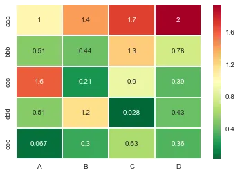
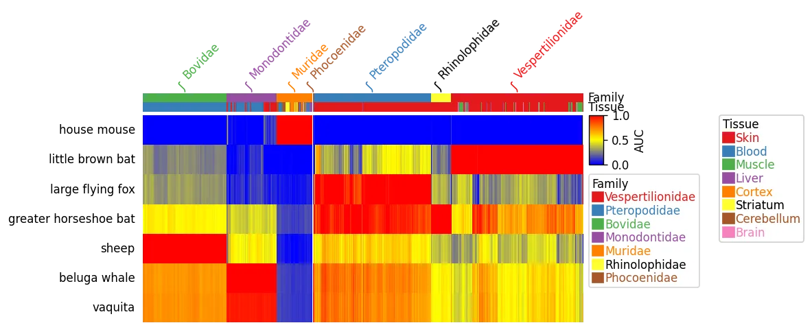
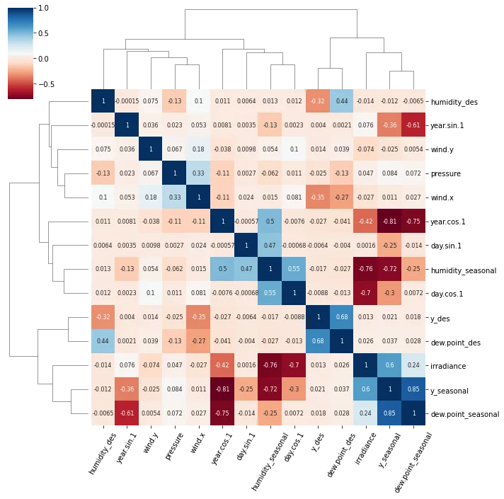
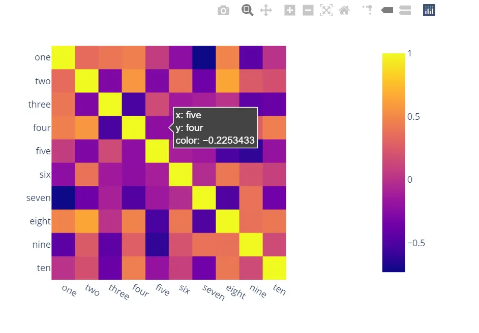
惊讶地发现没有人提到更有能力、互动性和易于使用的替代方案。
A)您可以使用Plotly:
只需两行代码即可获得:
交互性,
平稳的比例尺,
基于整个数据框而不是单独列的颜色,
轴上的列名和行索引,
缩放功能,
平移功能,
内置一键操作将其保存为PNG格式,
自动缩放,
悬停比较,
气泡显示值,因此热图仍然很好看,您可以在任何地方查看值:
import plotly.express as px
fig = px.imshow(df.corr())
fig.show()
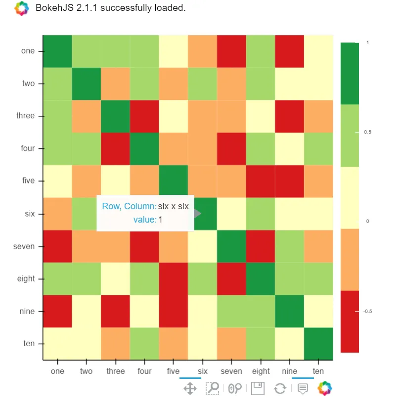
B) 你也可以使用Bokeh:
所有相同的功能,但需要更多的麻烦。但是如果您不想选择plotly,同时又想要所有这些功能,仍然值得一试:
from bokeh.plotting import figure, show, output_notebook
from bokeh.models import ColumnDataSource, LinearColorMapper
from bokeh.transform import transform
output_notebook()
colors = ['#d7191c', '#fdae61', '#ffffbf', '#a6d96a', '#1a9641']
TOOLS = "hover,save,pan,box_zoom,reset,wheel_zoom"
data = df.corr().stack().rename("value").reset_index()
p = figure(x_range=list(df.columns), y_range=list(df.index), tools=TOOLS, toolbar_location='below',
           tooltips=[('Row, Column', '@level_0 x @level_1'), ('value', '@value')], height = 500, width = 500)

p.rect(x="level_1", y="level_0", width=1, height=1,
       source=data,
       fill_color={'field': 'value', 'transform': LinearColorMapper(palette=colors, low=data.value.min(), high=data.value.max())},
       line_color=None)
color_bar = ColorBar(color_mapper=LinearColorMapper(palette=colors, low=data.value.min(), high=data.value.max()), major_label_text_font_size="7px",
                     ticker=BasicTicker(desired_num_ticks=len(colors)),
                     formatter=PrintfTickFormatter(format="%f"),
                     label_standoff=6, border_line_color=None, location=(0, 0))
p.add_layout(color_bar, 'right')

show(p)