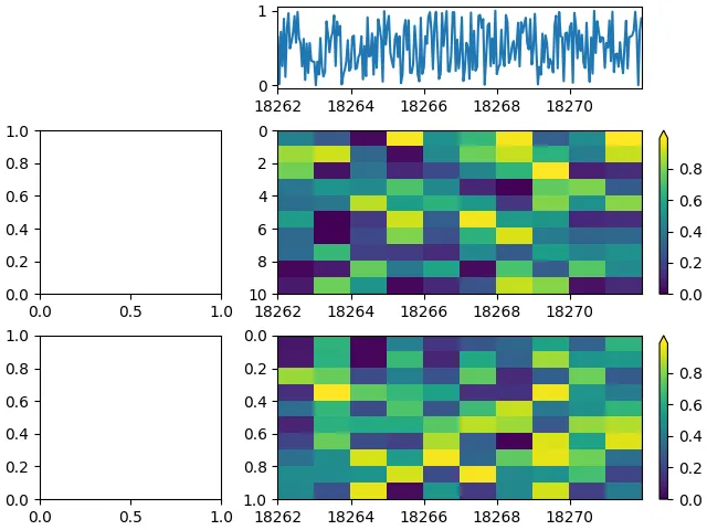
我试图在共享x轴的两个imshow和一个plot上面绘制它们。该图的布局是使用gridspec设置的。
这是一个最小工作示例:
这个情节的最终结果如下: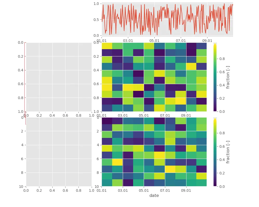 尽管轴似乎是相互关联的(应用于所有轴的日期格式),但它们的范围不同。
注意:两个左轴不能共享相同的x轴。
编辑:添加了ConnectionPatch连接,但在使用constrained_layout时会出现断裂。
    import matplotlib as mpl
    from matplotlib import pyplot as plt
    import numpy as np
    fig = plt.figure(figsize=(10,8))
    gs = fig.add_gridspec(3,2,width_ratios=(1,2),height_ratios=(1,2,2), left=0.1,right=0.9,bottom=0.1,top=0.99, wspace=0.1, hspace=0.1)
    ax=fig.add_subplot(gs[2,1])
    ax2=fig.add_subplot(gs[2,0], sharey=ax)
    ax3=fig.add_subplot(gs[1,0])
    ax4=fig.add_subplot(gs[1,1], sharex=ax, sharey=ax3)
    ax5=fig.add_subplot(gs[0,1], sharex=ax)

    dates = pd.date_range("2020-01-01","2020-01-10 23:00", freq="H")
    xs = mpl.dates.date2num(dates)
    ys = np.random.random(xs.size)
    N = 10
    arr = np.random.random((N, N))
    arr2 = np.random.random((N, N))

    norm=mpl.colors.Normalize(0, arr.max()) # change the min to stretch the color spectrum
    pcm = ax.imshow(arr, extent=[xs[0],xs[-1],10,0],norm=norm,aspect='auto')
    cax = fig.colorbar(pcm, ax=ax, extend='max') # , location='left'
    ax.set_xlabel('date')
    cax.set_label('fraction [-]')
    # ax.xaxis_date()
    myFmt = mpl.dates.DateFormatter('%d.%m')
    ax.xaxis.set_major_formatter(myFmt)

    norm=mpl.colors.Normalize(0, arr2.max()) # change the min to stretch the color spectrum
    pcm = ax4.imshow(arr2, extent=[xs[0],xs[-1],1,0],norm=norm,aspect='auto')
    cax4 = fig.colorbar(pcm, ax=ax4, extend='max')
    cax4.set_label('fraction [-]')

    ax5.plot(xs,ys)

    con1 = ConnectionPatch(xyA=(ax2.get_xlim()[0],1), xyB=(ax2.get_xlim()[0],1),
                       coordsA="data", coordsB="data", connectionstyle=mpl.patches.ConnectionStyle("Bar", fraction=-0.05),
                       axesA=ax2, axesB=ax3, arrowstyle="-", color='r')

    con2 = ConnectionPatch(xyA=(ax2.get_xlim()[0],0), xyB=(ax2.get_xlim()[0],0),
                       coordsA="data", coordsB="data", connectionstyle=mpl.patches.ConnectionStyle("Bar", fraction=-0.02),
                       axesA=ax2, axesB=ax3, arrowstyle="-", color='r')

    fig.add_artist(con1)
    fig.add_artist(con2)
这个情节的最终结果如下:
尽管轴似乎是相互关联的(应用于所有轴的日期格式),但它们的范围不同。注意:两个左轴不能共享相同的x轴。
编辑:添加了ConnectionPatch连接,但在使用constrained_layout时会出现断裂。
width_ratios=(5,10,1))。然后你可以这样做cax1 = fig.add_subplot(gs[1,2])和fig.colorbar(...cax=cax1)来将颜色条放在那里。 - JohanC