Matplotlib子图:imshow + plot

3

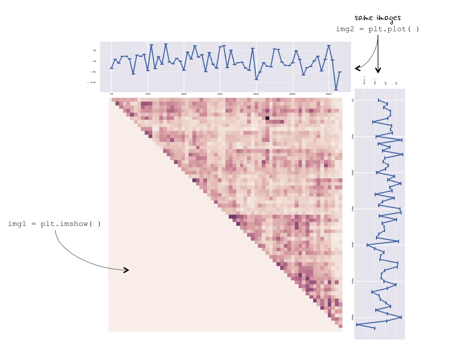
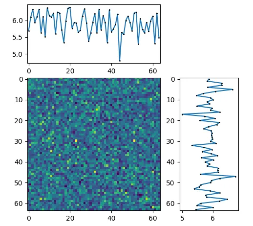
我希望创建一个看起来像下面图片的图表。该图表包含两个独特的绘图区域。img1是使用plt.imshow()生成的,而img2是使用plt.plot()生成的。我用于生成每个图表的代码如下所示:

plt.clf()
plt.imshow(my_matrix)
plt.savefig("mymatrix.png")

plt.clf()
plt.plot(x,y,'o-')
plt.savefig("myplot.png")

img1中使用的矩阵是64x64。对于img2的x轴,范围也是x=range(64)。理想情况下,两个img2的x轴与img1的轴对齐。

需要注意的是,最终图像让人想起seaborn的jointplot(),但下面的边缘子图(img2)没有显示分布图。

Ideal output with annotation

1个回答

4
您可以使用mpl_toolkits.axes_grid1make_axes_locatable功能,在中心imshow绘图的两个方向上创建共享轴。

这里有一个例子:

import matplotlib.pyplot as plt
from mpl_toolkits.axes_grid1 import make_axes_locatable
import numpy as np; np.random.seed(0)

Z = np.random.poisson(lam=6, size=(64,64))
x = np.mean(Z, axis=0)
y = np.mean(Z, axis=1)

fig, ax = plt.subplots()
ax.imshow(Z)

# create new axes on the right and on the top of the current axes.
divider = make_axes_locatable(ax)
axtop = divider.append_axes("top", size=1.2, pad=0.3, sharex=ax)
axright = divider.append_axes("right", size=1.2, pad=0.4, sharey=ax)
#plot to the new axes
axtop.plot(np.arange(len(x)), x, marker="o", ms=1, mfc="k", mec="k")
axright.plot(y, np.arange(len(y)), marker="o", ms=1, mfc="k", mec="k")
#adjust margins
axright.margins(y=0)
axtop.margins(x=0)
plt.tight_layout()
plt.show()

enter image description here


太棒了!这正是我需要的!谢谢! - undefined

网页内容由stack overflow 提供, 点击上面的
可以查看英文原文,
原文链接