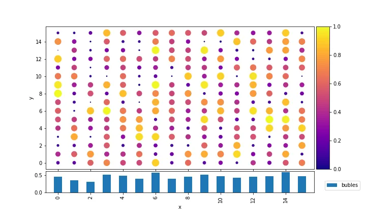
Sharex 表示轴限制相同且轴已同步。这并不意味着它们重叠在一起。这取决于您如何创建色条。
Pandas 散点图创建的色条与 matplotlib 中的任何标准色条一样,都是通过从与其相关联的轴上取走一部分空间来创建的。因此,此轴比网格中的其他轴小。
您可以选择以下选项:
import matplotlib.pyplot as plt
import pandas as pd
import numpy as np
import itertools as it

xy = list( it.product( range(10), range(10) ) )
df = pd.DataFrame( xy, columns=['x','y'] )
df['score'] = np.random.random( 100 )

kw = {'height_ratios':[13,2]}
fig, (ax,ax2) = plt.subplots(2,1,  gridspec_kw=kw, sharex=True)

df.plot(kind='scatter', x='x',  y='y', c='score', s=100, cmap="PuRd",
          ax=ax, colorbar=True)
df.groupby("x").mean().plot(kind = 'bar', y='score',ax=ax2, legend=False)

ax2.legend(bbox_to_anchor=(1.03,0),loc=3)

pos = ax.get_position()
pos2 = ax2.get_position()
ax2.set_position([pos.x0,pos2.y0,pos.width,pos2.height])

plt.show()
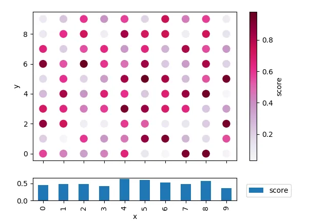
fig.colorbar(ax.collections[0], cax=cax)
然后移除不需要的右下轴线 (ax.axis("off"))。如果需要的话,您仍然可以通过 ax2.get_shared_x_axes().join(ax, ax2) 来共享坐标轴。
import matplotlib.pyplot as plt
import pandas as pd
import numpy as np
import itertools as it


xy = list( it.product( range(10), range(10) ) )
df = pd.DataFrame( xy, columns=['x','y'] )
df['score'] = np.random.random( 100 )

kw = {'height_ratios':[13,2], "width_ratios":[95,5]}
fig, ((ax, cax),(ax2,aux)) = plt.subplots(2,2,  gridspec_kw=kw)

df.plot(kind='scatter', x='x',  y='y', c='score', s=80, cmap="PuRd",
         ax=ax,colorbar=False)
df.groupby("x").mean().plot(kind = 'bar', y='score',ax=ax2, legend=False)

fig.colorbar(ax.collections[0], cax=cax, label="score")
aux.axis("off")
ax2.legend(bbox_to_anchor=(1.03,0),loc=3)
ax2.get_shared_x_axes().join(ax, ax2)
ax.tick_params(axis="x", labelbottom=0)
ax.set_xlabel("")

plt.show()
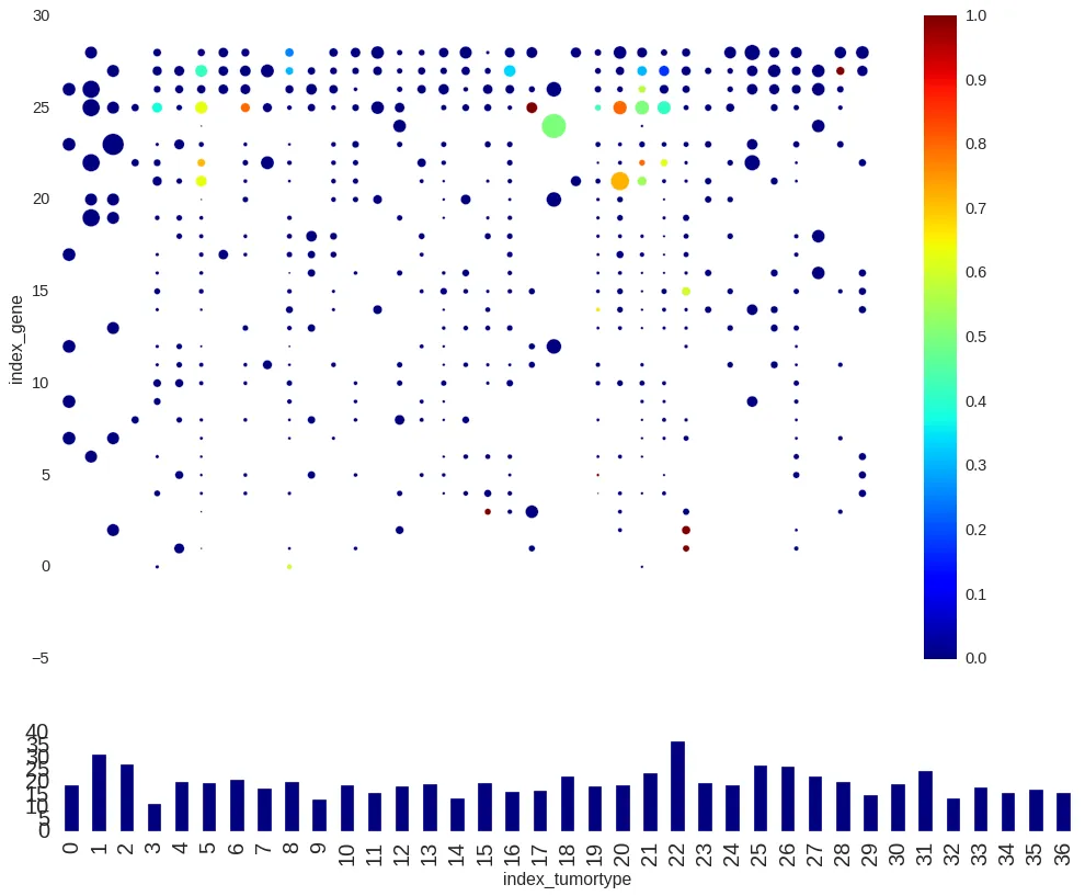 我有两个子图,一个是散点图,另一个是柱状图,我希望它们共享x轴。散点图还有一个颜色条。然而,由于两个图的轴不重合,共享x轴似乎无法使用。