修改 matplotlib 2D 数组颜色条图的轴。

7
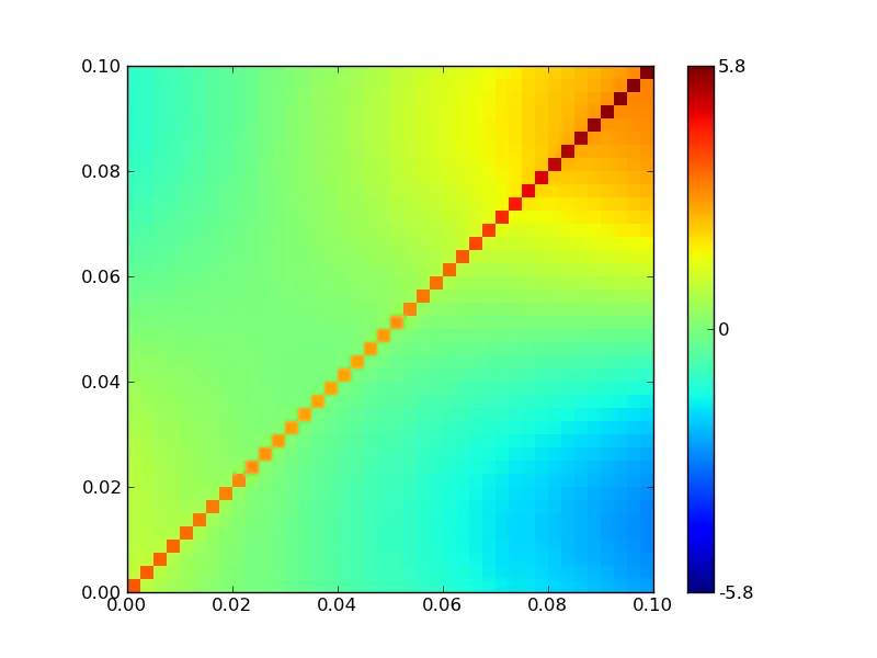
我有一个2D的numpy数组,想在colorbar中绘制它。我遇到了一些问题,无法更改坐标轴以显示我的数据集。垂直轴从0到100向下延伸,而我希望它从0.0到0.1向上延伸。所以我需要做两件事:
  • 使用np.flipud()翻转数组,然后也要“翻转”轴
  • 将标签更改为从0到0.1,而不是从0到100
这是我当前colorbar图的示例: Example of Colorbar plot 以下是代码:
data = np.load('scorr.npy')
(x,y) = np.unravel_index(data.argmax(), data.shape)
max=data[x][y]

fig = plt.figure()
ax = fig.add_subplot(111)
cax = ax.imshow(data, interpolation='nearest')
cbar = fig.colorbar(cax, ticks=[-max, 0, max])
cbar.ax.set_yticklabels([str(-max), '0', str(max)])
plt.show()

有没有人有建议呢?提前谢谢!
2个回答

9

我想您需要查看imshow选项中的“origin”和“extent”。

import matplotlib.pyplot as plt
import numpy as np

x,y = np.mgrid[-2:2:0.1, -2:2:0.1]
data = np.sin(x)*(y+1.05**(x*np.floor(y))) + 1/(abs(x-y)+0.01)*0.03

fig = plt.figure()
ax = fig.add_subplot(111)
ticks_at = [-abs(data).max(), 0, abs(data).max()]
cax = ax.imshow(data, interpolation='nearest', 
                origin='lower', extent=[0.0, 0.1, 0.0, 0.1],
                vmin=ticks_at[0], vmax=ticks_at[-1])
cbar = fig.colorbar(cax,ticks=ticks_at,format='%1.2g')
fig.savefig('out.png')

extent and origin


0
我所知道的唯一更改图像绘制轴标签的方法是手动标记... 如果有人有更简洁的方法,我很乐意学习。
ax.yaxis.set_ticks(np.arange(0,100,10))
ax.yaxis.set_ticklabels(['%.2f' % 0.1/100*i for i in np.arange(0,100,10)]) 

网页内容由stack overflow 提供, 点击上面的
可以查看英文原文,
原文链接