在我开始之前,我想说一下,我曾尝试过遵循这篇和这篇关于同样问题的帖子,但是它们使用了像imshow热图这样的东西,而不是像我所做的2D直方图。
以下是我的代码(实际数据已被随机生成的数据替换,但主要思路是相同的):
import matplotlib.pyplot as plt
import numpy as np
def subplots_hist_2d(x_data, y_data, x_labels, y_labels, titles):
fig, a = plt.subplots(2, 2)
a = a.ravel()
for idx, ax in enumerate(a):
image = ax.hist2d(x_data[idx], y_data[idx], bins=50, range=[[-2, 2],[-2, 2]])
ax.set_title(titles[idx], fontsize=12)
ax.set_xlabel(x_labels[idx])
ax.set_ylabel(y_labels[idx])
ax.set_aspect("equal")
cb = fig.colorbar(image[idx])
cb.set_label("Intensity", rotation=270)
# pad = how big overall pic is
# w_pad = how separate they're left to right
# h_pad = how separate they're top to bottom
plt.tight_layout(pad=-1, w_pad=-10, h_pad=0.5)
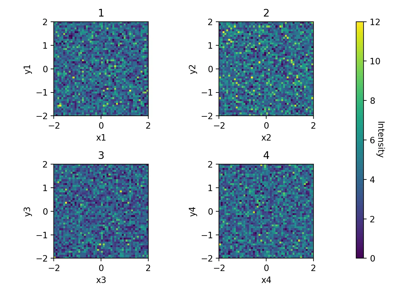
x1, y1 = np.random.uniform(-2, 2, 10000), np.random.uniform(-2, 2, 10000)
x2, y2 = np.random.uniform(-2, 2, 10000), np.random.uniform(-2, 2, 10000)
x3, y3 = np.random.uniform(-2, 2, 10000), np.random.uniform(-2, 2, 10000)
x4, y4 = np.random.uniform(-2, 2, 10000), np.random.uniform(-2, 2, 10000)
x_data = [x1, x2, x3, x4]
y_data = [y1, y2, y3, y4]
x_labels = ["x1", "x2", "x3", "x4"]
y_labels = ["y1", "y2", "y3", "y4"]
titles = ["1", "2", "3", "4"]
subplots_hist_2d(x_data, y_data, x_labels, y_labels, titles)
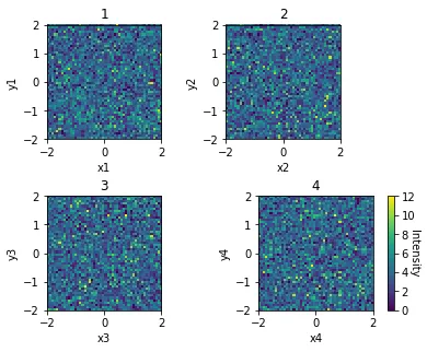
以下是它生成的内容:
现在我的问题是,我无论如何都不能让颜色条应用于这4个直方图。另外,由于某种原因,右下角的直方图与其他直方图相比表现得有些奇怪。在我发布的链接中,他们的方法似乎没有使用 a = a.ravel(),我之所以在这里使用它,是因为这是唯一允许我将4个直方图绘制为子图的方法。请帮帮我吗?
编辑:
Thomas Kuhn 的新方法实际上解决了我所有的问题,直到我放置标签并尝试使用 plt.tight_layout() 排列重叠的部分。如果我在 plt.tight_layout(pad=i, w_pad=0, h_pad=0) 中放置特定的参数,则似乎颜色条开始表现不正常。我现在来解释一下我的问题。
我对您的新方法进行了一些更改,以使其适合我的需要,就像这样
def test_hist_2d(x_data, y_data, x_labels, y_labels, titles):
    nrows, ncols = 2, 2
    fig, axes = plt.subplots(nrows, ncols, sharex=True, sharey=True)
    ##produce the actual data and compute the histograms
    mappables=[]
    for (i, j), ax in np.ndenumerate(axes):
        H, xedges, yedges = np.histogram2d(x_data[i][j], y_data[i][j], bins=50, range=[[-2, 2],[-2, 2]])
        ax.set_title(titles[i][j], fontsize=12)
        ax.set_xlabel(x_labels[i][j])
        ax.set_ylabel(y_labels[i][j])
        ax.set_aspect("equal")
        mappables.append(H)

    ##the min and max values of all histograms
    vmin = np.min(mappables)
    vmax = np.max(mappables)

    ##second loop for visualisation
    for ax, H in zip(axes.ravel(), mappables):
        im = ax.imshow(H,vmin=vmin, vmax=vmax, extent=[-2,2,-2,2])

    ##colorbar using solution from linked question
    fig.colorbar(im,ax=axes.ravel())
    plt.show()
#    plt.tight_layout
#    plt.tight_layout(pad=i, w_pad=0, h_pad=0)
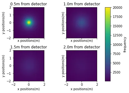
现在,如果我尝试生成我的数据,就像这样:
phi, cos_theta = get_angles(runs)

detector_x1, detector_y1, smeared_x1, smeared_y1 = detection_vectorised(1.5, cos_theta, phi)
detector_x2, detector_y2, smeared_x2, smeared_y2 = detection_vectorised(1, cos_theta, phi)
detector_x3, detector_y3, smeared_x3, smeared_y3 = detection_vectorised(0.5, cos_theta, phi)
detector_x4, detector_y4, smeared_x4, smeared_y4 = detection_vectorised(0, cos_theta, phi)
这里的
detector_x, detector_y, smeared_x, smeared_y都是数据点列表,现在我将它们放入2x2列表中,以便于我的绘图函数适当地进行解包,方法如下:data_x = [[detector_x1, detector_x2], [detector_x3, detector_x4]]
data_y = [[detector_y1, detector_y2], [detector_y3, detector_y4]]
x_labels = [["x positions(m)", "x positions(m)"], ["x positions(m)", "x positions(m)"]]
y_labels = [["y positions(m)", "y positions(m)"], ["y positions(m)", "y positions(m)"]]
titles = [["0.5m from detector", "1.0m from detector"], ["1.5m from detector", "2.0m from detector"]]
我现在使用以下代码运行:
test_hist_2d(data_x, data_y, x_labels, y_labels, titles)
只需打开plt.show(),它就会显示如下图所示:
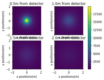
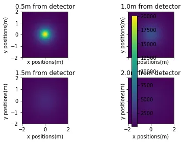
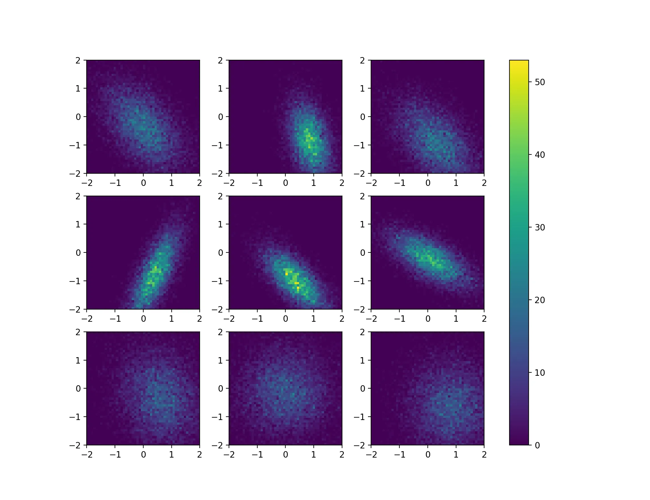
这很好,因为数据和可视化方面,这正是我想要的,即色彩映射对应于所有4个直方图。然而,由于标签与标题重叠,我认为我只需运行相同的代码,但这次使用plt.tight_layout(pad=a, w_pad=b, h_pad=c),希望能够解决标签重叠的问题。但是这一次,无论我如何更改数字a,b和c,我总是得到我的色条在第二列图形上,就像这样:
现在,只有更改a使整体子图变大或变小,我最好的办法就是使用plt.tight_layout(pad=-10, w_pad=-15, h_pad=0)进行调整,看起来像这样:
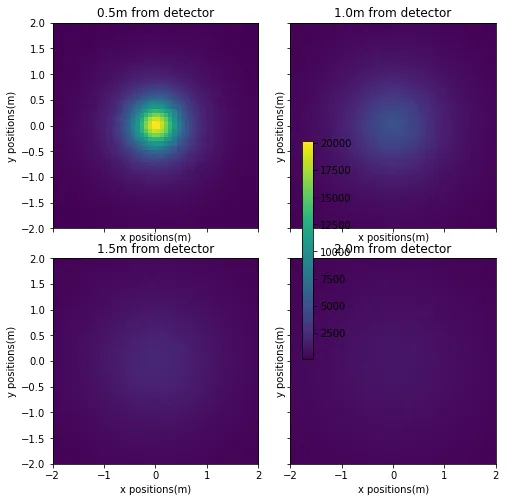
因此,无论您的新方法是如何做到的,它都使整个图形失去了可调性。您的解决方案虽然很好地解决了一个问题,但却引发了另一个问题。那么在这里应该怎么做呢?
编辑2:
使用fig,axes = plt.subplots(nrows,ncols,sharex=True,sharey=True,constrained_layout=True)以及plt.show(),结果如下:
正如您所看到的,子图列之间仍然存在垂直间隙,即使使用plt.subplots_adjust()也无法消除。
tight_layout可以解决2D直方图之间间隔的问题。原因是imshow会为轴使用等比例,而您的直方图是正方形的。tight_layout始终尝试平均填充空间。我认为有两个相当简单的解决方法:(1)使用非等比例(imshow(...,aspect ='auto')),或(2)玩弄图形的宽高比,例如使用plt.subplots(..., figsize = (4.8,4))。 - Thomas Kühn