我使用pyplot.hist()函数创建了一个带有matplotlib的直方图。我想在条形图上添加一个 bin 高度的平方根(sqrt(binheight))作为误差值。请问如何做到这一点?
.hist()函数的返回元组中包括return[2] -> 一个由1个Patch对象组成的列表。我只找到了通过 pyplot.bar() 创建的柱状图才能添加误差。
我使用pyplot.hist()函数创建了一个带有matplotlib的直方图。我想在条形图上添加一个 bin 高度的平方根(sqrt(binheight))作为误差值。请问如何做到这一点?
.hist()函数的返回元组中包括return[2] -> 一个由1个Patch对象组成的列表。我只找到了通过 pyplot.bar() 创建的柱状图才能添加误差。
确实需要使用 bar。你可以使用 hist 的输出结果并将其绘制成条形图:
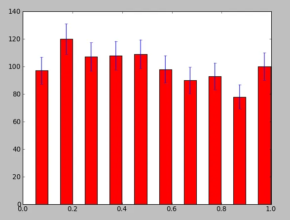
import numpy as np
import pylab as plt

data       = np.array(np.random.rand(1000))
y,binEdges = np.histogram(data,bins=10)
bincenters = 0.5*(binEdges[1:]+binEdges[:-1])
menStd     = np.sqrt(y)
width      = 0.05
plt.bar(bincenters, y, width=width, color='r', yerr=menStd)
plt.show()
您也可以使用pyplot.errorbar()和drawstyle关键字参数的组合。下面的代码创建了一个直方图的图形,使用了阶梯线图。每个条柱中心都有一个标记,每个条柱都带有所需的泊松误差线。
import numpy
import pyplot

x = numpy.random.rand(1000)
y, bin_edges = numpy.histogram(x, bins=10)
bin_centers = 0.5*(bin_edges[1:] + bin_edges[:-1])

pyplot.errorbar(
    bin_centers,
    y,
    yerr = y**0.5,
    marker = '.',
    drawstyle = 'steps-mid-'
)
pyplot.show()
当在同一图中绘制多个直方图的结果时,线性图更容易区分。此外,在使用yscale='log'绘图时,它们看起来更漂亮。
pyplot.errorbar中使用fmt='none'选项,可以只绘制误差线。 - Kevin Powell