在 Pandas 中使用 Matplotlib 对分组数据进行直方图绘制

3

我有一个数据框,我在其中对两列进行分组:

ax = df_all.groupby(['Component', 'SubComponent' ])['SubComponent'].count()

这将给我带来以下结果:

--------------------------------------------------
| Component | SubComponent|                      |
--------------------------------------------------
|A          |First        |                     1|
--------------------------------------------------
|           |Second       |                    10|
--------------------------------------------------
|           |Third        |                     6|
--------------------------------------------------
|B          |First        |                     8|
--------------------------------------------------
|           |Second       |                     5|
--------------------------------------------------
|           |Third        |                    17|
--------------------------------------------------

现在我想用它来制作直方图。 每个条形图将是组件,每个组件将被分成子组件,显示每个子组件的出现次数和不同颜色。
使用matplotlib.pyploy有简单的方法来实现吗?
谢谢, Submi
1个回答

3
您可以使用 unstackDataFrame.plot.bar
print (ax.unstack())
SubComponent  First  Second  Third
Component                         
A                 1       4     15
B                 6       2      1

ax.unstack().plot.bar(stacked=True)

graph


print (ax.unstack(0))
Component      A  B
SubComponent       
First          1  6
Second         4  2
Third         15  1

ax.unstack(0).plot.bar(stacked=True)

graph3

< p > 注意:

pandas中size和count的区别是什么?


你知道为什么我无法使用plt.figure(figsize =(10,8))更改此绘图的大小吗? - Submi
1
尝试使用 
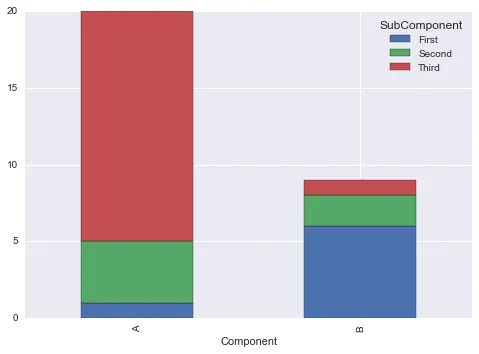
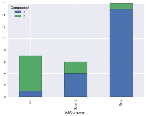
ax.unstack().plot.bar(stacked=True, figsize=(10, 8)) - jezrael

网页内容由stack overflow 提供, 点击上面的
可以查看英文原文,
原文链接