这是在Windows 7 x64位机器上运行的Python 3.4.3 x64位环境,使用PyCharm Educational edition 1.0.1编译器。程序所用数据来自于纽约市的Citi Bike计划(数据可在此处找到:http://www.citibikenyc.com/system-data)。
我已经将数据排序,生成了一个只包含独特自行车ID和每辆自行车骑行次数的CSV文件(文件名为Sorted_Bike_Uses.csv)。我试图制作一张以自行车ID为横轴、使用次数为纵轴的图表。我的代码如下:
它创建了一个几乎正确格式的图表。唯一的问题是它对自行车ID进行数字顺序排序,而不是按使用顺序排序。我尝试重新利用以前用于制作类似图表的旧代码,但只会制作出更糟糕的图表,一些数据被绘制了两次。效果如下:
第二组代码使用与第一组代码相同的数据集,并已更改为适合Citi Bike数据。我的谷歌技巧已经用尽。我尝试重新格式化xticks,将第二个代码的片段添加到第一个代码中,将第一个代码的片段添加到第二个代码中等等。可能有些东西就在我面前,但我看不见它。任何帮助都会感激。
我已经将数据排序,生成了一个只包含独特自行车ID和每辆自行车骑行次数的CSV文件(文件名为Sorted_Bike_Uses.csv)。我试图制作一张以自行车ID为横轴、使用次数为纵轴的图表。我的代码如下:
import pandas as pd
import matplotlib.pyplot as plt

# read in the file and separate it into two lists
a = pd.read_csv('Sorted_Bike_Uses.csv', header=0)
b = a['Bike ID']
c = a['Number of Uses']

# create the graph
plt.plot(b, c)

# label the x and y axes
plt.xlabel('Bicycles', weight='bold', size='large')
plt.ylabel('Number of Rides', weight='bold', size='large')

# format the x and y ticks
plt.xticks(rotation=50, horizontalalignment='right', weight='bold', size='large')
plt.yticks(weight='bold', size='large')

# give it a title
plt.title("Top Ten Bicycles (by # of uses)", weight='bold')

# displays the graph
plt.show()
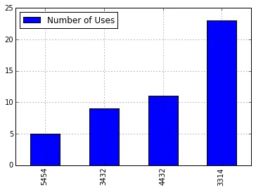
它创建了一个几乎正确格式的图表。唯一的问题是它对自行车ID进行数字顺序排序,而不是按使用顺序排序。我尝试重新利用以前用于制作类似图表的旧代码,但只会制作出更糟糕的图表,一些数据被绘制了两次。效果如下:
my_plot = a.sort(columns='Number of Uses', ascending=True).plot(kind='bar', legend=None)

# labels the x and y axes
my_plot.set_xlabel('Bicycles')
my_plot.set_ylabel('Number of Rides')

# sets the labels along the x-axis as the names of each liquor
my_plot.set_xticklabels(b, rotation=45, horizontalalignment='right')

# displays the graph
plt.show()
第二组代码使用与第一组代码相同的数据集,并已更改为适合Citi Bike数据。我的谷歌技巧已经用尽。我尝试重新格式化xticks,将第二个代码的片段添加到第一个代码中,将第一个代码的片段添加到第二个代码中等等。可能有些东西就在我面前,但我看不见它。任何帮助都会感激。
plot(b, c)会将b绘制在c上。如果你想按照车次的顺序绘制它们,请使用作为排序后数字的x轴。 - tacaswell