Plotly去除X轴排序

7
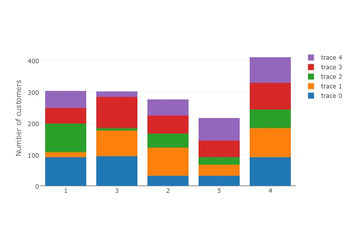
我想绘制一个条形图。在x轴上是顾问的ID,它们的范围在1000到2000之间。每个顾问都有特定数量的客户(y轴)。
现在我想在plotly中绘制条形图。但是plotly按照顾问ID升序排序并将其解释为整数,但实际上它们不是。它们应该按照我给plotly的列表进行排序。
顺便说一下,在matplotlib中顺序是正确的。
trace1 = go.Bar(
    x=consultants, 
    y=info[0,:]
)
trace2 = go.Bar(
    x=consultants,
    y=info[1,:],
)
trace3 = go.Bar(
    x=consultants,
    y=info[2,:]
)
trace4 = go.Bar(
   x=consultants,
   y=info[3,:]
)

data = [trace1, trace2, trace3, trace4]
layout = go.Layout(
       barmode='stack',
       xaxis=dict(
       categoryorder='array',
       categoryarray=consultants,
       titlefont=dict(
         size=18,
         color='black'),
       showticklabels=True,
       tickfont=dict(
        size=16,
        color='black',
        ),
    tickangle=20
    ),
yaxis=dict(
    title='Number of customers',
       titlefont=dict(
        size=18,
        color='black'),
    showgrid=True,
    showline=False,
    showticklabels=True,
    tickfont=dict(
        size=16,
        color='black')
    ),

  )

fig = go.Figure(data=data, layout=layout)
py.iplot(fig, filename='stacked-bar')

请查看:https://plot.ly/python/reference/#layout-xaxis-categoryorder - Maximilian Peters
似乎是正确的关键字。但如果我输入categoryorder='array',那么categoryarray应该长什么样呢?它是list(range(len(num_consultants)))还是num_consultants?到目前为止还没有效果。 - user47091
2个回答

5

最新版的Plotly现在在布局选项中有一个变量,用于指定X轴的分类布局:

fig.update_layout(
xaxis_type = 'category'
)

4
有趣的是,Plotly似乎忽略整数的“categoryorder”,但可以通过在“layout”的“xaxis”中传递type='category'来禁用排序。

type (枚举:"- " | "linear" | "log" | "date" | "category")

默认值: "-"
设置轴类型。 默认情况下,plotly尝试通过查看引用有关轴的跟踪的数据来确定轴类型。

enter image description here

import plotly
import plotly.graph_objs as go
import numpy as np

plotly.offline.init_notebook_mode()

consultants = [1, 3, 2, 5, 4]
info = np.random.randint(100, size=(5,5))

data = []
for i in range(len(info)):
    data.append(go.Bar(x=consultants, 
                       y=info[i,:]))

layout = go.Layout(barmode='stack', 
                   xaxis=dict(type='category'),
                   yaxis=dict(title='Number of customers'))

fig = go.Figure(data=data, layout=layout)
plotly.offline.iplot(fig, filename='stacked-bar')

这似乎不起作用。输出为 0 1 2 3 4,但我想要的是 4 3 2 1 0。以下是代码: xaxis=dict(type='category', tickvals = ["4", "3", "2" ,"1", "0"] ) ) - Hayat

网页内容由stack overflow 提供, 点击上面的
可以查看英文原文,
原文链接