我有一个用plotly创建的图表。当我将它部署到我的shiny app上时,X和Y标签被裁剪了,如下图所示:
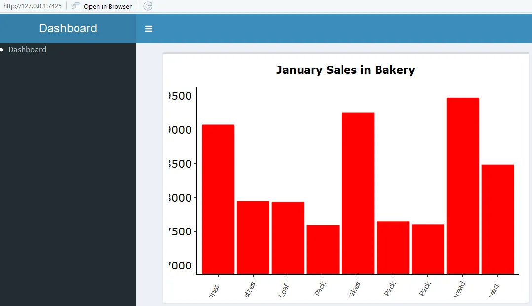
我该如何防止这种情况发生?如果我使用普通的图表,则标签不会被裁剪,但我需要图表是交互式的。
以下是我创建图表的代码:
ui.r:
#creating app with shiny
library(shiny)
library(shinydashboard)

shinyUI(
  dashboardPage(
  dashboardHeader(title = "Dashboard"),
  dashboardSidebar(
  menuItem("Dashboard")
),
dashboardBody(
  fluidPage(
    box(plotlyOutput("bakePlot")),
    box(plotOutput("bakeMonthly"))
  )
)
)
)
server.r:
shinyServer(function(input, output){

output$bakePlot <- renderPlotly({
ggplot(sales_bakery, aes(ProductName, ProductSales))+
stat_summary(fun.y=sum,geom="bar",colour="red",fill="red",show.legend = FALSE) +
coord_cartesian(ylim = c(7000, 9500)) + ggtitle("January Sales in Bakery") +
xlab("Category") + ylab("Quantity Sold")+
  theme(
        axis.title.x = element_blank(),
        axis.title.y = element_blank(),
        axis.text.x = element_text(angle = 60, hjust = 1),
        axis.text.y = element_text(colour = "black", size = 14),
        panel.background = element_rect(fill = "white"),
        panel.grid.minor = element_blank(),
        panel.grid.major = element_blank(),
        axis.line = element_line(colour = "black", size = 1),
        legend.position = "none",
        plot.title = element_text(lineheight = 1.8, face = "bold"))
})
+ theme(plot.margin = unit(c(1, 1, 1, 2), "cm"))?最后一个数字是左边距,您可能需要尝试不同的值。 - Maurits Evers