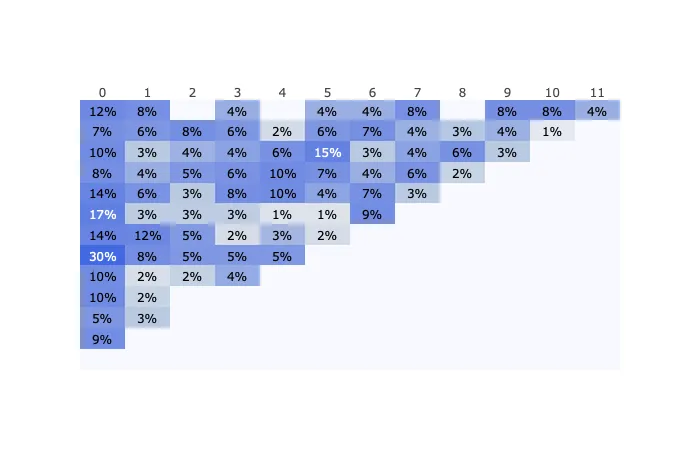
我在使用plotly时遇到了显示y轴标签的问题。
这是我的索引:
index = ['2015-11','2015-12','2016-01','2016-02','2016-03','2016-04','2016-05',
         '2016-06','2016-07','2016-08','2016-09','2016-10','2016-11']
数据
data = [[0.115, 0.077, 0.0, 0.038, 0.0, 0.038, 0.038, 0.077, 0.0, 0.077, 0.077, 0.038],
  [0.073, 0.055, 0.083, 0.055, 0.018, 0.055, 0.073, 0.037, 0.028, 0.037, 0.009, 0.0],
  [0.099, 0.027, 0.036, 0.045, 0.063, 0.153, 0.027, 0.045, 0.063, 0.027, 0.0, 0.0],
  [0.076, 0.038, 0.053, 0.061, 0.098, 0.068, 0.038, 0.061, 0.023, 0.0, 0.0, 0.0],
  [0.142, 0.062, 0.027, 0.08, 0.097, 0.044, 0.071, 0.027, 0.0, 0.0, 0.0, 0.0],
  [0.169, 0.026, 0.026, 0.026, 0.013, 0.013, 0.091, 0.0, 0.0, 0.0, 0.0, 0.0],
  [0.138, 0.121, 0.052, 0.017, 0.034, 0.017, 0.0, 0.0, 0.0, 0.0, 0.0, 0.0],
  [0.297, 0.081, 0.054, 0.054, 0.054, 0.0, 0.0, 0.0, 0.0, 0.0, 0.0, 0.0],
  [0.095, 0.016, 0.024, 0.04, 0.0, 0.0, 0.0, 0.0, 0.0, 0.0, 0.0, 0.0],
  [0.102, 0.023, 0.0, 0.0, 0.0, 0.0, 0.0, 0.0, 0.0, 0.0, 0.0, 0.0],
  [0.054, 0.027, 0.0, 0.0, 0.0, 0.0, 0.0, 0.0, 0.0, 0.0, 0.0, 0.0],
  [0.087, 0.0, 0.0, 0.0, 0.0, 0.0, 0.0, 0.0, 0.0, 0.0, 0.0, 0.0],
  [0.0, 0.0, 0.0, 0.0, 0.0, 0.0, 0.0, 0.0, 0.0, 0.0, 0.0, 0.0]]
我用以下代码创建了一个热力图:
import plotly.figure_factory as ff
from plotly.offline import iplot
import re

cols = range(12)
index = index
df = pd.DataFrame(data, columns = cols)
df.index = index

x = df.columns.tolist()
y = df.index.tolist()
z = df.values

annotation_text = np.char.mod('%.0f%%', df*100).tolist()
annotation_text = [[re.sub('^0%$','', x) for x in l] for l in annotation_text]


colorscale=[[0.0, 'rgb(248, 248, 255)'],
            [0.04, 'rgb(224, 228, 236)'],
            [0.08, 'rgb(196, 210, 226)'],
            [0.12, 'rgb(158, 178, 226)'],
            [0.16, 'rgb(134, 158, 227)'],
            [0.2, 'rgb(122, 146, 227)'],
            [1.0, 'rgb(65, 105, 225)'],
            ]


fig = ff.create_annotated_heatmap(z, x=x, y=y, colorscale= colorscale,
                                  annotation_text = annotation_text)

fig.layout.yaxis.autorange = 'reversed'
offline.iplot(fig, filename='annotated_heatmap_color.html')
这会生成正确的热力图,但是y轴标签缺失
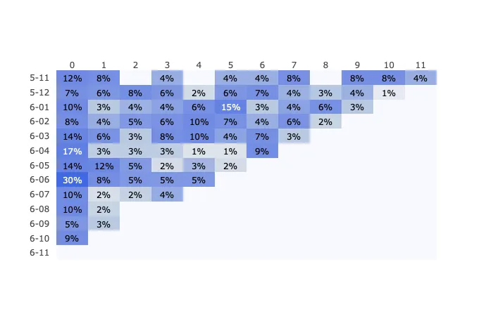
当我将索引更改为较短的值,如'5-11'
index = [x[3:] for x in index]
标签已经显示出来了。
 我不理解其中的逻辑,想知道如何修复它。
index = index和df.index = index。我删除了这些行,这样我就可以运行你的代码,并且我的代码在两个轴都标记的情况下表现出了预期的行为。 - Polkaguy6000