Plotly:如何添加多个y轴?

8
我有一些数据,包含5个不同的列,它们的值相互之间有所不同。
Actual gen  Storage Solar Gen   Total Gen   Frequency
  1464      1838    1804         18266        51 
  2330      2262    518          4900         51
  2195      923     919          8732         49
  2036      1249    1316         3438         48
  2910      534     1212         4271         47
  857       2452    1272         6466         50
  2331      990     2729         14083        51
  2604      767     2730         19037        47
  993       2606    705          17314        51
  2542      213     548          10584        52
  2030      942     304          11578        52
  562       414     2870         840          52
  1111      1323    337          19612        49   
  1863      2498    1992         18941        48
  1575      2262    1576         3322         48
  1223      657     661          10292        47
  1850      1920    2986         10130        48
  2786      1119    933          2680         52
  2333      1245    1909         14116        48
  1606      2934    1547         13767        51

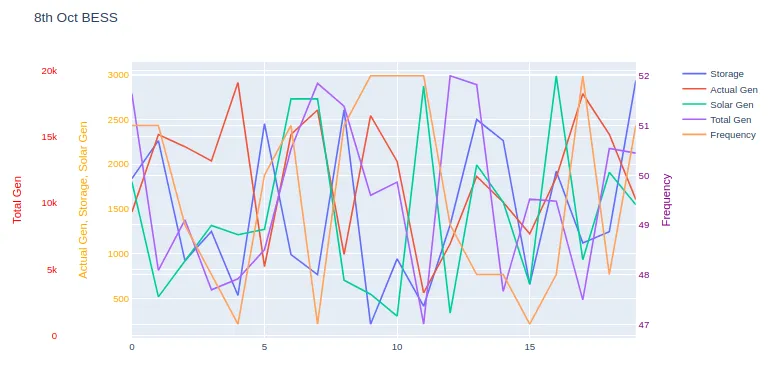
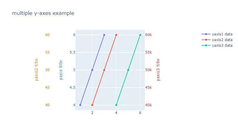
所以,从这些数据中,我想绘制一个带有3个y轴的图表。一个是频率,第二个是总发电量,第三个是实际发电量、储能和太阳能发电量。频率应该在第二Y轴(右侧),其余内容应该在左侧。
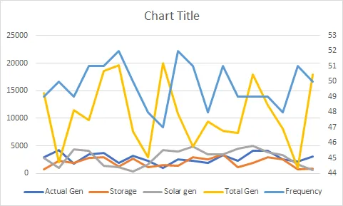
  • 对于频率,你可以看到值在47到52之间非常随机,所以应该放在右边,像这样: enter image description here

  • 对于总发电量,其值非常高,与其他值相比从100到20000,因此我无法将它们与其他值合并,类似于这样: enter image description here 这里我想要:

  • Y轴标题1 = 实际发电、存储和太阳能发电

  • Y轴标题2 = 总发电量

  • Y轴标题3 = 频率

我的方法:

import logging

import pandas as pd
import plotly.graph_objs as go
import plotly.offline as pyo
import xlwings as xw
from plotly.subplots import make_subplots

app = xw.App(visible=False)
try:
    wb = app.books.open('2020 10 08 0000 (Float).xlsx')
    sheet = wb.sheets[0]
    
    actual_gen = sheet.range('A2:A21').value
    frequency = sheet.range('E2:E21').value
    storage = sheet.range('B2:B21').value
    total_gen = sheet.range('D2:D21').value
    solar_gen = sheet.range('C2:C21').value

except Exception as e:
    logging.exception("Something awful happened!")
    print(e)
finally:
    app.quit()
    app.kill()

# Create figure with secondary y-axis
fig = make_subplots(specs=[[{"secondary_y": True}]])

# Add traces
fig.add_trace(
    go.Scatter(y=storage, name="BESS(KW)"),
)
fig.add_trace(
    go.Scatter(y=actual_gen, name="Act(KW)"),
)
fig.add_trace(
    go.Scatter(y=solar_gen, name="Solar Gen")
)
fig.add_trace(
    go.Scatter(x=x_values, y=total_gen, name="Total Gen",yaxis = 'y2')
)
fig.add_trace(
    go.Scatter(y=frequency, name="Frequency",yaxis = 'y1'),
)

fig.update_layout( title_text = '8th oct BESS',
    yaxis2=dict(title="BESS(KW)",titlefont=dict(color="red"), tickfont=dict(color="red")),
    yaxis3=dict(title="Actual Gen(KW)",titlefont=dict(color="orange"),tickfont=dict(color="orange"), anchor="free", overlaying="y2", side="left"),
    yaxis4=dict(title="Solar Gen(KW)",titlefont=dict(color="pink"),tickfont=dict(color="pink"), anchor="x2",overlaying="y2", side="left"),
    yaxis5=dict(title="Total Gen(KW)",titlefont=dict(color="cyan"),tickfont=dict(color="cyan"), anchor="free",overlaying="y2", side="left"),
    yaxis6=dict(title="Frequency",titlefont=dict(color="purple"),tickfont=dict(color="purple"), anchor="free",overlaying="y2", side="right"))

fig.show()

有人可以帮忙吗?


请澄清确切的问题。我看到您有Plotly文档...您卡在哪里了?此外,也许可以将“Total Gen”重新计算为log10比例尺? - S3DEV
先生,我在 Total_gen 绘图时遇到了困难。我无法绘制 y 轴标题 2。 - Vesper
1
好的,我已经做出了更改。谢谢。 - Vesper
非常感谢,先生。这真的非常有帮助。 - Vesper
1
不客气,很高兴能帮到你。祝一切顺利! - S3DEV
2个回答

7

这是一个创建多层y轴的示例。

实质上,关键在于:

  • 为每个轴在layout字典中创建一个键,然后将跟踪赋值给该轴。
  • xaxis domain设置为比[0,1]更窄(例如[0.2, 1]),从而将图形左侧推向右侧,为多层y轴留出空间。

链接到有关此主题的官方 Plotly 文档。

为了使本演示的数据易于阅读,我已经将您的数据集存储为CSV文件,而不是Excel - 然后使用pandas.read_csv()函数将数据集加载到pandas.DataFrame中,然后将其作为数据列传递给绘图函数。

示例:

读取数据集:

df = pd.read_csv('energy.csv')

示例绘图代码:

import plotly.io as pio

layout = {'title': '8th Oct BESS'}
traces = []

traces.append({'y': df['storage'], 'name': 'Storage'})
traces.append({'y': df['actual_gen'], 'name': 'Actual Gen'})
traces.append({'y': df['solar_gen'], 'name': 'Solar Gen'})
traces.append({'y': df['total_gen'], 'name': 'Total Gen', 'yaxis': 'y2'})
traces.append({'y': df['frequency'], 'name': 'Frequency', 'yaxis': 'y3'})

layout['xaxis'] = {'domain': [0.12, 0.95]}
layout['yaxis1'] = {'title': 'Actual Gen, Storage, Solar Gen', 'titlefont': {'color': 'orange'}, 'tickfont': {'color': 'orange'}}
layout['yaxis2'] = {'title': 'Total Gen', 'side': 'left', 'overlaying': 'y', 'anchor': 'free', 'titlefont': {'color': 'red'}, 'tickfont': {'color': 'red'}}
layout['yaxis3'] = {'title': 'Frequency', 'side': 'right', 'overlaying': 'y', 'anchor': 'x', 'titlefont': {'color': 'purple'}, 'tickfont': {'color': 'purple'}}
    
pio.show({'data': traces, 'layout': layout})

图表:

由于这些追踪的性质,它们彼此重叠,这可能会使图表解释变得困难。

有几个选项可供选择:

  • 更改每个 y 轴的 range 参数,使轴仅占用图表的一部分。例如,如果数据集范围从 0-5,将相应的 yaxis range 参数设置为 [-15, 5],这将把该追踪推到图表的顶部。

  • 考虑使用子图,可以将类似的追踪分组...或每个追踪都可以有自己的图表。这里是 Plotly 的子图文档。

enter image description here

评论(简短版):

此处显示的示例代码使用较低级别的 Plotly API,而不是像 graph_objectsexpress 这样的便捷包装器。原因是我(个人认为)向用户展示发生在“引擎盖下”的东西,而不是用便捷包装器掩盖底层代码逻辑,这对用户有所帮助。

这样,当用户需要修改图表的更细节部分时,他们将更好地了解 Plotly 为底层图形引擎(Orca)构建的 listdict


谢谢你的回答。pio是如何定义的? - Emad
@Emad - 很高兴为您服务。pio来自于import plotly.io as pio。(已更新答案) - S3DEV

3
这是我的函数,用于在x轴上将任何带有索引的数据框绘制出来。应支持任何大小的数据框。
def plotly_multi(data):
    if data.shape[1]>2:
        fig = go.Figure()
        fig.add_trace(
            go.Scatter(x=data.index, y=data.iloc[:, 0], name=data.columns[0]))
    
        fig.update_layout(
            xaxis=dict(domain=[0.1, 0.9]),
            yaxis=dict(title=data.columns[0]),
            yaxis2=dict(title=data.columns[1], anchor="x", overlaying="y", side="right"))
    
        for i, col in enumerate(data.columns[1:], 1):
            fig.add_trace(
                go.Scatter(x=data.index,y=data[col],name=col,yaxis=f"y{i+1}"))
    
        for i, col in enumerate(data.columns[2:], 2):
            axis = f"yaxis{i+1}"
    
            if i%2 == 0:
                side = "left"
                position = (i-1)*0.05
            else:
                side = "right"
                position = 1 - (i-2)*0.05
    
            axis_value = dict(
                title=col,
                anchor="free",
                overlaying="y",
                side=side,
                position=position)
            exec(f"fig.update_layout({axis} = axis_value)")
    if data.shape[1]==2:
        fig = make_subplots(specs=[[{"secondary_y": True}]])
        # Add traces
        fig.add_trace(
            go.Scatter(x=data.index, y=data.iloc[:, 0], name=data.columns[0]),
            secondary_y=False,)
        fig.add_trace(
            go.Scatter(x=data.index, y=data.iloc[:, 1], name=data.columns[1]),
            secondary_y=True,)
        # Set x-axis title
        fig.update_xaxes(title_text="Date")
        # Set y-axes titles
        fig.update_yaxes(title_text=data.columns[0], secondary_y=False)
        fig.update_yaxes(title_text=data.columns[0], secondary_y=True)
    if data.shape[1] == 1:
        fig = px.line(data.reset_index(), x = data.index.name, y = data.columns)
    
    fig.update_layout(
    title_text="Data",
    width=800,)
    
    fig.show()

网页内容由stack overflow 提供, 点击上面的
可以查看英文原文,
原文链接