我有以下代码:
from plotly.subplots import make_subplots
import requests
import json
import datetime as dt
import pandas as pd
import plotly.graph_objects as go


def get_candles(symbol, window, interval='1h'):
    url = "https://api.binance.com/api/v1/klines"
    end_time = dt.datetime.utcnow()
    delta = dt.timedelta(hours = window)
    start_time = end_time - delta
    start_date = str(int(start_time.timestamp() * 1000))
    end_date = str(int(end_time.timestamp() * 1000))
    limit = '1000'
    market = symbol + 'BUSD'

    req_param = {"symbol": market, "interval": interval, "startTime": start_date, "endTime": end_date, "limit": limit}

    text = requests.get(url, params = req_param).text
    data = json.loads(text)
    df = pd.DataFrame(data)
    df.columns = ['open_time',
                    'o', 'h', 'l', 'c', 'v',
                    'close_time', 'qav', 'num_trades',
                    'taker_base_vol', 'taker_quote_vol', 'ignore']

    df.index = [dt.datetime.fromtimestamp(x/1000.0) for x in df.close_time]

    return df


def chart(symbol, interval='1h'):
    windows = {'1m': 1, '5m': 5, '15m': 15, '30m': 30, '1h': 60, '2h': 120, '4h': 240, '6h': 360, '12h': 720, '1d': 1440}
    chart = get_candles(symbol.upper(), windows[interval], interval)
    fig = make_subplots(specs=[[{"secondary_y": True}]])
    print(chart['v'].max())
    fig.add_trace(go.Candlestick(x=chart.index,
            open=chart['o'],
            high=chart['h'],
            low=chart['l'],
            close=chart['c'],
            name="yaxis1 data",
            yaxis='y1'), secondary_y=True)
    fig.add_trace(go.Bar(x=chart.index, y=chart['v'], name="yaxis2 data", yaxis="y2"), secondary_y=False)
    fig.layout.yaxis2.showgrid=False
    fig.update_yaxes(type="linear")
    fig.update_layout(xaxis_rangeslider_visible=False)

    # fig.show()

    fig.write_image("figure.png", engine="kaleido")

chart('bnb')
它生成以下图像:
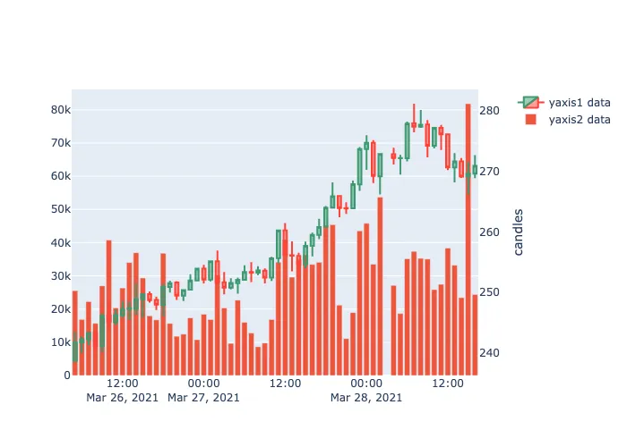
现在我想让音量条只到图表总高度的1/3,我尝试这样做:
fig.update_layout(yaxis1=dict(title="bars", domain=[0, int(2* chart['v'].max()/3)]))
但这没有任何效果。
如何为某个y轴指定名称并更改其范围?
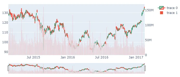
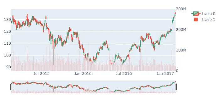
secondary_y = False或True吗?详情请见:https://plotly.com/python/multiple-axes/ - astrochunfigcontains both axes, so when updating, you still need to be explicit. Much like how you useadd_trace, you need to specifysecondary_yin yourfig.update_yaxes- astrochun